| Image |
Comment |
| 06/17/2006 05:48:00 PM |
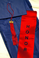
With Honorsby AzCKellyComment: A challenge entry with NO comments?? This cannot stand! Definitely meets the challenge, nice juxtaposition of colors that vividly contrast. Why the low score and dearth of feedback?? Dunno, technically a nice image but I guess it lacks that wow factor so valued by the DPC community. Nice idea and execution, IMO. |
 Photographer found comment helpful. Photographer found comment helpful. |
| 06/17/2006 04:16:30 PM |
|
| Photographer found comment helpful. |
| 06/17/2006 04:15:04 PM |
-(:..:Scale:..:)-by Canadian_ehComment: Would probably have been much better with a tighter look at the rocks, to capture some of the textures and details at the next level. Maybe some sort of common object (watch, pen, etc.) to provide some scale. |
| Photographer found comment helpful. |
| 06/17/2006 04:13:39 PM |
Reflectionsby Jaded_HousewifeComment: My first impression is that the reflections in the glasses are distracting because they obscure the eyes, but I gather from your title that you WANT me to look at the reflections. A good sharp image but the indirect lighting on the face make the colors seem a little flat. The bright blues and greens of the shirt steal attention away. |
| Photographer found comment helpful. |
| 06/17/2006 03:10:19 PM |
St Andrews Parkby igoofryComment: You must have selected this shot knowing I was coming! How can I resist a moon?? Excellent job capturing a number of fascinating elements that aren't always easy to do in a single photo. The sky is a soft blue gradient, The moon looks exactly as your eye experiences it in a blue sky. The golden light on the trees and foreground grass is outstanding, and a sharp little bird in flight right through the center. Outstanding job. This picture does something that only a well captured photo can do - it provides a feast of options for the eye to roam too and fro. Very nicely done! |
| Photographer found comment helpful. |
| 06/17/2006 03:05:38 PM |
Homeless Melodiesby jwillertonComment: Greetings from the Critique Club
by strangeghost
The first three parts of this critique are written based purely on examination of your photo. "Final thoughts" is written after reviewing your score, photographer's comments, and voter comments.
TECHNIQUE
The first thing that struck me about your picture is the relative darkness of the face. With a portrait like this, the face is automatically where the eye goes upon first looking, so it has to live up to the attention it's going to get. Your lighting and the subject's dark complexion has left the face in deep shadow. It is a fascinating face, with much detail that unfortunately, seems to be lost in the rest of the image. I like the choice of black and white - a duotone would have worked well too. Focus looks good; a nice clean image, but the darkness of the face puts me off a bit. Did you try to shoot with a fill-flash??
COMPOSITION
The composition is unusual and I'm not sure it's balanced enough. I like the fact that you got close, but I think you could have tightened it up even more. I love the placement of the left hand but the chopping of the guitar neck and the entire right arm feels odd. The background is also not desirable so I would have probably chosen to get closer and really fill the frame with the face and upper body. Maybe a different perspective to preserve some of the guitar too (looking down the neck toward the person, etc.).
EMOTIONAL IMPACT
People shots are some of the most emotionally hard-hitting shots and this one does a good job, but would have been much more impacting had the face been more prominent and/or better lit. The expression on his/her face is very intriguing. I can't tell if it's a smile or a frown about the break out. The sunglasses are cool but I bet the eyes would have been awesome too.
FINAL THOUGHTS
Your title does a good job of providing some context. Your final score of just above five is what I would have predicted. I bet with more emphasis on the face in both technique (lighting) and composition, you would have pushed six. |
| Photographer found comment helpful. |
| 06/17/2006 07:39:13 AM |
Southern Gentlemanby SDWComment: Fill the frame dude. Your mug is way more interesting than the rocks - as nice as they are. Leave in the foot, or crop the lower body much more severely in the interest of showing more face. Your left hand looks awkward the way it's hanging there too. Put something in your hand to give it a reason to be there. A flower, a rock-hammer, a lens cap, whatever. |
| Photographer found comment helpful. |
| 06/12/2006 10:44:38 PM |
|
| Photographer found comment helpful. |
| 06/07/2006 03:38:18 PM |
She Loves You by MayaMComment: Good grief girl, you're leaving us in your dust! Congrats on your second ribbon in as many months (two challenges in a row for you, right??). |
| Photographer found comment helpful. |
| 06/03/2006 07:46:42 PM |
|
| Photographer found comment helpful. |
Home -
Challenges -
Community -
League -
Photos -
Cameras -
Lenses -
Learn -
Help -
Terms of Use -
Privacy -
Top ^
DPChallenge, and website content and design, Copyright © 2001-2025 Challenging Technologies, LLC.
All digital photo copyrights belong to the photographers and may not be used without permission.
Current Server Time: 08/06/2025 09:26:33 AM EDT.