|
|
|
Showing 351 - 360 of ~1461 |
| Image |
Comment |
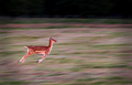
| 07/03/2006 12:05:05 PM | ~ SPRING ~ by AlexSaberiComment: A stunning image. Perfect motion pan - very difficult and you nailed it perfectly! |  Photographer found comment helpful. Photographer found comment helpful. |
| 07/02/2006 11:27:22 PM | Nobody wantsby lensblurComment: Greetings from the Critique Club
by strangeghost
The first three parts of this critique are written based purely on examination of your photo. "Final thoughts" is written after reviewing your score, photographer's comments, and voter comments.
TECHNIQUE
Outstanding depth, almost gives a three dimensional feel to the image. The exposure is a bit dark, particularly in the trees. Focus is good. I like the deeply saturated blues of the sky and how it contrasts with the earthy colors that dominate the rest of the image.
COMPOSITION
It's a unique take on a demolition. The titled viewpoint, the deep depth of field; these combine to create a surreal feel to the whole scene. The foreground is dominated by the twisted mass of iron rod and rocks, which tends to make things look a bit messy, but I still like the effect.
EMOTIONAL IMPACT
As much as I like the technical and compositional job you've done, I don't think the picture has a significant emotional impact. It's definitely unique and creative, but not all that compelling or provocative.
FINAL THOUGHTS
Voters were relatively indifferent though your commenters seemed to like it. Your final score of five probably results from the overall lack of emotional punch that I mentioned. It's a very well done image though. I like your compositional eye and you nailed the technical aspects. Good job. |
| 07/01/2006 01:59:18 PM | Last Resortby mikehollemanComment: Greetings from the Critique Club
by strangeghost
The first three parts of this critique are written based purely on examination of your photo. "Final thoughts" is written after reviewing your score, photographer's comments, and voter comments.
TECHNIQUE
Focused but almost has an oversharp feel to it, as if it's a crop of a larger image that you tried to salvage detail by using USM? Exposure is excellent for the building but the sky has washed out to a very pale blue. It looks like you shot with very high sun. Such shots are usually better early in the morning or late in the afternoon to take advantage of the much lower sun angle to create interesting shadows and textures. Colors are OK but a bit muted. The greens and yellows of the vegetation could really form a dramatic contrast to the starkness of the building.
COMPOSITION
A good viewpont of an abandoned building - a shot that surely meets the challenge. I like the inclusion of foreground vegetation that also looks abandoned. As mentioned, the oversharp appearance hurts here, especially in the branches of the bushes. I might have recommended using a single foreground bush and re-composing placing the building and sign on one side and the barren bush on the other. As shot, the composition has the plants blocking a part of the structure that my eye wants to see more of, the unique overhang in front of the main entrance (?). For a photo like this, you really have to answer the question, "what is the main point of interest you want your viewers to see?" I'm not sure I know exactly what that is when I look at this pic. The sign draws the eye, as does the architecture, as does the damage to the building and the vegetation. What's the main subject?? Know that in advance and then compose your shot and you'll have a photo that seems to express a clear purpose.
EMOTIONAL IMPACT
While this photo clearly meets the challenge description, it doesn't have any truly memorable or unique element that makes me go "wow" and keeps my eyes engaged. I think playing with the light and rethinking the composition more thoroughly could have helped, but it's difficult to say.
FINAL THOUGHTS
You obviously touched a nerve with some of your commenters who either recognized the location or realized the intent of your photo/title combo. Your final score of 5.1 is not bad, but I wonder if you were a bit disappointed? I see that it's your first challenge (well done, welcome!) and that you did confess to using the USM. Back off a bit on that filter, it's very easy to over do. Keep shooting, I enjoyed studying your image for this critique! | | Photographer found comment helpful. |
| 06/30/2006 01:55:16 PM | Grand Entranceby anthonyczajaComment: Lovely warm colors. I wish I could see her face a bit better, but I love the whimsical nature of her movements. | | Photographer found comment helpful. |
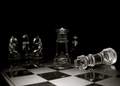
| 06/30/2006 11:56:38 AM | Who did it?by mssnareComment: Greetings from the Critique Club
by strangeghost
The first three parts of this critique are written based purely on examination of your photo. "Final thoughts" is written after reviewing your score, photographer's comments, and voter comments.
TECHNIQUE
This photo appears to be well-shot from the standpoint of focus, exposure and cleanliness (no dust spots or obvious imperfections). The lighting appears to be a bit dark, which could also be an artistic choice on your part. In general, I'm a big fan of flat black backgrounds, but have mostly seen these work well in colorful images. With your image being rendered in B&W, the dark background makes for a very moody and dark image overall. The three pieces on the left are particularly hard to distinguish. I can tell the center one is a bishop and guess the others are knights, but it's not completely clear. You've done pretty good job of controlling the reflections - not an easy task when shooting glass subjects!
COMPOSITION
I love the angles created by the oblique view of the chess board - much more interesting than if you had not shot from the corner. I've already spoken to the ambiguity of the identity of some of the chess pieces, but your subject is clearly the defeated King and the perp seems to be the Queen standing right beside him. I think even non chess-players will be able to relate to the tension created by the staging. Chess players will enjoy the additional imagery implied by the fact that chess pros traditionally knock over their King as the universal sign of resignation (giving up). From a purely "it's a matter of taste" standpoint, I wonder if you shot this scene with a slightly higher camera angle? I like the feel you've created by making the viewer feel like he is right down among the chess pieces, but a slightly higher perspective might have had some interesting elements as well. Alternatively, getting the camera even lower (tough to do though) could have made the Queen really appear to tower over the defeated King. Compositionally speaking, I really like the black background here, as well as the negative space it provides.
EMOTIONAL IMPACT
What type of impact does this image contain? Does it speak to the average viewer? I would guess that it does on some levels, but I'm wondering about the directness of its connection to the challenge. Does it speak to desolation?? On some level, certainly, though I'm wondering if a general voting audience would agree. It's a technically excellent shot and has a professional feel to it, both in technical elements and composition. And to me, it does have a feeling of desolation about it. I don't think, however, that it has a sufficient "wow" factor to elevate it to the top levels of the typical DPC challenge. It's a pleasing, well done shot, but one that probably got lost somewhere in the bottom of the top third in placement.
FINAL THOUGHTS
Well, I was evidently too kind in my estimation of whether the voters would "get it" or not. I'm shocked that this ended up as low as it did. The bottom 10% is a pretty crummy place to land, and I bet you were disappointed in this finish. Don't be discouraged though. You've clearly got a good eye and are willing to spend some time thinking out of the box (as one of your commenters observed). Keep shooting. I enjoyed the opportunity to study this image closely for a critique. | | Photographer found comment helpful. |
| 06/29/2006 09:57:55 AM | Rho-Ophiuchus Nebula Complexby coliwablComment: Dennis, I'd venture to say that fewer than 1 out of 1000 DPC users appreciate what this photo depicts and have no idea the difficulties involved in capturing the subtleties shown. Not only do you show the dust lanes leading into Sagittarius, but you've also captured the elusive nebulosities around Rho Oph. Superb work with a single exposure. From one astrophotographer to another, my hat is off. I'd love to see a link to a full size version, if you have one online. | | Photographer found comment helpful. |
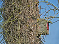
| 06/29/2006 12:08:03 AM | No One Lives Here Anymoreby obsidianComment: Greetings from the Critique Club
by strangeghost
The first three parts of this critique are written based purely on examination of your photo. "Final thoughts" is written after reviewing your score, photographer's comments, and voter comments.
TECHNIQUE
Subject is sharply focused. The many foreground branches are less so but this is not a problem and adds some depth to the image. Color range seems good. The sky is a satisfying blue though there seems to be a little haloing around the branches on the upper right and left. Maybe a tad oversharp? The birdhouse is well lit in what looks like high sun. Technically not a bad image other than the possible overprocessing on sharpness.
COMPOSITION
I can see why you were attracted to this subject for this challenge. The heavily vined tree is intriguing and the bird's house seems strangely out of place and isolated. However, the incredible density of the vines makes for a "messy" feel to the photo, and even the birdhouse subject is somewhat hidden behind them. Since the birdhouse is clearly the subject of the photo, you probably should have gotten closer and made more of an attempt to fill the frame with the birdhouse and just allowed enough of the background to give it some context and feeling of desolation, and left out some of the cluttered feel that the tree as a whole gives. It's also disturbing to have to look through the branches to see the bird house itself. Your depth of field is fairly deep, keeping nearly all the branches well focused. It would have been interesting to see a shallower depth, with the background falling softly out of focus. This would made it easier for the eye to find and rest on your intended subject. It's also somewhat awkward that we're looking only at the side of the birdhouse. I can't tell if there's an opening in the front of it or not. Your title suggests abandonment but it's difficult to tell for sure with a side view.
EMOTIONAL IMPACT
As shot, it's a picture that looks a bit cluttered and seems to lack a clear voice. I think more attention paid to composition could have made this much stronger and given it an emotional "punch" that your audience would have found memorable.
FINAL THOUGHTS
In general, your commenters seemed to zero in on the same things I mentioned. It does have a busy, cluttered feel to it. Your final score of 4.5 is below average and probably signifies a mostly quick appraisal, failure to connect immediately, so vote and move on. The fact that this birdhouse spoke to you indicates, to me, a good vision for a tough, conceptual challenge like this one. Good job on finding a worthy subject. Now really spend some time figuring out how to capture it in a way that adds drama, conflict, emotion, or purpose. Most of all, study composition. How can you make use of your subject, its textures and location, to make this image talk to people. Keep shooting, I like your style.
| | Photographer found comment helpful. |
| 06/28/2006 11:14:30 AM | Troll !!!by taterbugComment: Extra points for appropriate humor! The quintessential DPC Urban Legend! | | Photographer found comment helpful. |
| 06/17/2006 08:18:58 PM | | | Photographer found comment helpful. |
| 06/17/2006 08:17:25 PM | Rubyredby sherpetComment: Sherpet, your eye for flower abstracts just astounds me. You cause me to look at flowers a whole different way. Bravo. This needs to be hanging in a gallery somewhere. | | Photographer found comment helpful. |
|
Showing 351 - 360 of ~1461 |
Home -
Challenges -
Community -
League -
Photos -
Cameras -
Lenses -
Learn -
Help -
Terms of Use -
Privacy -
Top ^
DPChallenge, and website content and design, Copyright © 2001-2025 Challenging Technologies, LLC.
All digital photo copyrights belong to the photographers and may not be used without permission.
Current Server Time: 08/06/2025 09:27:36 AM EDT.
|