| Image |
Comment |
| 05/03/2006 01:25:36 PM |
|
| 05/03/2006 01:24:55 PM |
|
 Photographer found comment helpful. Photographer found comment helpful. |
| 05/03/2006 01:20:05 PM |
"Free as a Bird"by NstiG8trComment: Nice color combinations here (might even have been good for the complementary challenge). It doesn't quite hit the mark with demonstrating "freedom" but the crisp definition of the feathers is wonderful. |
| Photographer found comment helpful. |
| 05/03/2006 01:18:59 PM |
|
| Photographer found comment helpful. |
| 05/03/2006 01:18:26 PM |
Like Father Like Sonby twm122Comment: I like the saying and the way you're showing it - I wish I could see the father's pose a little better. Because of the angle he could be pointing or shading his eyes.
I love the mix of blues. |
| Photographer found comment helpful. |
| 05/03/2006 01:17:29 PM |
Love at First Sightby AlmelundComment: I like the capture (prom?) but I wish I could see the fellow's eyes a little better so really see the affection between the two of them. The harsh light is a little distracting (the shadow of her chin on the flower). |
| 05/03/2006 01:16:14 PM |
A Stitch in Time saves nineby TajhadComment: I'm not really able to make out the sewing part of the image - the thread is there, but I don't see the needle or what she's actually working on.
However, I like the colors. The photo could be generally sharper/better focused. |
| Photographer found comment helpful. |
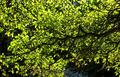
| 09/18/2005 10:18:51 PM |
Branch - back lightby BK1017Comment: Greetings from the Critique Club. I'm leaving this critique because you clicked "I would like an indepth critique on my submission" when you submitted.
Appropriateness for challenge - it's a photo of a branch in the topic branch - you found a good subject.
Color & Exposure - the color is wonderfully vibrant, perhaps a little overexposed, but the backlit nature of the subject actually works as a stylistic choice. It's much more like graphic art than photography as a style.
Composition - I think this is what hurt your photo the most. The composition lacks an overall coherence. The large mass of leaves are not uniform enough to create a single subject, and the lines of the branches and twigs are too chaotic to present a clear path for the eye to follow. The centering of the branch horizontally doesn't help to give any visual pop to the photo. I think your subject has a lot of merit and it's entirely likely that a closeup or crop of other elements within this shot could yield as much more pleasing photo.
I hope to see more of your photos in the future. |
| 09/13/2005 06:38:05 PM |
|
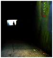
| 09/13/2005 01:45:21 PM |
Solitaryby JPRComment: I love the grittyness of this photo, the stark overexposure at the end of the tunnel and the supersaturated colors. |
| Photographer found comment helpful. |
Home -
Challenges -
Community -
League -
Photos -
Cameras -
Lenses -
Learn -
Help -
Terms of Use -
Privacy -
Top ^
DPChallenge, and website content and design, Copyright © 2001-2025 Challenging Technologies, LLC.
All digital photo copyrights belong to the photographers and may not be used without permission.
Current Server Time: 07/31/2025 03:34:37 PM EDT.