| Image |
Comment |
| 05/03/2004 05:05:54 PM |
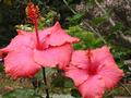
Paradise Pinkby acarnComment: Hibiscus is an interesting choice for this challenge, because of how far outside of the flower the sexual parts are. I'm sure others have already commented that it should be larger. |
 Photographer found comment helpful. Photographer found comment helpful. |
| 05/03/2004 03:21:18 PM |
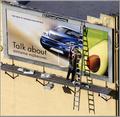
Transitionsby garrywhite2Comment: beautiful! would have qualified for serendipity too! I love the color difference between the two billboard designs and the darkness/definition on the arms of the man putting up the sign. The shadows really help to make it. I find the rooftop a little distracting, but a wonderful entry. good luck! |
| Photographer found comment helpful. |
| 05/03/2004 02:51:00 PM |
good morning, Angie!by ursulaComment: Lovely colors and lighting. I'm not sure about the darker lump at the top - I'd find the composition a little more pleasing with a crop of it. Nice find. |
| Photographer found comment helpful. |
| 05/03/2004 02:47:31 PM |
Wavesby K-RobComment: Looks like bananas, but I love the colors and the irregular nature of the curves and variations in the color. |
| Photographer found comment helpful. |
| 05/03/2004 02:46:36 PM |
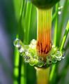
Dawnby instepsComment: Wonderful abstract - I have no clue what this is. I love the colors and the texture of the fringy stuff. The lighting is very interesting and aids in a compelling composition. |
| Photographer found comment helpful. |
| 05/03/2004 02:41:35 PM |
Global Warmingby ArtifactsComment: Beautiful colors. I love the lines and compositiong and how the vertical streaking aids the composition. |
| Photographer found comment helpful. |
| 05/03/2004 02:36:49 PM |
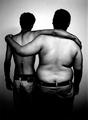
Hour Glass Figuresby ResurrectedComment: A wonderfully simple and understated choice. I like the black and white - it allows us to concentrate on the differences in size instead of flesh. I wish the left fellow was a little better lit across the lower back. |
| Photographer found comment helpful. |
| 05/03/2004 02:35:21 PM |
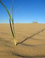
The Shady Proportions of Time.by boredComment: Wonderful sense of perspective. The texture of the sand is great. I'd love to see the end of the shadow and the grass fully in frame. The sky is great. Message edited by author 2004-05-05 02:21:39. |
| Photographer found comment helpful. |
| 05/03/2004 02:33:59 PM |
|
| Photographer found comment helpful. |
| 05/01/2004 02:40:48 PM |
Antennaby GeneralEComment: Originally posted by GeneralE:
I'm a sucker for cloudscapes too, and one reason I went B+W was to put more emphasis on the silhouette aspect rather than make it a nice cloudscape with an antenna in the way. |
Oh yes, now that I see the color ones, B&W was the right way to go for the challenge.
But I must say that I love the simple color "adjusted" one. We just don't get great clouds here in LA like that ... I'd have to go to the high desert for a storm or something. |
| Photographer found comment helpful. |
Home -
Challenges -
Community -
League -
Photos -
Cameras -
Lenses -
Learn -
Help -
Terms of Use -
Privacy -
Top ^
DPChallenge, and website content and design, Copyright © 2001-2025 Challenging Technologies, LLC.
All digital photo copyrights belong to the photographers and may not be used without permission.
Current Server Time: 08/04/2025 03:57:20 PM EDT.