| Image |
Comment |
| 02/18/2008 10:31:10 AM |
Xby levyj413Comment: Nice angle here. And I wouldn't say I'm exactly whoopin' ya at trivia...(Just saw your comment on my December self-portrait). Nice to meet you too. I see you also did a three-headed self-portrait. |
 Photographer found comment helpful. Photographer found comment helpful. |
| 02/13/2008 09:53:44 AM |
time fliesby ralphComment: Hmmm, I don't see how this was a panning shot...I see out-of-focus LEDs, but no motion blur that you would get if you were panning. Unless they are flahing LEDs, and you panned with the candle moving with the camera a lot better than I could do! |
| 02/06/2008 12:49:37 PM |
|
| Photographer found comment helpful. |
| 02/01/2008 10:05:30 AM |
|
| Photographer found comment helpful. |
| 02/01/2008 09:50:15 AM |
|
| 02/01/2008 09:49:21 AM |
|
| Photographer found comment helpful. |
| 02/01/2008 09:48:35 AM |
|
| 02/01/2008 09:47:37 AM |
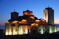
Church St.Klimentby lapopComment: Nice capture of the building's lighting, but composition seems too centered. |
| 02/01/2008 09:46:51 AM |
archetypeby GordonComment: Far too blurry for my taste, and contrast seems low. |
| Photographer found comment helpful. |
| 02/01/2008 09:46:02 AM |
Modern Canvasby BradComment: The black bars at top and bottom are distracting, make it look like a mistake. They also made me notice the thin bars on the sides. I'd suggest a more intentional-looking border, if indeed you did do that on purpose. |
| Photographer found comment helpful. |
Home -
Challenges -
Community -
League -
Photos -
Cameras -
Lenses -
Learn -
Help -
Terms of Use -
Privacy -
Top ^
DPChallenge, and website content and design, Copyright © 2001-2025 Challenging Technologies, LLC.
All digital photo copyrights belong to the photographers and may not be used without permission.
Current Server Time: 08/26/2025 01:24:22 AM EDT.