| Image |
Comment |
| 04/19/2004 03:38:38 PM |
|
 Photographer found comment helpful. Photographer found comment helpful. |
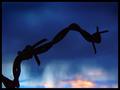
| 04/19/2004 03:38:04 PM |
Descentby BobsterLobsterComment: Image has a nice feel to it. Sky is nice but has a bit of unnaturalness. Don't like the thin blue line border. |
| Photographer found comment helpful. |
| 04/19/2004 03:36:43 PM |
Point of No Returnby dsidwellComment: Blue color is nice. Subject is forboding but effective. The area of strngest contrast is the pink cloud against the black border at the bottom. Therefore your eye is pulled to that spot. Don't think the black border adds anything. |
| Photographer found comment helpful. |
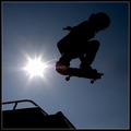
| 04/19/2004 03:34:38 PM |
TerraSurferby jmsetzlerComment: Nice placement of the main subject. Sun a bit bright and the lens flare detracts a bit. Don't like the thin white border line. |
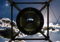
| 04/19/2004 03:33:25 PM |
Eye in the Skyby amonteforteComment: Nice angle. In this case (a rare find) the dead centereing of the image works well. You waited for the right image to be in the center eye. |
| 04/19/2004 03:32:02 PM |
|
| Photographer found comment helpful. |
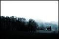
| 04/19/2004 03:30:39 PM |
Cottonwood Treeby SammieComment: Sky is nice - shape of the tree is nice. The white cloud on the left edge draws yoiur eye over there. |
| Photographer found comment helpful. |
| 04/19/2004 03:29:41 PM |
El Cabezon, Seventy Miles Awayby ElGordoComment: Very nice colors and transition from left to right, Great presentation it this "slim Jim" format. This image would be a natural in the "inspiritional poster" challenge. |
| Photographer found comment helpful. |
| 04/19/2004 03:28:24 PM |
The Lost Churchby ewebComment: This image has a very nice feeling of peace and serenity. It's very nicely done. Unfortunatley the only things that look like silhouettes are the trees on the left.
Your image is in the bottom righ quadrant which is lovely all by itself. So - forget the challenge and concentrate on the bottom right image of the church, foogy trees, grass, pond. It's great. |
| Photographer found comment helpful. |
| 04/19/2004 03:25:02 PM |
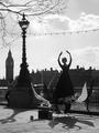
Power and Eleganceby clickawayComment: Nice feel. A wonderful rendition. Wish I could see your model's feet. The tall statue seems to divide the picture at that point - while the clock towers is very nice it's hard to get to. The other human figure below the clock tower adds nothing to the image for me. |
| Photographer found comment helpful. |
Home -
Challenges -
Community -
League -
Photos -
Cameras -
Lenses -
Learn -
Help -
Terms of Use -
Privacy -
Top ^
DPChallenge, and website content and design, Copyright © 2001-2025 Challenging Technologies, LLC.
All digital photo copyrights belong to the photographers and may not be used without permission.
Current Server Time: 08/26/2025 12:27:48 PM EDT.