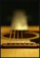
DPChallenge: A Digital Photography Contest You are not logged in. (log in or register
 
Browse Settings
Currently viewing:
Registered Usertristalisk

Show comments:

Per page:

Order:

Comments:


Comments Made by tristalisk
Pages:   ... [51] [52] [53] [54] ... [81]
Showing 501 - 510 of ~804
Image Comment
 Scout (and Atticus): after the confrontation
01/24/2005 10:44:25 AM
Scout (and Atticus): after the confrontation
by nsbca7

Comment:
wonderfull shot and spectacular use of selective desatration. This is one of 10's for this challenge in my book. I did however find one thing that I did not like in this photo. That is the fact that I did't take it.. Thanks for allowing me the pleasure of voting on this piece..... Keep up the great work.......

Tristalisk
Photographer found comment helpful.
Curvy Chaos
01/24/2005 07:55:07 AM
Curvy Chaos
by bryanbrazil

Comment:
Wow I like this one. I doubt I will vote on this challenge, however however I still felt like this shot deserved a comment. This is new and creative. This has a high resemblance of paint on a canvas. This by no treatch even resembles photography. Definately fits and exceed the challenge Keep up the great work!!

Photographer found comment helpful.
Hornets Nest
01/21/2005 01:28:22 PM
Hornets Nest
by Dim7

Comment:
Greetings from the critique club!!

Initial Impact: uhhhmmm.....oh ok its a hornets nest.

Meet the Challenge: yes. Brokeh is an out of focus background that enhances the object of interest in the foreground. The long dark shadowy lines definately enhance the object.

Focus: looks pretty good but theres not alot of ways to mess that up in brokeh.

Color: the colors in this image are rather bland the strogest contrasts are in the background. There does not seem to be any thing to help pull the bee hive into the spotlight.

Lighting: I think that a little darker lighting with a soft spot light on the nest would have looked a little better. But over all the lighting is pretty good as it is.

Setup, symetry, and balance: The photo "usualy" tends to look better if the subject of the photo is close to the center of the shot. In this picture it is slightly offset to the left.My eyes are forced to fight between the tree trung and the nest. There is no smooth flow between the two different subjects. I also feel that if this had been shot a little closer up it would have alowed the veiwer the opportunity to see and enjoy all of the intracate layers that the nest are made of. This would have not only given this shot a bit more intrest, but would have also added a sense of danger to the shot as well.

Overall: this a a little better than the average shot. But with a slightly different composition, Thsi could have easily have becom a chillingly wonderfull shot... I look farward to seeing what other interesting subjects you will find for us all to enjoy next. Good luck in your future challenges.
paw
01/21/2005 11:47:41 AM
paw
by redpanda

Comment:
Initial impact: Ahhhh it's catzillaa!!!cool.

Does it meet the Challenge? No Unfortunatly it doesn't meet the challenge. Brokeh is using an out of focus background to enhance the subject of na image.You have a shallow DOF that slowly fades back and causes the cats leg to go out of focus. But no real back ground to speek of. If you had had the cats head as the background and out of focus to where it is just barely in identifiable that would have been a good use of brokeh. I can see those large yellow eyes gleaming out from behind those intimidating claws now....oooh creepy..

Focus; The cats paw has very good focus. I can see each of the individual hairs. I realy like the focus on the paw itself.

Color: well theres not much color to speak of in this shot. The few colors there are such as the pink on the bottom of the paws looks to be correct. I don't feel however that you need much more color in this shot. So I would have to say this was done well.

Composition. Short of the lack of background the composition look nice. I can only see a few things in this area that are distracting. The little bitts of dirt on the cats fur wich were already mentioned. The other item I find distracting is the checkered cloth. I feel that a sollid color would have worked better.

Lighting: Beautifull lighting. I have nothing at all I can say that would improve your lighting.

Overall: I like this photo. If it had not been in a brokeh challenge I would have given it a 6 as is. With the few small changes I had mentioned I feel it could easily have scored it a 8 or 9 in any challenge. This is a wonderfull shot that just did not quite make the challenge IMO. So please keep up the great work and good luck in future challenges.

Tristalisk
My glass guitar
01/20/2005 01:24:06 PM
My glass guitar
by tolovemoon

Comment:
Greetings From The Critique Club!

Initial impact: ouch grainy..

Im not sure if this was done intentional or if you just lost alot during file downsizing, but the grainyness of the shot completely killed it. I would recomend you try a peice of free software colled neat image it would kill alot of the grainyness. I ran your samll image through it and it realy seemed to help I would have given it a 5 verses the two I had given in the challenge.

I suppose thats enough on the grainyness, lets more on to the meat of the shot.

Lighting; I do like the lighting in this shot the highlights and shadows are all very pleasing and in good locations.

Colors: I would like to have seen the colors a little more saturated maybe +4 to 5. I also think that the white plate on the red guitar would look better a little nicer. Beyond that the colors a very nice.

Back ground: in general the blue background would have worked fine. However for the Brokeh challenge I would have used a more intricate back ground to show the oof and blur better. Perhaps placing a guitar in the background sitting about neck llevel would have worked nice. The other part That looks ackward in this shot is the fur that the guitars are setting on. It just does not seem to have a compatable feel with the smooth glass guitars. I think placing them on a large mirror would have looked wonderfull.

Does it meet the challenge: No I don't feel it does. To be brokeh it requires an out of focus background that inhances the object of focus. Where as with this shot there is nothing the background as being out of focus. So without that it does not enhance the glass guitars.

Symetry and balance; This phot does have nice symetry and balance. My eyes flow nicely from one guitar to the next.

Well I hope you don't take the low score or my comments to badly. I am realy trying to help. I myself have had an image flop like this and score in the three's. I looked through the rest of your portfolio and I can tell you not a lousy photographer. You just didn't have much luck with this one shot... Best of luck and I look forward to seeing you in future challenges.

Tristalisk
Here's to You, Edvard
01/20/2005 08:15:54 AM
Here's to You, Edvard
by xtabintun

Comment:
LMAO wonderfull shot. I have been a big fan of both art and music most of my life. I have even painted the scream once in high school. I however never even concieved of using it as a photo. Very well done and creative. Thanks for the wonderfull laugh. Truely a priceless piece of art IMO.
Photographer found comment helpful.
Sensitiva
01/19/2005 11:49:02 AM
Sensitiva
by Pano

Comment:
Greetings from the Critique club!

Initial impact: woa thats ok of focus... ohh ok it's for the brokeh challenge.

Does it meet the challenge: IMO no. Brokeh is an out of focus background that enhances the image. I feel and you seem to feel the same way acording to your comments, that the image would look better if the heels were in focus. I also feel that for brokeh to work effectivly you should not be able to easily identify the background image.

Focus: Theres no need to rehash on the previous comment on brokeh.I read through the comments left to you from other voters and asij mention noise in the background. While I agree that neat image would work nicely on this, I dis agree that it is noise in the image. I think that what you are seeing is the panty hose. I have shot it several times and had similar results. I have discovered however that if you would like to keep the panty hose definable then a light coat of hairspray misted over them helps. Not 100% sure why but the lighting seems to like it better. However if you want a nice dark tan, neat image works very well.

Color: I like the colors fairly well. The rose is my only complaint in the catagory. I feel that a red rose would work better than the pink symbolicly than the pink. It repressents more of a lust in my mind wich work better with the heels in my opinion. The Rose also apears to be a little old, and is begining to wilt. If this was the idea perhaps a little older rose would have done better.

Over all: I think this is an absolutly great concept. I like the feeling and impact of the shot. But I feel that the rose and brokeh did not work well with the shot. On an off track did you try putting the heels in the foreground and the rose in the background? That might have worked.. well I hope my critique had at least somthing you found usefull in it for you. Best of luck in future challlenges!!

Tristalisk
Photographer found comment helpful.
Motherly Love
01/19/2005 10:47:06 AM
Motherly Love
by photomayhem

Comment:
Greetings from the critique club!

Initial opinion: aww how nice...4.8783! what the....

Does it meet the challenge: I must admit that it is very weak in the brokeh catagory. Whaile the brokeh is there it's not very strong. I feel that in good brokeh the chakground would be almost unidentifiable yet hint at what it might be. While out of focus I can still clearly tell that they are cabinets with bottles plates and some christas style flowers on the counter. I feel this might have a bit to do with such a strong and wonderfull image scoring so low.

Lighting: I realy like the lighting. The flesh tones are very rich and full of life. The slight shadows dancing around the face are also very well done.

Focus; he he focus on a Brokeh photo..almost a funny catagory. But still necessary. I feel the the two main characters are focused very nicely. I think that the soft focus works very well on them and I would not change a thing here. As I stated earlier however, the backgound could use a little less focus.

Back ground: Perhaps if this had been shot in front of a less identifiable back ground it would have done better. I personaly would like to have seen this shot in front of some fall colored trees, some reeds, or somthing of the sort. Another option that might work well is to cop this image a little tighter. Perhaps right along the bottom of the glass in the cabinets.

Overall: I realy like this shot. I feel that with the back ground fixed and peoples phobia to pictures of peoples childen, this could have easily been a contender for a ribbon. This in my opinion is a great example of a family shot that you can enjoy even if you don't know the family. I don't remeber what I scored this shot in the challenge. But I would score it about a 7 now. If the background was more brokeh. I would easily say an 8 or 9. This is a wonderfull and well exicuted shot in my opinion. So keep up the great work, and I hope you have better luck in future challenges.

Tristalisk
Photographer found comment helpful.
Strung Out
01/19/2005 09:56:37 AM
Strung Out
by MR_P

Comment:
Greetings from the critique club!

Initial impact: oooh guitar..woh I'm dizzy...

Does it meet the challenge.... hmm I don't know... My personal opinion is no. However from your comments many say yes. It looks to me from your score it was pretty well divided. with the yes group winning. My reason for saying no is this. I feel that Brokeh is the element of having an Out of Focus back ground with and having somthing to do with light. The "object" of your focus gradualy goes out of focus. You don't have an out of focus background in my opinion. But like I said it apears the voters disagree for the most part.

Lighting: wonderfull lighting, you alow the weiwer to see all of the rich tones in the wood grain, and I feel that placing the light to alow the reflecion of the pegs on the woods was agood choise. It adds a little more depth to the shot.

Color: I could not ask for more great color.

Composition and framing: I am happy with these aspects as well. The border works well with the image.

Overall: I'm not sure why but this photo gives me nausia. Not that it's a bad image. But the angle or the fade or the combination just dosn't sit well with me. I get a feeling of vertigo. Yet this is a very well shot and thought out peice of photographc art. It is technicaly has almost no imperfections. Yet just does not click with me.

So in conclusion I feel that some might not have seen this as fitting the challenge. This might have had a bit to do with this not making the top 10. Aside from the debate on what is brokeh.. this is a great image and I hope to see more like it. Good luck in future challenges..

Tristalisk
Photographer found comment helpful.
The Lone Leaf
01/19/2005 09:09:29 AM
The Lone Leaf
by Montereykiddo

Comment:
Greetings From the Critique Club!

First impression: Wow Nice.. ooh brokeh I like this.

Does it meet the challenge? Undoubtably Not only did it meet the challenge in my eyes. It meet the challenge definition and the texbook definition of brokeh. You have an out of focus background with points of light that enhances the overall image well done.

Color: Wonderfull use of colors the red and green contrast works very well. The Darker background on the lighter leaf also looks nice. I tend to agree with Bear musics comment however the light area of light in the top left corner does become a little distracting. I would be tempted to edit that spot.

Composision: Very nice well balanced shot. Everything feels to be in the right place.

Focus: hmm on a brokeh shot..almost a void catagory. But I do however see one area that I feel could be improved. The base of the leaf nearthe stem is a little out of fucus it would have been nice if that could have been kept crisp as well.

Lighting: I'm sure this might be debated, but I feel that the white line across the top edge of the leaf is distracting. I thik it pulls away from the natural beauty and color of the shot. While I'm sure others could easily see it as a nice highlite. Other than that the lighting apears perfect.

Overall; This is a very nice image in many aspect. While it's slight imperfections may hurt it a little this is still a great image. I remember voting on this in the challenge I had given it a 7 I still feel pretty happy with that rating. In a little less compeditive challenge, or a little more touch up this could have easily been a contender for a ribbon. This is a great shot with few flaws. Keep up the wonderfull work.

Tristalisk
Photographer found comment helpful.
Pages:   ... [51] [52] [53] [54] ... [81]
Showing 501 - 510 of ~804


Home - Challenges - Community - League - Photos - Cameras - Lenses - Learn - Help - Terms of Use - Privacy - Top ^
DPChallenge, and website content and design, Copyright © 2001-2025 Challenging Technologies, LLC.
All digital photo copyrights belong to the photographers and may not be used without permission.
Current Server Time: 06/19/2025 06:16:07 PM EDT.