| Image |
Comment |
| 02/24/2005 09:02:37 AM |
Oil and Waterby JackoComment: very crisp shot of the oil. I enjoy the hundreds of little bubbles. I must admit however that I can undestand the separation of oil and water but don't see it here. In order for oil to have this apearance it would need to be in water. Wowever you don't let us "see" the water that it is separated from. great shot just a little off 6 |
 Photographer found comment helpful. Photographer found comment helpful. |
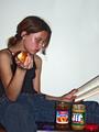
| 02/24/2005 08:55:20 AM |
After School Snackby PaulinaRDComment: I'm sure that the separaion in this shot has somthing to do with penut butter and jelly. I Think however that im missing it. I also feel that better lighting would realy have helped this shot. You hace a glare on the side of the models head, and the denim, shirt, bottle and table all seem to have no contrast. They all seem to meld together. The lighing makes this overall good shot feel like just another snap shot. |
| Photographer found comment helpful. |
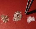
| 02/24/2005 08:33:46 AM |
A job for the very patienceby scottwilsonComment: I realy enjoy this shot. I feel that the bright red background works well. I especialy enjoy the story and the meaning behind this shot. It's not often I find a shot whos message is clear. great shot. bumbing up |
| Photographer found comment helpful. |
| 02/24/2005 08:30:46 AM |
Towel Borderby aromiaComment: while the towels are separted from on another. I fail to see the conection to the challenge. I also feel the towels are a little fadded and this could have used a little more saturation to liven it up a bit. As it it is a little bland to me. |
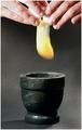
| 02/24/2005 08:28:19 AM |
Add One Large Eggby TranquilComment: well I like this shot but three things stand out that I dont like. first the mortar: why would someone use a mortor to put eggs in? Just dosn't seem to fit.
Second: the motion blur: While not a bad effect I think that stop motion would have looked more pleasing.
last of all: the hands look to be a little too bright.
Overall nice shot better than the average. |
| Photographer found comment helpful. |
| 02/24/2005 08:24:49 AM |
what lies beneathby saintaugustComment: wow creative this one took me a bit to identify. while it may fit the challenge I just didn't find this overly exiting. I will however give it a small bump on the premises of you made me have to think to identify a comon object. nice job. |
| Photographer found comment helpful. |
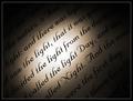
| 02/24/2005 08:22:40 AM |
The creationby JinjitComment: An interesting photo. I give it points for technical. I am not familiar with the writting and perhaps that is why I can't associate it with the challenge. Nice shot I just missed you intention so I'll give you a 8 -2 and leave you with a 6. |
| Photographer found comment helpful. |
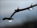
| 02/23/2005 03:58:57 PM |
I Am My Work -- the Thorn that Weeps, & Holds the Sky Entire...by Bear_MusicComment: Well bear music I'll squeek on in here and admit to being one of the 2's. If this had been shot for a different challenge I'll use the brokeh challenge for an example. I feel my score probably would have been around a 6 or 7. From a technical aspect its a decent photo. I think that the end of the twig stopping abrubtly in the photo is a bit distracing. It leaves me with an unfinished feel. I do however enjoy the shallow DOF, and the mood that the shot portays. I'f this had been a shot of your dog,wife, or kids. I probably would have agreed it fit the challenge. I thought about this shot for a bit before I scored it. I didn't feel that this represented you. Your kids might be part of you, your wife may have made you the way you are, but I was unable to see this lovely water drop hanging from a thorn as a photo of who someone is. I don't intend to be defending myself. I Just felt that someone who felt this was a low scoring shot should explain themself. So that perhaps you could better understand why the photo scored as it did. Well I hope I was of some help to you. May you have better luck in the Future.
Tristalisk |
| Photographer found comment helpful. |
| 02/23/2005 11:42:48 AM |
Gangsta'by postoakinversionComment: Greetings from the critique club!!
Initial impact: Woa thats dark.. hmm gangsta..ok it fits.
Does it meet the challenge: Well so long as thats realy you in the pfoto I would have to say yes.
Focus: Very Nice and crisp I don't think you could have nailed it better.
Color: well theres not much color in this shot. I don't feel that alot of colors would have been appropriate for this shot either. I tend to think however that I would have liked this shot a little better if your eyes had been a tiny bit brighter. The are a strong feature in this shot and that they were underplayed.
Lighting: I tend to disagree with the others however on this aspect. I think that the lighting was just right. I see gangsta's as being dark and shadowy. I feel tht the stong shadows in this case add to the feeling of danger.
Composition: The layout you used works very well. I think however that due to the fact that your only realy showing the one eye. That a bit of an agle from the side might have looked better. I think that this might have given you a more candid appearance.
Overall: Very strong image. I dislike the gangsta's that I have met in person and don't usualy care for there nature. I feel that you may have lost a very slight amount of points due to this factor. Despite my dislike for the subject matter, I still would not be able to score this photo any way but high. Powerfull shot Keep the great work coming.
Tristalisk |
| Photographer found comment helpful. |
| 02/18/2005 03:12:12 PM |
Color of Moneyby hjolliComment: Greetings From The Critique Club!!
Initial Impact: .........................
Does It Meet the challenge? No I don't feel it fits the challenge very well. While the the shot does have some large pinkish colored banners in it. I don't feel the banners are enoughto carry the photo by thereself. I feel that to meet the challenge that the object in pink should be the part of the image that demands the veiwers attention.
Focus:The focus is very nice in this shot. I can make out the fine details on the most distant objects and the little pretty lights along the sides.
Color: The colors on this shot seem a little bland to me. There are no vibrant colors to entice the veiwer.
Lighting: The lighting in this situation have a what you have is what you get scenerio. There was nothing you could do about the lighting. Taking that into consideration I would have to say that you did prety good.
Composition. There are not ant good strong lines for the veiwers eyes to follow through the photo. I also feel that this would have done better if the banners were centered between the two escalators. I think I would also have cropped the bottom section off. The people on the bottom serve no purpose and seem to detract from the wonderfull archetecture.
Overall: this seems like a pretty standard photo. There is no center of intrest. What are you trying to show the weiwer. What was it about this shot that inspired you to take it? If it was the archetecture try shooting it with less distracing people around. If it was the people try zooming in on just a small group of people. If it was the banners Like I suspect it was then I would have concentrated more on the banners and less on the remainder of the area. Perhaps using a DOF to blur them out a bit leaving only the banners crisp and just hinting at the world around them. This shot had alot of potential but lacked direction. I hope that I don't sound like I am bashing your photo. I just feel that honest is the best tool we have for learning. If it is of any consulation I gave It a 5 during that challenge. I found it to be just average. good luck in future challenges.
Tristalisk |
Home -
Challenges -
Community -
League -
Photos -
Cameras -
Lenses -
Learn -
Help -
Terms of Use -
Privacy -
Top ^
DPChallenge, and website content and design, Copyright © 2001-2025 Challenging Technologies, LLC.
All digital photo copyrights belong to the photographers and may not be used without permission.
Current Server Time: 08/22/2025 09:29:06 AM EDT.