| Image |
Comment |
| 02/24/2005 03:10:57 PM |
Degrees Of Separationby SirBiggsALotComment: ok we have a candle on a peice of ice, on a mirror. While mildly interesting it makes no sense to me.. technicaly it's ok. it's in focus, the colors look right, and the rule of 3rds was used.. but alas it looks like a candle on ice on a mirror. There seems to be nothing to it.. I'm not even sure where the separation is that you are trying to portray. is it the fire and ice? The solid to liquid? The two mirrored setup causing a duplicate?. I'm sorry but its just a run of the mill shot that dosn't fit the challenge to me.. |
| 02/24/2005 02:46:30 PM |
separated not by distance - rather , through the way we areby claudia26Comment: ackward and not apealing to me.. the harsh colors of the tree just do not set well for me. While it is an interesting shot I don't feel it fitts the challenge. Without the title I would have no clue what you were thinking. With the title I feel its a pretty weak connection. As for the shot itself I feel that more natural lookin wood would have looked better. Or perhaps even a shot from futher way leaving the whole tree as a silloutte. |
 Photographer found comment helpful. Photographer found comment helpful. |
| 02/24/2005 02:34:21 PM |
The End at the Beachby FleximusComment: I like it the green and red contrast .. the two walking away from each other. The look on her face.. This is a shot with a story to tell I like the concept. However there are a few things I don't care for as well the line going across the top of the girls hair. The rocks also are difficult too look at out of focus. I fully understand the reason for having the boy out of focus but it just dosn't work well for me.. Great shot with a couple of little imperfections.. gets an 8 from me |
| Photographer found comment helpful. |
| 02/24/2005 02:27:01 PM |
Ultimate Separation by marboComment: ooooh pretty. I like this shot very nice scenery, wonderfull clouds I think I could realy enjoy the separation that the pilot seems to have from the world up there. Great idea and very nicely executed.. on of my top picks of the challenge. |
| Photographer found comment helpful. |
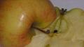
| 02/24/2005 02:24:43 PM |
sharing halvesby clictacameraComment: I don't get the sharing halves. But I do however see the separation. I feel this is a bit dull and lifeless as is .. The colors don't pop very well. and the apple is taking on a yellow tinge. maybe my mind is just swimming in the gutter but this seems to have a strong sexual conatation. If so neat.. if not...umm i don't know what im talking about.... |
| Photographer found comment helpful. |
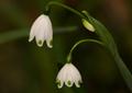
| 02/24/2005 02:21:03 PM |
Life may lead us down separate paths, but we will never be apartby luv2photoComment: hey no fair I realy want to click the 9 button. The lines are just wonderfull. But then I started to take time and enjoy the shot. Quickly realizing the entire floer in the back is out of focus. I think that this could have use d just a little more lighting to bring out more of the details. The leaf looks like it would have a beautifull curve to it. so with a little more light and better focus you had an easy 9.. as is I cant bring myself above a 7 |
| 02/24/2005 02:15:55 PM |
Petal by Petalby soupComment: Interesting and unusual. The first thing that strikes me as being off is the top leaf looks to out of focus.. It meets the challenge IMO but feels a little of. otherwise nice colors, for the most part it's crisp and in focus. There are no shadows on your nice white back ground.. not a bad shot at all.. it just doeas not move me emotionaly so i'll give you a 7. |
| Photographer found comment helpful. |
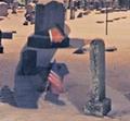
| 02/24/2005 01:47:21 PM |
Of Church And Stateby dsmboostaholicComment: A coomon theme shot from a completely original angle. I like the originality of the shot I think that it would be improved however by either dilling a hole through the god. or using a more commanly accepted black masking to censor out the word. Overall not a bad shot stands a little ahead of most. |
| 02/24/2005 01:44:02 PM |
Stress Induced.....by DrakeComment: I like the4 lighting and the details in this shot. The red hue throughout the shot works very well will the theme. I don't however care for the loose strings on the bottom of the shot. Meets the challenge and is well done. |
| Photographer found comment helpful. |
| 02/24/2005 01:42:19 PM |
Detachedby timmotykaComment: Interesting technique even if it dosn't work for me. Fits the challenge well. as for color, focus and lighting.. wel I don't like it.. but I will however acknowledge that that is just personal tast and it is obvious that this was an intentional effect.. Interesting and unusual. |
Home -
Challenges -
Community -
League -
Photos -
Cameras -
Lenses -
Learn -
Help -
Terms of Use -
Privacy -
Top ^
DPChallenge, and website content and design, Copyright © 2001-2025 Challenging Technologies, LLC.
All digital photo copyrights belong to the photographers and may not be used without permission.
Current Server Time: 08/21/2025 10:57:41 PM EDT.