DPChallenge: A Digital Photography Contest You are not logged in. (log in or register
 
Browse Settings
Currently viewing:
Registered Usertristalisk

Show comments:

Per page:

Order:

Comments:


Comments Made by tristalisk
Pages:   ... [81]
Showing 21 - 30 of ~804
Image Comment
Thinking of You
10/05/2005 08:56:37 AM
Thinking of You
by brens29

Comment:
Greetings From the Critique Club!!!

Initial Imapact: WOW awsome colors!!

Meeting The Challenge: Sure this fits the challenge but it dosn't seem to fit the title very well. As is I see this as more of a "May your future be brighter" or "Good luck on the road ahead" type card. "Thinking of you" is a very personal message but the photo dosn't represent a personal feeling to me. It has more of a spiritual feel to it. Perhaps if there was a peson walking down this road it would lend towards the personal by giving feelings of thinking while walking, separation or being alone.

Color: Spectacular colors! Dead on perfect in this area. I couldn't ask for more.

Focus:While not spot on perfect there is enough detail that I don't seem to mind. I feel it even gives the photo a slight surreal look.

Lighting: All natural not much you can do with that. But as a general rule midday sun is not the prefered lighting. If this had been shot closer to dusk or dawn you would have had warmer colors a more vibrant sky, and a bit more pleasant looking gravel road.

Composition: The composition follows the rule of thirds well, but I agree with one of the other comments about the crop. I think this shot could benifit some by cropping a bit off of the bottom. The gravel road is slightly burned out and does not add much to the photo. I think cropping this out would help a bit. I don't think you need to crop out a full third of the shot but up to or near the top of the big rocks would probably work well.

Overall: I very pleasant shot. A couple of tweeks and a title change and I think this would have done much better. I am a bit suprised at the score this did receive I would have guessed it would have done a little better around a 5.3-5.6 or so. Nice job keep up the great work.
Photographer found comment helpful.
Baby's first Portrait
09/12/2005 09:32:07 AM
Baby's first Portrait
by Photogirl_in_Vancouver

Comment:
WOOHOO! finaly a baby shot that has not been slaughtered by neat image. Wonderfully done.
Photographer found comment helpful.
Dustin
09/12/2005 09:23:37 AM
Dustin
by cloudsme

Comment:
This is a nice image. but I feel that a partait is a intamate photo. I think a closer crop would have given this more of a personal feeling.
Photographer found comment helpful.
Almost there!
09/12/2005 08:57:21 AM
Almost there!
by siggi

Comment:
Creepy.... don't know why or understand it....just creepy. ... Nicely done...I think..
Photographer found comment helpful.
Those Eyes
09/12/2005 08:56:02 AM
Those Eyes
by mystical_princess

Comment:
Absolutaly wonderfull shot. However the eyes look overshapened and the skin looks a bit waxy. Great lighting, perfect composition.
Photographer found comment helpful.
Hummingbird Portrait
09/12/2005 08:54:47 AM
Hummingbird Portrait
by TomH1000

Comment:
Motion blur in a portrait? If you had managed to stop the motion in the wngs you would have realy impressed me. This is definately the most challenging poartait to capture I have seen so far in the challenge. Best of luck with the Non-Human portait. I think the voters will eat you alive with does not fit the challenge. So I vote higher than usual to hold a fraction of the ingnorance at bay. Wonderfull work, and nicely done!!!
One moment, please
09/12/2005 08:50:07 AM
One moment, please
by mycelium

Comment:
Your DOF was a bit shallow towards the mouth this apears to be a touch OOF. This is a wonderfull image with a lot of personality. Good contrast , nice colors and a nearflawless composition. Wonderfully done!
Photographer found comment helpful.
My Boo Bear
09/12/2005 08:48:26 AM
My Boo Bear
by sacredspirit

Comment:
This looks like it was just a slight bit overworked with Neat Image. Not by much just a fraction to smooth. This is still a wonderfull image with a great background and nice lighting. Nicely done
Photographer found comment helpful.
Cymbology
09/12/2005 08:41:52 AM
Cymbology
by fellajr

Comment:
I just went browsing through my 10's to refresh my memory and what my top votes had been on. There on the top of the list is this photo. 5.6??? I thought this was a good enough shot to get one of the 32 10's I had given out since becoming a member. I must admit I never expected this one to score quite so low. Not a bad score, but I still thought this one would go a bit higher.
Dark & Light
09/08/2005 01:16:02 PM
Dark & Light
by thorgils

Comment:
Greetings from the Critique Club!!!

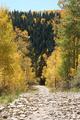
Initial impact: Hmm pretty. Not a high impact image but it does remind me of an oriental ink print or somthing of the sort.

Meeting the challenge: Sure it meets the commonly accpeted definition of the challenge. But not mine personaly. I feel that without the title that this image and most others in the challenge would have trouble holding up. So this is just a matter of personal taste. After all I felt the same about the 1st and second place shots as well.

Color: Well there realy is not much to say in this area. Other than I feel that using B&W was a great decision in this case.

Contrast: WOW!! You definately have a great start on that one. I would like to have seen whiter whites and blacker blacks. If you had managed to get the contrast and details in the leavs and trunk as well you would have had a real trophy shot with this one.

Lines: I feel that your diagonal lines work well in this shot. It gives a dull subject a bit of spice. I feel that it was also a good choice to leave the ends of the branches towards the top of the photo. This gives you a feeling of streagnth and foundation.

Composition: To some extent this follows the rule of thirds. However when you suject ecpompasses the entirty of the of the screen it is not necessary to follow the rule of three. I feel that this composition works well. You managed to completely fill the space which in a shot like this is perfect.

Lighting: Perhaps a small amount of lighting from ground level would have helped. While not necessary it might have assisted in bringing out more of the details.

Overall: Nice photo. I think that you main downfall for this was simply detail. With a little post processing work to bring out the details and tweek the contrast this 4.4 would easily have been a 5.4 or possibly better.

Best of luck in all of your future challenges

Tristalisk

Pages:   ... [81]
Showing 21 - 30 of ~804


Home - Challenges - Community - League - Photos - Cameras - Lenses - Learn - Help - Terms of Use - Privacy - Top ^
DPChallenge, and website content and design, Copyright © 2001-2025 Challenging Technologies, LLC.
All digital photo copyrights belong to the photographers and may not be used without permission.
Current Server Time: 06/18/2025 10:57:41 AM EDT.