| Image |
Comment |
| 01/22/2006 02:17:37 PM |
Untitledby welcherComment: This really cute, after I decided I liked the harsh lighting. Her eyes and the facial expression are the winners here, with some nice work composing and setting the shot up. Colours are also good, could've done slightly without the harshness, but good anyhow. 7/10 |
| 01/21/2006 04:12:26 PM |
Sunset & Glassby bacchusComment: Lovely. Got lots of nice touches, horizon is slightly off-putting. The pier and the dolphin are really good touches. 7/10 |
 Photographer found comment helpful. Photographer found comment helpful. |
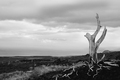
| 01/21/2006 04:10:52 PM |
Pele's Furyby The EskimoComment: Nice. Could've done with a bit more contrast, but I like the composition here. The roots are a great touch. 7/10. IMHO really does need some bolder post-processing. Good capture anyhows. |
| Photographer found comment helpful. |
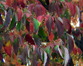
| 01/21/2006 04:08:41 PM |
Natures Colorsby dwolffComment: A little bland but nice colours, needs something extra to take it to the next level. 5/10 |
| Photographer found comment helpful. |
| 01/21/2006 04:06:08 PM |
|
| Photographer found comment helpful. |
| 01/21/2006 04:01:14 PM |
Saluting the Flagby Goofy0319Comment: Nice silhouette work, shame the flag is right near the hole in the clouds, detracts from the subject slightly. It's a shame it's a statue and not a real horseman but a decent take anyway. 6/10 |
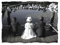
| 01/21/2006 03:55:38 PM |
Contemplationby AryellaComment: First of all I HATE BORDERS. Now that we've got that out of the way, I like this. The b/w helps, if you asked them to stand there I would have got the left hand boy to move closer to the girl and away from the post which I think would help a bit. This photo adds to my if you're going to have a look-out, why ruin the outlook file - the wires are not helpful either. Despite the negatives, I'm still going to give this 7/10 because I like the feeling you've captured here. |
| Photographer found comment helpful. |
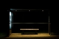
| 01/21/2006 03:45:55 PM |
king kongby visaksenComment: Very stylish. The seat is the prize winner here and the black negative space framing the photo. The poster light is helpful to the cause to as the reflection on the back window shows that there is glass there. The white stripes through the glass are a little distracting but what do you do? 8/10 |
| Photographer found comment helpful. |
| 01/21/2006 03:41:42 PM |
The Sun Sets on 2005by ChrisW123Comment: This has a nice structure to it, but the slant to the clouds, leaves me feeling like I've fallen out of the frame. An average picture that could have been much better. 5/10 |
| Photographer found comment helpful. |
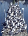
| 01/21/2006 03:38:41 PM |
Bird Dockby bs-photosComment: I like the composition here, and the colours. A little less exposed and this would have been great, as it is it's quite good. 7/10 |
| Photographer found comment helpful. |
Home -
Challenges -
Community -
League -
Photos -
Cameras -
Lenses -
Learn -
Help -
Terms of Use -
Privacy -
Top ^
DPChallenge, and website content and design, Copyright © 2001-2025 Challenging Technologies, LLC.
All digital photo copyrights belong to the photographers and may not be used without permission.
Current Server Time: 06/19/2025 04:29:39 AM EDT.