| Image |
Comment |
| 11/17/2004 07:52:19 PM |
Psionby ShadowrainComment: I don't understand what you were getting at with this photo. It is grainy distorted, and has no point |
 Photographer found comment helpful. Photographer found comment helpful. |
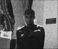
| 11/17/2004 07:51:13 PM |
Ethanby dsmboostaholicComment: Great DOF. Although the back ground is a little out of focus, I still like the shot. The lighting in the foreground leading to the darkness in the background gives it a cool affect. The boy seems a little out of focus as well, but it isn't noticed easily because you cannot see his face or parts that would be noticebly blurry. |
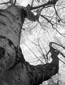
| 11/17/2004 07:48:50 PM |
Reach for the Skyby maknbaconComment: The tree is a little out of focus, and with the plain sky above, theres nothing that really stands out in the picture. I do think that the moss on the tree is cool |
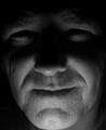
| 11/17/2004 07:46:29 PM |
Dark Portraitby ColeyComment: Although it is pretty dark, the facial features are still visible. 7. |
| Photographer found comment helpful. |
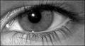
| 11/17/2004 07:44:49 PM |
My Eyeby Digital GrizzlyComment: The glare on the eye is a little distracting. Itys a little out of focus. |
| Photographer found comment helpful. |
| 11/17/2004 07:42:20 PM |
|
| Photographer found comment helpful. |
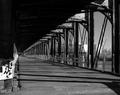
| 11/17/2004 07:38:24 PM |
Condemned Bridgeby genghisComment: Nice angle. I like the view going down the right side with the beams. If the shadows were more visible it would look nice. 8. |
| Photographer found comment helpful. |
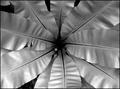
| 11/17/2004 07:34:59 PM |
Stargateby insaneComment: I like the odd lighting, how the light source is coming from underneath. My only criticism is that i wish the center wasn't as dark so you could see more of what it is. |
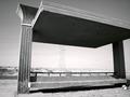
| 11/17/2004 07:33:23 PM |
Waiting In Vainby poweronoComment: The background looks like its blown out from the light. I don't particularly enjoy the odd angle with the right corner cut off. |
| Photographer found comment helpful. |
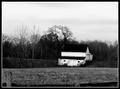
| 11/17/2004 07:32:09 PM |
Old Barnby JeileenComment: This si somewhat of a plain picture. If more of the fence was seen, It would look like a deep DOF picture. Maybe if there was more to see closer, it would give the viewer more to look at |
| Photographer found comment helpful. |
Home -
Challenges -
Community -
League -
Photos -
Cameras -
Lenses -
Learn -
Help -
Terms of Use -
Privacy -
Top ^
DPChallenge, and website content and design, Copyright © 2001-2025 Challenging Technologies, LLC.
All digital photo copyrights belong to the photographers and may not be used without permission.
Current Server Time: 08/02/2025 07:02:04 AM EDT.