| Image |
Comment |
| 07/04/2004 08:32:33 PM |
Tessby sixmacsComment: Lighting: Lighting is well balanced, but the lack of a catchlight leaves the right eye looking flat.
Pose: The pose is fine, but the extreme smile has caused some unflattering lines.
Background: Is a bit cluttered, but not overly so. |
 Photographer found comment helpful. Photographer found comment helpful. |
| 07/04/2004 08:28:08 PM |
Safari Samby JackoComment: Lighting: Just shy of perfect -- the back of the chair got a bit too hot.
Pose: the only thing I would change is the creasing of the shirt, but little ones being what they are that really can not be helped.
Background: seamless and perfect slight gradient. |
| Photographer found comment helpful. |
| 07/04/2004 08:25:01 PM |
Someday.....by geewhyComment: Lighting: The lighting is nearly perfect, just a tad bit brighter than I would have liked on the left.
Pose: works well.
Background: very well chosen for the subject and mood. |
| Photographer found comment helpful. |
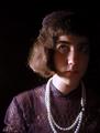
| 07/04/2004 08:23:32 PM |
Margaretby melismaticaComment: Lighting: Needs a reflector to bounce light back onto the left side of the face and hair. The catchlight in her right eye is fine, but she needs on in her left. The light on her neck is a bit hot.
Pose: The pose is fine, but if her head was turned a bit to the right, the light would be able to fall more uniformly on the left side of her face and would not create the heavy shadows under her hair on her right.
Background: The black works well, but would prefer more separation between her and the background. |
| 07/04/2004 08:19:44 PM |
Tamaraby PhilosComment: Lighting: Fine, except for the eyes. With eyes that dark I would prefer more of a catchlight.
Pose: Nothing more to say than that it works.
Background: The pattern on the right is distracting. Her hair is the main background, so a tighter crop would have worked better I think. |
| Photographer found comment helpful. |
| 07/04/2004 08:15:38 PM |
Bill & Kimby TooCoolComment: Lighting: The lighting is well balanced, but without a catchlight their eyes are not as expressive as the rest of their face. The top of her hair seems a bit hot.
Pose: Works, although her expression could be a bit better.
Background: is fine, except for the blown out sky. |
| Photographer found comment helpful. |
| 07/04/2004 08:04:10 PM |
flirtaceous. by theodor38Comment: Lighting: The softbox is really working well for you, although I would have liked to see more light in the left eye.
Pose: You have as much fun in front of the camera as you do behind it, and it shows.
Background: The white works well. |
| Photographer found comment helpful. |
| 07/04/2004 07:57:53 PM |
Bella Fioreby scalvertComment: Lighting: Good light from the right, but needs more from the left to balance and get rid of the dark shadows (particularly in the eyes and rose. The eyes are too dark without a catchlight.
Pose: Very cute pose, but she is leaning a bit too far forward for it to work I think. Cropping the chair just slightly forms lines that draw the eye out of the scene. In fact, I think it would be better with a much closer crop from all sides except the top.
Background: The background is distracting, particularly the molding running through her head. |
| Photographer found comment helpful. |
| 07/04/2004 07:50:05 PM |
Contemplationby waterliliesComment: Lighting: Low light, low contrast. More light is needed, as well as a reflector or something to get rid of the shadows making bags under her eyes.
Pose: Very nice pose.
Background: Works well. |
| Photographer found comment helpful. |
| 07/04/2004 07:24:44 PM |
Photographers portraitby birgirComment: Lighting: Needs a reflector on his left and a catchlight in his eyes so they are not lost in the shadows.
Pose: The pose is fine, but look into alternate expressions and posture. The tilt does nothing for me and cropping off his knee is not good.
Background: The shade works well, but including the supports of the tent greatly detract from the portrait, particularly where the bar cuts through his head. |
| Photographer found comment helpful. |
Home -
Challenges -
Community -
League -
Photos -
Cameras -
Lenses -
Learn -
Help -
Terms of Use -
Privacy -
Top ^
DPChallenge, and website content and design, Copyright © 2001-2025 Challenging Technologies, LLC.
All digital photo copyrights belong to the photographers and may not be used without permission.
Current Server Time: 08/04/2025 05:11:27 AM EDT.