| Image |
Comment |
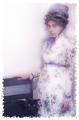
| 07/04/2004 09:24:27 PM |
1860's in technicolorby ladpupmoeComment: Lighting: The lighting if generally fine, but the dress appears a bit hot in places. The soft focus is over-done I think.
Pose: too stiff and rigid.
Background: Works. I don' t normally pay any more attention to a border than I do titles, but this one does not work for me. |
 Photographer found comment helpful. Photographer found comment helpful. |
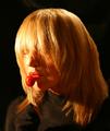
| 07/04/2004 09:06:20 PM |
I can hear musicby RUEDISCHMUTZComment: Lighting: is too dark on the left and hot on the left, both loosing detail; but the catchlights really add the the expression.
Pose: The pose is great
Background: cluttered. |
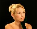
| 07/04/2004 09:01:42 PM |
Mayor of Dogvilleby ellamayComment: Not a person, but:
Lighting: Needs a reflector bouncing light up to the lower portions of the face to get rid of the harsh shadows (or at least reduse them enough to restore detail). The eyes are dark and unexpressive; a catchlight would have helped greatly.
Pose: works well.
Background: fine. |
| Photographer found comment helpful. |
| 07/04/2004 08:59:40 PM |
MyTootsieby neilmwilsonComment: Lighting: A reflector is needed to bounce light onto the left side of the face, and it really needed to have been toned down as there are hot spots in the hair and on the nose.
Pose: The pose is not very expressive. The DOF is too shallow as the right shoulder is OOF.
Background: Works fine. |
| Photographer found comment helpful. |
| 07/04/2004 08:57:09 PM |
All Aboardby pumaComment: Lighting: The lighting on the face is good even if a little dark, but there are many hot spots elsewhere in the image.
Pose: her pose is ok, but the glasses have got to go.
Background: Cluttered and distracting. A shallower DOF would have provided the hint of the train without it overpowering her. |
| 07/04/2004 08:54:12 PM |
Glowingby lizzyc3Comment: Lighting: The 'glow' is overexposure. This really needed a reflector on the right to clear up most of the shadows. A catchlight in her eyes would have allowed them to be more expressive.
Pose: The arm crossing her chest pulls the eye down with nothing to pull it back up to her face, which I would have liked to see with a different expression. Also, you choose a rather tight DOF for this shot, and then focused on the top of her blouse instead of her face. This resulted in most of the image being OOF.
Background: The white works well. |
| Photographer found comment helpful. |
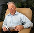
| 07/04/2004 08:49:22 PM |
Great Grandpa,Chuck and his story book.by camelotnorthComment: Lighting: The lighting is nearly perfect.
Pose: With the left elbow sticking out the lines draw the eye away from him. Taking the photo from his right instead of his left would have taken care of this. Also, on a minor note, the eyes are the most expressive part of the face, having him look down is fine within the context of the rest of the image but cutting his eyes in half with the rim of his glasses is distracting.
Background: The leaves are bit distracting, but not overly so. |
| Photographer found comment helpful. |
| 07/04/2004 08:44:37 PM |
Pleasant thoughtsby awpollardComment: Lighting: Well done, with perfectly expressive catchlights.
Pose: The pose is well done, but I think tilting her head toward the camera and then moving the camera up to just above eye level would have been more expressive without the foreshortening.
Background: The solid black is well done, but a lighter color would have conveyed 'pleasant' more clearly. |
| Photographer found comment helpful. |
| 07/04/2004 08:40:16 PM |
All American Pug, He thinks he's human!by hallswelComment: Sorry, not a person, but:
Lighting: Well lit, with expressive catchlights.
Pose: "I'm going to bite you leg off if you do not give my master a good score." ;)
Background: The background is too cluttered. I realize it was the intention, but it draws too much attention away from the model of the portrait. |
| 07/04/2004 08:38:33 PM |
My Love...by toddheadComment: Lighting: The lighting is great.
Pose: The pose works well, but I don't care for her expression. I can not tell if it was intentional, but I am guessing not, but the focus at the back of her hair is getting a bit soft.
Background: The smooth black is well done. |
| Photographer found comment helpful. |
Home -
Challenges -
Community -
League -
Photos -
Cameras -
Lenses -
Learn -
Help -
Terms of Use -
Privacy -
Top ^
DPChallenge, and website content and design, Copyright © 2001-2025 Challenging Technologies, LLC.
All digital photo copyrights belong to the photographers and may not be used without permission.
Current Server Time: 08/04/2025 08:45:36 PM EDT.