| Image |
Comment |
| 03/22/2004 10:58:44 AM |
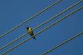
Bird on wireby rameviComment: great composition, great color. i'd love to see more detail on the bird. |
 Photographer found comment helpful. Photographer found comment helpful. |
| 03/22/2004 10:56:28 AM |
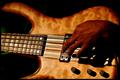
Playing on linesby pitsamanComment: nice lighting and focus. i like the idea, but i'd like to see more of the arm that goes with this hand. it doesn't seem quite attached to anything, and the dark shadows add to that effect. |
| Photographer found comment helpful. |
| 03/22/2004 10:54:55 AM |
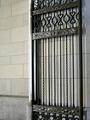
Gateby cmangisComment: simple and effective. it's pretty, though for me it lacks a real focus. i like the symmetry. |
| Photographer found comment helpful. |
| 03/22/2004 10:52:49 AM |
Parallel Stringsby MattBL34Comment: good idea. the lines draw me right into the image. there's a bit too much blur at the bottom of the frame which i find distracting, though. |
| Photographer found comment helpful. |
| 03/22/2004 10:51:25 AM |
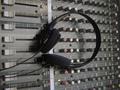
Visual Audioby christie3Comment: good angle. the focus is a little soft. i'd like to see the white dials at the right side line up with the righthand edge of the frame. |
| Photographer found comment helpful. |
| 03/22/2004 10:49:26 AM |
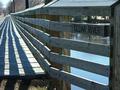
Simply Straightby fredluvsHimComment: nice work. some changes to the cropping might improve this a little. i'd like to se a little more visible on the left and top, and perhaps a little less of the grass and dirt at the bottom. still, i like this. the lines work well to pull me in. |
| Photographer found comment helpful. |
| 03/22/2004 10:44:43 AM |
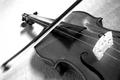
Violinby kaenmeyComment: great composition. i like the focus, and the exposure at the top left. well-balanced. |
| 03/22/2004 10:43:40 AM |
natural orderby lakritstrollComment: this is a unique idea for this challenge. i like the use of color on this a lot. something in the composition isn't quite working for me, though i can't pin down what it is. |
| Photographer found comment helpful. |
| 03/22/2004 10:41:54 AM |
Freedom of Expressionby qazwixComment: i like the use of the lines and the angle this was shot at. i would have left a bit more room around the fingers on her hand. also, aesthetically, i think if the model had been looking to the right rather than directly at the camera, this would have worked better. |
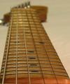
| 03/22/2004 10:39:25 AM |
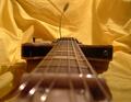
squier's neckby scalesComment: i like the idea of this, but the image itself just isn't working for me. the depth of field feels too shallow. also, the cropping feels off balance; it's centered at the bottom of the image, but the top has all of that negative space at the right. |
| Photographer found comment helpful. |
Home -
Challenges -
Community -
League -
Photos -
Cameras -
Lenses -
Learn -
Help -
Terms of Use -
Privacy -
Top ^
DPChallenge, and website content and design, Copyright © 2001-2025 Challenging Technologies, LLC.
All digital photo copyrights belong to the photographers and may not be used without permission.
Current Server Time: 08/02/2025 10:55:11 PM EDT.