| Image |
Comment |
| 05/14/2004 09:28:17 AM |
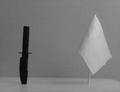
Deadly Oppositesby rigelComment: The elements in this photo look blurry. There is too much gray/white in this photo for my taste- it makes everything look dull. |
| 05/14/2004 09:26:37 AM |
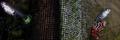
She and Heby greslizzzComment: This photo suffers from blurriness. The background is also not very photogenic. The framing of the composition puts the two interesting elements at opposite ends of the frame and has them seperated by more of that uninteresting background. This makes it difficult for me to view the photo as a whole- it almost seems like two photos side by side (is this a double exposure?) I can see what you were trying to do in terms of opposites, but I think the execution could be better. |
 Photographer found comment helpful. Photographer found comment helpful. |
| 05/14/2004 09:18:23 AM |
Flowers VS Fruitby KrisComment: I don't get what is opposite about the elements in this photo. The still life of the fruit looks very nice, but the out of focus flowers really detract from this image. If the flowers are an important element in the photo (as I suspect from the title) I would prefer to see them in focus and more than 1/4 of the way into the frame. As it is right now, it feels very unbalanced- the eye is drawn all the way to the left of the photo and out of the frame. |
| 05/14/2004 09:12:31 AM |
a beach dinnerby xburnerxComment: I don't particularly care for the overexposure or blown out highlights on this photo. I also don't get what is opposite. |
| 05/14/2004 09:06:18 AM |
|
| 05/12/2004 01:51:17 PM |
Go and Stopby willtataComment: To me this looks like a plain old shot of a sign. There is nothing that stands out or makes it interesting. |
| 05/12/2004 01:49:42 PM |
|
| Photographer found comment helpful. |
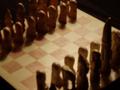
| 05/12/2004 01:47:19 PM |
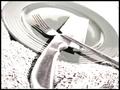
chessmenby MorbidAngelComment: Out of focus. The lighting seems to be coming from a bad angle to show the detail of the pieces. |
| 05/12/2004 01:46:23 PM |
Predictableby JtepesComment: This looks out of focus and isn't all that interesting to me. |
| 05/12/2004 01:45:21 PM |
|
| Photographer found comment helpful. |
Home -
Challenges -
Community -
League -
Photos -
Cameras -
Lenses -
Learn -
Help -
Terms of Use -
Privacy -
Top ^
DPChallenge, and website content and design, Copyright © 2001-2025 Challenging Technologies, LLC.
All digital photo copyrights belong to the photographers and may not be used without permission.
Current Server Time: 08/18/2025 04:17:18 AM EDT.