| Image |
Comment |
| 05/14/2004 10:03:07 AM |
My opposing friendsby novetanComment: This picture isn't very interesting to me. I see some dull colored rocks and poorly defined shadows. Much of the rock in this picture looks overexposed and washed out. |
| 05/14/2004 09:58:57 AM |
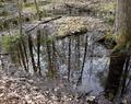
Otherworldby KaDiComment: I don't find this picture to be particulary interesting. It feels very busy with lots of different elements vying for your attention. I like the focus and depth of field. |
 Photographer found comment helpful. Photographer found comment helpful. |
| 05/14/2004 09:57:04 AM |
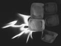
The Gameby MrZedComment: The colors look very subdued and unnatural in this picture. If this was done in PS, I don't particulary care for the effect. If it came from the camera, you may want to re-evaluate the use of backlighting for this shot. The reflections on the floor distract from the main subject. A table cloth or sheet or something under the chess set might have removed or at least softened these reflections. |
| Photographer found comment helpful. |
| 05/14/2004 09:48:44 AM |
sublimationby DoylieComment: I don't find this image very appealing. The colors are dull, like the photo was overexposed or brightened too much. The focus looks a little soft. Overall the subject is boring too. There is nothing that makes you go "wow". |
| 05/14/2004 09:44:13 AM |
Fire and Iceby JukomoxComment: The ice looks out of focus and is awfully dark. It doesn't stand out from the background at all. The fire is interesting and by itself might make a good photo, but this combination is pretty dull. |
| Photographer found comment helpful. |
| 05/14/2004 09:42:18 AM |
Left & Right in Black & Whiteby GeneralEComment: Nice deep blacks and contrast. That is about all this photo has going for it. Maybe there is some personal sentiment in it for you, but it's lost on me. |
| Photographer found comment helpful. |
| 05/14/2004 09:40:28 AM |
oppositeheadersby rrp1Comment: I don't know that I buy the Opposites in this photo. It looks like it could have benefitted from a faster shutter speed- everything looks a tad blurry. The background detracts from this image a bit. A tighter zoom and larger aperature might have helped blur out the background and direct focus towards the photo. |
| 05/14/2004 09:36:44 AM |
Fire/Waterby borisonComment: I don't particularly care for the candle being out of focus and only a small point of the foreground being in focus. The cropping seems too wide for this particular photo. The interesting elements are arranged front to back and having such a wide field of view leaves a lot of uninteresting area on the left hand side. I like the candle reflections in the water drops. |
| 05/14/2004 09:33:45 AM |
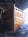
Ready for launchingby skalman69Comment: I don't get what is opposite here- light and dark? The bright (overexposed) light at the right draws the eye away from the subject and pulls the eye out of the frame leaving the entire left side of the photograph dark and unnoticed. There is nothing of interest for the eye on the left. |
| 05/14/2004 09:30:29 AM |
Fire and Iceby indianzfanComment: Interesting shot, though it appears to me that the ice has been relegated to the background and isn't palying as much a role in the photo as the title indicates. Having some additional light on the ice might help it stand out more. |
Home -
Challenges -
Community -
League -
Photos -
Cameras -
Lenses -
Learn -
Help -
Terms of Use -
Privacy -
Top ^
DPChallenge, and website content and design, Copyright © 2001-2025 Challenging Technologies, LLC.
All digital photo copyrights belong to the photographers and may not be used without permission.
Current Server Time: 08/18/2025 12:36:33 AM EDT.