| Image |
Comment |
| 10/17/2005 05:55:58 PM |
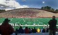
Homecomingby RiderGalComment: I like the framing of this shot with the two spectators in the foreground. |
 Photographer found comment helpful. Photographer found comment helpful. |
| 12/19/2004 11:25:54 AM |
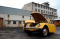
Wind + Pole = Beetle ÷ 2by helgihelgiComment: I'm not buying the wind aspect of this photo, but it is a very nice shot. The color and background framing the image are very nice. I like the low angle from which this was taken. |
| 12/19/2004 11:20:34 AM |
Good windby StagoleeComment: Very cool! This looks like an Australian class skiff race. Very good light, and I like the background. With the crew hiked out that you really get the impression of strong wind. |
| Photographer found comment helpful. |
| 12/19/2004 10:57:16 AM |
My Fanby docpjvComment: Very interesting composition. In my opinion, this shot would be strengthened by some more dynamic lighting. Right now the lighting is kind of flat and pale- like it was lit with an overhead flourescent light and a weak flash for front lighting. Some ideas that I might try to add some lighting interest to the shot are adding a warm side light aimed at the model but avoiding the fan to increase the dynamic range difference between her face and the fan. Alternatively adding a backlight aimed at the fan might give the same result but in a different way.
Nice job with the framing of this shot. I think it is a very strong composition. Good luck. |
| Photographer found comment helpful. |
| 12/19/2004 10:42:38 AM |
Windby cthotaComment: This is an interesting image, but the white balance looks off to me. If this shot was lit with tungsten lights, try setting the white balance to tungsten and take a look at the results. It should render the pages white instead of the pale yellow they are now. If the yellow was intentional, then ignore my comment! |
| Photographer found comment helpful. |
| 12/19/2004 10:37:43 AM |
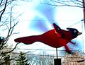
Up, Up and Awayby gedisaComment: This image looks like it had a heavy editing hand- like the contrast and birghtness were cranked up too much. I think this shot could be greatly improved by shooting with a different background. The blown out sky and multiple telephone lines cris-crossing the image greatly detract from the photo. A more shallow depth of field might also help, but you might not be able to achieve it and still get the motion blur in the wings (depending on your equipment). Using your flash for some fill lighting might help expose the bird properly without making the sky as overexposed. These are just some techniques that in my opinion might help improve this image. |
| Photographer found comment helpful. |
| 12/19/2004 12:48:07 AM |
"Flames" in the windby birdyblueComment: Excellent! Very nice lighting. It looks like some of the areas of hair have been oversaturated and lost some detail, but I don't think it detracts from the image much. This is one of my top picks for this challenge. |
| Photographer found comment helpful. |
| 12/19/2004 12:28:10 AM |
breeze anyone?by PhobosComment: Very nice! My only complaint is that the white highlights at the left are a bit too bright and distracting. Other than that, I like it. |
| Photographer found comment helpful. |
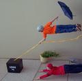
| 12/17/2004 11:17:22 PM |
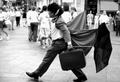
Windy Day Fun by FirstyComment: Incredible! I almost believe the wind is doing this. Is this really a wall that looks like a floor??? |
| Photographer found comment helpful. |
| 12/17/2004 11:05:30 PM |
|
| Photographer found comment helpful. |
Home -
Challenges -
Community -
League -
Photos -
Cameras -
Lenses -
Learn -
Help -
Terms of Use -
Privacy -
Top ^
DPChallenge, and website content and design, Copyright © 2001-2025 Challenging Technologies, LLC.
All digital photo copyrights belong to the photographers and may not be used without permission.
Current Server Time: 08/18/2025 01:43:59 PM EDT.