| Image |
Comment |
| 08/19/2002 02:17:00 AM |
|
| 08/19/2002 02:45:00 AM |
|
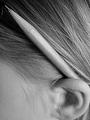
| 08/19/2002 02:31:00 AM |
Pencilby mscott821Comment: There's a pencil in there somehow! I enjoyed this shot. 8 |
| 08/26/2002 08:32:00 PM |
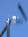
mechanical free fallby cq107Comment: Sorry cq107. I really wanted to empathize with you. You sounded so disappointed with your average. So, you tried something new, and people didn't respond well -- isn't that part of the learning process? Not trying to preach. I know how it is to be disappointed with your placement. But you said in the chatroom that you're discouraged from doing anything creative or different in the future - I hope it's not true. |
| 08/19/2002 02:03:00 AM |
mechanical free fallby cq107Comment: It's obvious the blur is intentional. What it intends to do is not quite clear to me. Excuse the pun. I'm afraid I can't muster more than a 3. |
| 08/19/2002 01:46:00 AM |
|
| 08/19/2002 03:21:00 AM |
Storageby MrsKroComment: Very nice. I like the title; I like the texture of her hair; I like the soft coloring. 8 |
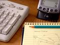
| 08/19/2002 02:51:00 AM |
#2 FLOWERby RedRuthannComment: UPDATED COMMENT: In reviewing my scores, I found this photo fit in better with those I scored a seven than the ones I scored a six. I have adjusted your score accordingly. I wonder whether the softness in the background is intentional -- it adds to the soft, flowery feel of the photo. Still, it leaved me wondering what it would look like with wider depth of field. Perhaps youll post outtakes...? Also, I really should comment on your originality. Quite clever. 7 ORIGINAL COMMENT wow, an artist on multiple fronts... 6 |
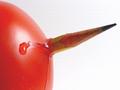
| 08/25/2002 10:27:00 PM |
dry with two olives pleaseby TerryGeeComment: This is another of the photos that I am changing my score on at the last moment. I like the definition of the light on the rim of the glass and I particularly liked the hues created in the martini and on the submerged pencil. The framing is quite nice too. There's one little blip of light on the right of the glass that seems too bright (nitpick). Also, the olives are essential to the photo, but their color clashes with the bright yellow of the pencil and the hues in the water. Don't know what you could have done to alleviate that except maybe experiment with different pencil colors. If it came down to it and that was going to cost you the hues in the water, I would live with the clash of the olives against the yellow. 6 (I wish I could use .5 in my score.) :-) |
| 08/19/2002 02:01:00 AM |
Frustrationby annelizabethComment: I like the composition of the shot a lot. It wants to be one of my favorites of the week, but these's so much light in the center compared with relative darkness now by the pencil. At first I wanted to say boost the contrast, but that would only darken the pencil and lighten the paper. Perhaps shifting the lighting a bit. Still, 8 for now and I'll have to look again during the week. |
Home -
Challenges -
Community -
League -
Photos -
Cameras -
Lenses -
Learn -
Help -
Terms of Use -
Privacy -
Top ^
DPChallenge, and website content and design, Copyright © 2001-2025 Challenging Technologies, LLC.
All digital photo copyrights belong to the photographers and may not be used without permission.
Current Server Time: 07/31/2025 08:36:13 AM EDT.