| Image |
Comment |
| 11/17/2005 02:54:24 PM |
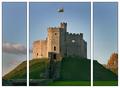
Cardiff Castleby postoakinversionComment: i personally think this image could have been stronger if the castle was off to the side and more of the landscape filled the space.
Of course there might not be anything of any interest of to the side?
Anyway, it's a good quality image.
well taken. |
 Photographer found comment helpful. Photographer found comment helpful. |
| 11/17/2005 02:50:41 PM |
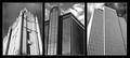
Downtownby justin_hewlettComment: nice lines and black and white usage.
Angles and perspective are very good also. |
| Photographer found comment helpful. |
| 11/16/2005 09:09:16 AM |
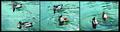
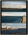
bottoms upby sevilduvarciComment: a good series of captures.
I don't like the water color though.
And the ducks seem over sharpened or neat imaged or something.
But I guess that's the price of having to fit 3 images into 640 pixels! |
| Photographer found comment helpful. |
| 11/16/2005 09:08:02 AM |
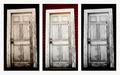
Which Door?by rexComment: it would have been nice if they all had different colored backgrounds rather than just the middle one.
But a nice looking door anyway. |
| Photographer found comment helpful. |
| 11/16/2005 09:07:07 AM |
Michelle's Husbandsby bobdaveantComment: i think he looks the best with the full beard.
I don't fancy him or anything like that!!!!!
good captures.
Nice lighting.
Good portraits.
Blah Blah Blah |
| Photographer found comment helpful. |
| 11/16/2005 09:05:44 AM |
Hamilton Pierby Moose101Comment: a good set of images.
It's a shame the sky wasn't a bit more interesting for you, but that's not your fault!!!!
I suffer from that problem all the time. |
| Photographer found comment helpful. |
| 11/16/2005 09:04:47 AM |
window watchersby saintaugustComment: I didn't like the civilian man in the last image.
But then I looked more and realized I do!!!!
Isn't that weird :-)
Anyway, a good image and (apart from the civilian) this almost has a world war II feel about it. |
| 11/16/2005 09:03:14 AM |
What's on your dresser?by lwkimagesComment: i like this apart from the right hand image.
It's definitely the weaker of the three.
there's nothing to really focus on in that picture?
too much negative space?
but a good effort. |
| Photographer found comment helpful. |
| 11/16/2005 09:01:46 AM |
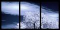
Come To My Windowby BalkoComment: the contrast in the tree color and the black borders work very well together. |
| Photographer found comment helpful. |
| 11/16/2005 08:59:13 AM |
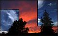
Night & Dayby BradComment: unusual and that's a good thing.
nice quality images.
well done. |
| Photographer found comment helpful. |
Home -
Challenges -
Community -
League -
Photos -
Cameras -
Lenses -
Learn -
Help -
Terms of Use -
Privacy -
Top ^
DPChallenge, and website content and design, Copyright © 2001-2025 Challenging Technologies, LLC.
All digital photo copyrights belong to the photographers and may not be used without permission.
Current Server Time: 08/25/2025 11:25:09 PM EDT.