|
|
|
Showing 641 - 650 of ~6721 |
| Image |
Comment |
| 02/23/2010 09:47:40 PM | |  Photographer found comment helpful. Photographer found comment helpful. |
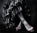
| 02/23/2010 09:45:21 PM | Stepping Outby IvoryComment: Although the shoes are understated here, this may well be best of show in terms of photo quality, subject, capture and presentation. Thanks for showing me this! | | Photographer found comment helpful. |
| 02/23/2010 09:44:07 PM | | | Photographer found comment helpful. |
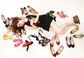
| 02/23/2010 09:43:28 PM | My Secret Shoe Affair by ekmaiComment: Well composed commercial quality photo. I can imagine it in a magazine ad, or a web ad. Well done. | | Photographer found comment helpful. |
| 02/23/2010 06:45:48 PM | Miss Molly Belleby DrakeComment: Greetings from the Critique Club
And greetings, Michigander! I used to live down the road from you in Jackson. Been to Battle Creek many times. I took a look at your portfolio and you have some stunning photos there, full of drama and fury. And you've been around enough to have amassed a terrific body of work. I hope we'll see a lot more.
Your photo made me smile! You've got a good fit for the challenge. The degree of difficulty in working with a 7 month old pup is pretty high.
But it scored in the middle of the pack. As you point out, the DOF is pretty shallow and I believe at least some voters would vote higher with greater DOF. Actually the focus is right where it ought to be, on the "headwear" and on the eyes. Deepening the DOF to include the whole hat might have inched up the score.
I like to think of photos in terms of foreground (subject) and background (everything else.) A great photographer will manage/control both. I like the black background, but there's some artifact showing through in the lower left that pulls my eye away from the subject. It would have been legal to darken the artifact so that it doesn't visually impede. Otherwise background is fine.
I am not great with artificial lighting ... so take what I'm about to say as an uninformed comment. I think if you had used some extra light, possibly behind Molly, and possibly something to bring out some highlights in her fur, she would have had greater depth and "life." I don't really know how to do it, but I've seen it done and it would have raised my score on the photo.
Otherwise, it's hard to find much to critique here.
|
| 02/23/2010 06:21:46 PM | Key to Survival in Montrealby clarmoreComment: Greetings from the Critique Club
There are things I like a lot about this ... The capture of the fur in the hood is great and fits the challenge well ... detail, focus, color, and contrast ... composition was well done ... and combined with the white background, it tricks me into believing it was shot in the wintery north. Montreal, say :)
I like the "thousand yard stare" in his eyes. That begins to tell a story. And finally, your model is a good looking guy.
But the presentation of your models face is both a little hot (over exposed) and flat (lacking defining shadow.) Perhaps a little bit of work with a Dodge and Burn layer would have helped both.
I actually think your pictured is a bit under appreciated by voters. I would have voted it higher than its average if I had voted on the challenge. Maybe it's suffering from "genre fatigue." We see quite a few photos of this same general subject and composition. While this is a good photo, voters tend to need better and better examples of a genre to score them equally highly.
I took a look at your portfolio. You have some terrific photos there. You've obviously got talent and a mastery of your camera. I hope you'll show us more of your work! | | Photographer found comment helpful. |
| 02/21/2010 08:57:44 PM | Snow, What Snow?by hokiexComment: Greetings from the Critique Club.
Until a year ago, my son lived in Richmond going to school at W&M. We've visited there and like it, mostly. But I digress. Congratulations on your first DPC entry. At this point maybe you're a little disappointed in the score. Don't be ... you should see my first entry. I hope you'll stick around, enter often, and make the most of an opportunity to get substantially better at the photography thing!
Regarding your photo, there are things I like about it: 1) Good control of depth of field; 2) Good exposure; and 3) The subject.
And there's something that bugs me: Tilt - it seems to be tilted just a bit to the right. I have found that this is a personal pet peeve and that not everyone shares it. But I think if you're going to tilt, tilt a lot, or don't tilt at all to avoid an impression of sloppiness in your capture.
Why did this get a 4.55 score instead of a 6, say? Voters here are pretty strict on the notion that a photo conform to the challenge theme. I didn't, and I think most voters didn't get the relevance to the challenge theme. If they can't more or less instantly figure out how a photo fits the challenge, they tend to vote lower. Occasionally an off-theme (shoehorn) entry will score well, but it is usually a stunning photo that succeeds in spite of the theme. Each time you enter, think hard about whether there is an obvious connection to the theme. If not, consider reshooting from a different point of view, with different lighting, a different lens perhaps ... or consider a different subject.
I'm not sure this helped at all, but at least it lets you know how I was thinking.
If you'd like to discuss this more fully, just send me a PM with specific questions. And I'd be happy to act as a mentor reviewing future challenge candidates before you enter. But only if you think it could be genuinely helpful.
Best of luck in your next, and future challenges. | | Photographer found comment helpful. |
| 02/21/2010 08:37:54 PM | Their Sacrifice.............Our Freedomby kaiser_chiefComment: Greetings from the Critique Club
It is clear from your comments that you feel an emotional connection to the photo and to the soldiers buried here. And certainly their sacrifice "counts." Thanks for remembering them in your photo.
Now to the photo. To be honest, although I didn't vote this challenge, it doesn't "appeal" to me much. Whether it appeals to me, however, is irrelevant. Technically, the photo is fine. Focus, brightness, contrast, depth of field are all good and workmanlike. The composition is fine.
But I think there are two trouble spots.
First is the subject. With the crosses, it conveys a religious connotation on first impression. When it comes to DPC, a religious connotation doesn't always score (okay, rarely scores) very well. We might not like it or even agree, but it tends to be true. What is relevant and precious about a religious statement isn't always shared by voters. And they don't always linger long enough over an image to puzzle out that you may have a different message in mind.
Second is genre. I've been around DPC for half a decade and have seen many photos that are similar to yours ... similar enough to group in a single genre. When voters see a photo in a recognizable genre, they tend to mentally compare it to the best they've seen in the genre. To succeed at generating a high score, it must be among the best of the genre. Think about water drops ... The next one better show us something new, or substantially better than the genre, or it will be judged as "yet another good water drop shot" and fall to the middle. In the case of your photo, it may be that you haven't shown the community anything they haven't seen before.
It may be this has been no help at all. It represents only my own reaction. And it's how I think about it. I apologize if I've offended, but please take it as an ernest attempt to be constructive.
BTW, I spent a few minutes in your portfolio and I wanted to tell you how much I like your precision jet images. Well done! I am an air show fan and am programmed to like them, and they don't disappoint.
Best of luck in future challenges. | | Photographer found comment helpful. |
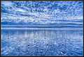
| 02/21/2010 08:15:04 PM | walks on the beachby Wildfire9Comment: Greetings from the Critique Club:
I have thought for awhile about your image. It appealed to me when I first saw it and I believe it scored below its potential. Why? In this case, it was not a particularly good fit for the challenge theme and voters tend to punish this.
Still it has a number of things to recommend it: 1) Well captured; 2) Well processed; 3) Interesting as an abstract; 4) Reasonably well composed except it might be improved by moving the horizon just up or just down so it doesn't bisect the image. You have good detail throughout the image, a testament to deep depth of field. I would like to stand where you're standing and gaze west for quite some time.The border treatment is good, and unlikely to offend the border police at DPC.
Still, the image is sterile, which is to say without life. I happen to like this, but many here would prefer that images convey an emotional payload. To me, this conveys a bit of lonesomeness, or maybe that you're comfortable with your own silence. But it's a subtle story. At DPC where many voters give each image 5 seconds, tops, it won't slow them down.
Blue! Statistically blue images tend to score well here. As an experiment, maybe try shifting the colors to red/orange/yellow. The experiment might not succeed but it would give you a few different looks at the image. Would it succeed as a golden sunset? Maybe. Would it succeed as a post apocalyptic red/orange sky? Maybe. You get the idea. By the way, this is legal in Basic Editing.
I don't know if any of this helps, but it lets you know how I think of it.
Best of luck in future challenges.
|
| 02/13/2010 02:17:03 AM | | | Photographer found comment helpful. |
|
Showing 641 - 650 of ~6721 |
Home -
Challenges -
Community -
League -
Photos -
Cameras -
Lenses -
Learn -
Help -
Terms of Use -
Privacy -
Top ^
DPChallenge, and website content and design, Copyright © 2001-2025 Challenging Technologies, LLC.
All digital photo copyrights belong to the photographers and may not be used without permission.
Current Server Time: 08/27/2025 05:54:02 PM EDT.
|