| Image |
Comment |
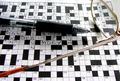
| 11/26/2004 07:30:20 PM |
16 downby biggood53Comment: Meets the challenge but to me it feels weak in composition. You've done a nice job with focus. and I tend to like shallow depth of field, although voters here seem not to. Levels could use some work. A bit greater saturation of the glasses might add a bit of pizazz. In the end, I am handicapped because I consider crossword puzzles a waste of time and I therefore don't find the subject all that interesting. I am sure there are uses for this in Stock Photos where the meaning is added through combining the photo with other content. Sorry to seem negative. |
 Photographer found comment helpful. Photographer found comment helpful. |
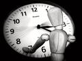
| 11/26/2004 07:23:48 PM |
Looking At The Time Go Byby DiscraftComment: There were an awful lot of ticking clocks. Woody adds a bit of whimsy to an otherwise cliched subject. Bump a couple of points for the humor. |
| Photographer found comment helpful. |
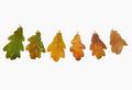
| 11/26/2004 07:22:25 PM |
Seasons come, Seasons goby eojedaaComment: Academically interesting image of a botanical process and subject but it doesn't resonate with me as an artistic photograph. Subject is weak. Focus needs improvement. White background does a nice job of showing off the subjects but is otherwise uninteresting. This has been done a lot, and the genre doesn't appeal to me, I guess. |
| Photographer found comment helpful. |
| 11/26/2004 07:18:46 PM |
|
| Photographer found comment helpful. |
| 11/26/2004 07:16:35 PM |
|
| 11/26/2004 07:14:51 PM |
Star Clockby Mary Ann MeltonComment: Clearly time is passing and it is an intellectually interesting idea, it doesn't hold my interest as a photograph. |
| Photographer found comment helpful. |
| 11/20/2004 02:03:09 PM |
thereby klementComment: The focus on this is so soft that is is essentially a B&W abstract. It seems to me this is risky on this site if you're going for votes, but I like risk takers. |
| 11/18/2004 10:47:07 PM |
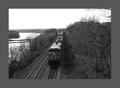
Heading Northby cdn1Comment: I would like this better if you devoted your space to the image rather than to the border. The basic image is small to start with and the wide border closes it in even further. Hard to tell but there seems to be a focus issue, too. |
| Photographer found comment helpful. |
| 11/18/2004 10:39:14 PM |
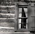
Old Panesby ejonesComment: Feels off balance to me. Too heavy on the right like it's about to fall over. |
| 11/18/2004 10:38:13 PM |
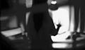
B&W Intentional Blur - Drive Homeby dugparkComment: Intentional low score. It seems to me that the blur should be there fro a reason and in this case, I can't really find it. It would be better if there was something in the frame that was sharp, IMO. |
Home -
Challenges -
Community -
League -
Photos -
Cameras -
Lenses -
Learn -
Help -
Terms of Use -
Privacy -
Top ^
DPChallenge, and website content and design, Copyright © 2001-2025 Challenging Technologies, LLC.
All digital photo copyrights belong to the photographers and may not be used without permission.
Current Server Time: 08/28/2025 02:15:39 AM EDT.