| Image |
Comment |
| 05/29/2004 03:30:41 PM |
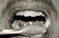
Brush Your Teeth!by mirdonamyComment: What a beautiful photo! The toothbrush is a little out of focus, otherwise for me it would have been top 3 -- then again, I guess my taste isn't the majority taste ;)
Nonetheless, it's a shame that many people think that in order for a photo to be rated highly it has to look like it would fit as a magazine ad... |
| 05/29/2004 03:17:56 PM |
|
| 05/29/2004 03:15:02 PM |
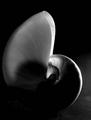
Simplicityby trainComment: Beautiful! An artfully composed image that doesn't just struggle to meet the challenge -- it is actually a beautiful artwork in and of itself |
 Photographer found comment helpful. Photographer found comment helpful. |
| 05/29/2004 03:12:27 PM |
|
| 05/25/2004 02:23:20 PM |
An Instinctual Habitby littlepitelComment: Hehehe I had the same idea...as it is, I'll give you the same vote I would have given my shot...6 for the interesting shot, but not really something that would hang in a gallery |
| Photographer found comment helpful. |
| 05/25/2004 02:22:27 PM |
Smokeby matiscroComment: This shot could be amazing -- I'd increase the contrast on the hand and cigarette more, crop it a bit closer, and make it nearly abstract...as it is, 5 |
| Photographer found comment helpful. |
| 05/25/2004 02:21:08 PM |
Good Habits Bad Habitsby ColeyComment: The idea itself is a 10 -- the only problem is that I can't imagine this hanging in a gallery or a museum. The picture alone is cute, but without the context of the contest it is a bit empty. 7 |
| Photographer found comment helpful. |
| 05/25/2004 02:18:39 PM |
|
| Photographer found comment helpful. |
| 05/25/2004 02:18:12 PM |
The Habit of The Birds - Abstractby laserComment: I like the originality of the picture, but I don't like the abstract composition itself -- it is grainy, the contrast is too high, and it's a bit too random for my taste -- i usually prefer either harmony or disharmonious paintings that are clearly so |
| 05/25/2004 02:16:45 PM |
Oops sorry!...... he he he heby aKiwiComment: Funny in the context of the contest, but the picture itself would have been more aesthetically pleasing (imho) in B&W and off center; as it is, it looks like a very nice snapshot |
| Photographer found comment helpful. |
Home -
Challenges -
Community -
League -
Photos -
Cameras -
Lenses -
Learn -
Help -
Terms of Use -
Privacy -
Top ^
DPChallenge, and website content and design, Copyright © 2001-2026 Challenging Technologies, LLC.
All digital photo copyrights belong to the photographers and may not be used without permission.
Current Server Time: 06/27/2026 08:50:16 AM EDT.