|
|
| Image |
Comment |
| 06/30/2004 06:55:59 PM | |  Photographer found comment helpful. Photographer found comment helpful. |
| 06/30/2004 06:55:16 PM | Stamensby ianepComment: Best flower photo in challenge, superb textures. |
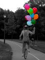
| 06/30/2004 04:44:13 AM | Balancing Balloonsby BassieComment: Greetings from the Critque Club!
Composition:
Your subject choice is excellent. The framing is compelling. Nicely done.
Lighting:
Your photo is underexposed, and that hurt your score. The details are drowned with so little contrast. Perhaps adjusting in editing could've fixed it, but most likely you just needed to let more light hit the sensor.
Techincal:
Your depth of field is a tad high, The background elements could've been softer to keep more attention on your subject. Again it's a little under-exposed. All of this could've been fixed in one simple aperture adjustment.
Post-processing:
Your editing is good. Your desaturation is great. Only complaint is the lack of contrast, just to repeat some fine-tuning in editing could've saved a reshoot.
Overall:
This is a great capture for the challenge. The biggest thing holding you back is the aperture. Using perhaps a f/4.0 would've softened the background as well as let more light in to get the proper exposure.
Excellent submission, congrats on your top10 finish. | | Photographer found comment helpful. |
| 06/30/2004 04:34:08 AM | green treesby AngelisComment: Greetings from the Critque Club!
Composition:
This is an interesting composition. Your framing is excellent. Keeping the front tree off center is very effective.
Lighting:
Your lighting is good, there is detail in the shadows and the exposure is correct.
Technical:
Your photo is technically sound.
Post-Processing:
Here is what killed your score. First of all, there is color in almost every pixel. It might be brownish etc, but it is still color. The voters were looking for greyscale specifically, as their comments mentioned. Also there are too many things colorized. This photo begs for just the front tree to be in color. All the other colorized trees only distract from your main subject.
Overall:
You got a great capture, but you didn't deliver the challenge theme in your editing to appease the voters. Next time make sure that all color is removed from the parts that aren't supposed to have any. Also had you only colored the front tree, it would've been tremendously more effective at capturing the challenge theme. Try it for yourself. I think you'll see what I mean.
Hope you do better in the future. Message edited by author 2004-06-30 04:35:42. |
| 06/30/2004 04:20:41 AM | On Dutyby pmichaudComment: Greetings from the Critque Club!
Composition:
Your subject is great! Unfortunately your framing and cropping etc don't leave much room around him. It makes the viewer wish for more room around him.
Lighting:
Your lighting is okay in this photo. There isn't much control over lighting in a spot like this, and you captured it just fine. Exposure is correct so no worries there.
Technical:
Your depth of field is a little deep. It would be nice to have gotten the background softer. Right now it's distracting, as too much is in focus.
Post-processing:
This is where your photo needs the most work. First of all you removed colors from his face and other areas of the skin. I assume this was from the process you used to desaturate. It makes him look sunburn. The policeman isn't what makes this photo. What makes the photo is the kilt. The fact that it is a policeman wearing the kilt isn't shown by the fact that only the policeman is in color. However, leaving ONLY the kilt would bring the attention to the kilt first and foremost. Also leaving only the kilt in color would've helped deter some of the background clutter going on. Your background would become the policeman himself, and would've been very effective.
Overall:
This is a great capture. You were limited in what you could do to compose the shot, but you worked with what was given you effectively. Your photo was hurt by your editing. I think your score would've been quite a bit higher had you left only the kilt in color. Try it for yourself, desaturate the rest of him and leave just the kilt. It's much more compelling.
Very nice attempt with a unique shot. A little fine-tuning of your editing skills and you'll see your scores move up. | | Photographer found comment helpful. |
| 06/30/2004 04:00:42 AM | Noodlesby kncoughlinComment: Greetings from the Critque Club!
Composition:
This is a wonderful capture. You used rule of thirds very effectively. Your subject is interesting and unique. It is also a great choice for this challenge.
Lighting:
Your lighting is obviously natural sunlight, and you caught it well, not letting it dominate your photo as could've easily and usually does happen.
Technical:
I think your photo is technically spot on. The exposure is good, allowing both detail in the shadows, and no washed out areas of the photo. Your aperture choice is great, keeping the subject in focus. There isn't much background to be distracting, so there's no need for a small depth of field to soften the details.
Post-processing:
This is where your photo got killed. You reduced hue and saturation. Everyone wanted it completely removed. Had you used the 'desaturate' option in Photoshop, you would have gotten the results the voters were looking for. Right now there is color in almost every pixel. Reducing the hue and saturation just wasn't enough. We wanted full desaturation! Small note is you might want to sharpen your photo using unsharp mask, As some commented the boy's face is a little soft, while his foot is in focus. Getting the subject sharp is important.
Overall:
I really like this photo, and wish it had done better. If you had gotten all of the color out, I think you could've easily gotten a much higher score. In your other photos you did a proper desaturation, I'm really not sure why you didn't here.
I hope next time your score reflects the quality of your photo a little better. |
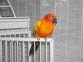
| 06/30/2004 03:45:03 AM | Simon's colorful feathersby hallswelComment: Greetings from the Critque Club!
Composition:
This is a good choice for this challenge, the colors are vibrant and lush. Your framing is very much centered, while it can work sometimes, in this case there just isn't enough going on in the photo to keep my interest. You look at it, say okay, this is a brightly colored bird, and that's it. It just leaves you hanging there. I'm not sure what would make it more interesting. Perhaps having the bird sitting on a finger instead, That would really bring out the fact that only the bird is in color. As it is, the cage and blinds are very sterile, and not very colorful. Having a colorful background will really drive the point home that only the bird is in color.
Lighting:
Your lighting is fine in the photo. The exposure is spot on and that's good.
Technical:
Your depth of field is fairly high, it could be a bit lower to soften the background, such as the window blinds.
Post-Processing:
Your desaturation technique is a little harsh, softening the transition would've helped. Right now it's bam! in your face trasition.
Overall:
The biggest problems with this photo is the fact that there's nothing there to keep your attention. Just having bright colors isn't always going to keep your viewer interested. I really think a different background etc would've helped your photo tremendously. Also using a bigger aperture would've softened your background. It has potential, but your delivery needs a little work to really cash in on that.
Good try, and I look forward to future submissions. |
| 06/30/2004 02:56:07 AM | Eyes of the Catby CantiqueComment: Greetings from the Critque Club!
Composition:
Unfortunately desaturating all but the eyes was a fairly common submission for this theme. I think that adversely affected your score. Your actual framing of the cat is nicely done however. You did a good job with rule of thirds.
Lighting:
Having photographed cats many times, I think you did a good job. While some thought the left side was too bright, I think the cat itself is a rather 'bright' cat. And there is plenty of detail to make up for the bright area.
Technical:
You did nicely here. Very sharp in focus. Good exposure. I would like to see a division between the dark spots on the cat's head, and the background (carpet?). They seem to blend together, but that isn't something very controlable.
Post-processing:
I think this is where the photo needs the most work. Your desaturation is excellent, your contrast of the eyes is nice (not sure what the original looked like). But my complaint is the back of the neck and some of the back. At 1/350s it isn't motion blur, and at f/5.6 I don't _think_ it's depth of field. I believe it's some editing you did to it. either with clone brush, burn or dodge. It just _looks_ edited, and that bothers me. If it wasn't you, my apologies, but I think you'll understand where I'm coming from.
Overall:
I think you have a great capture here. You chose a pretty popular subject (eyes) which hurt your score. The only suggestion for improvement I have is the back of the neck, it appears overly edited. If it wasn't maybe a longer depth of field would help. Otherwise, there isn't much I'd change.
Hope you do better next time. | | Photographer found comment helpful. |
| 06/30/2004 02:30:31 AM | It's about the musicby koltrane75Comment: Greetings from the Critque Club!
Compositon:
Your choice of subjects for this challenge hurt you I think. As many people said this would've been much better in a different challenge. The instruments are very small for being solely saturated. That said your framing is great. Your capture of this musical quartet is wonderful. It has a story to tell, and makes you want to know more.
Lighting:
Lighting is pretty good. The whites seem a tad on the over-exposed side, though just on the border of it.
Technical:
Perhaps a slightly smaller aperture would've blurred the background a bit better for you. As it is the stone columns look more in focus than the musicians. This is one of those photos where being forced down to 640 really hurts it. I think this would be extraordinary in it's full sized glory.
Post-processing:
Your desaturation looks good. Your subjects look a little soft. Presumably from the resizing. You might want to run unsharp mask after the final resize. You probably should've rotated the image a smidgen, as it is the steps are slightly crooked, which is slightly distracting.
Overall:
I think this would've scored much higher in a different challenge. I also think in it's full size it is probably a very unique and intriguing photo. My suggestions for improvement are rotating to get the steps straight, sharpening after resizing, and lastly while not appropriate for this challenge, I think you have a very strong completely black and white photo. In fact I think in black and white you could be talking ribbon worthy.
Excellent capture. Hope you do better next time. Message edited by author 2004-06-30 17:37:36. | | Photographer found comment helpful. |
| 06/30/2004 02:20:15 AM | Homesickby PhilosComment: Greetings from the Critque Club!
Composition:
Great job. You filled the frame nicely, your points of interest are intriguing and effective. I think you captured this challenge superbly.
Lighting:
I like the lighting you used. While it is highly contrasted, I think it helps rather than hurts in this photo. The important points are properly lighted, and that's what counts.
Technical:
I think you lost some points with voters with it appearing to be over-exposed. I think it works well for this photo though. It makes it interesting. It seems to be in focus, the photos appear soft enough to not steal too much of the attention.
Post-Processing:
I like what you did to it. It is very effective. Your desaturation was done nicely. I think many people voted lower due to the high number of objects left in color. Although, I don't think coloring just one would have the same effect. People would wonder what's so special about that specific photo, and it would detract from the theme you are presenting.
Overall:
I think you did a great job on this challenge. There is strong emotion in your photo and it speaks volumes. I like the editing you did to it, and think it helps give your photo character. About the only recommendation I have for you, would be perhaps have only 2 or 3 photos. This would satisfy all the people who thought there is too much in color.
Great first entry. I look forward to what you come up with next. | | Photographer found comment helpful. |
Home -
Challenges -
Community -
League -
Photos -
Cameras -
Lenses -
Learn -
Help -
Terms of Use -
Privacy -
Top ^
DPChallenge, and website content and design, Copyright © 2001-2025 Challenging Technologies, LLC.
All digital photo copyrights belong to the photographers and may not be used without permission.
Current Server Time: 07/31/2025 06:45:16 AM EDT.
|