| Image |
Comment |
| 10/06/2009 05:45:34 PM |
Almost straightby JMoreiraComment: Really a nice sports capture! Not too sure how well it conveys the challenge topic though, especially since he appears to be in a turn. |
 Photographer found comment helpful. Photographer found comment helpful. |
| 10/06/2009 05:44:38 PM |
|
| 10/06/2009 05:43:52 PM |
Sharpieby ben4345Comment: Good idea and concept. The layout you have chosen doesn't quite sit well with me, but that's just me. Since you are using a ruler in your image, it might all tie together better if you used a pencil or some other drafting type instrument rather than the marker (perhaps even just a thinner marker). |
| 10/06/2009 05:43:49 PM |
500 Boylston Streetby DeniseComment: Nice image overall with good lines and nice color. I'm not sure if I would have liked this more without the sky (a tighter crop on the building itself). |
| Photographer found comment helpful. |
| 10/06/2009 05:42:54 PM |
dropguitarby SandkuhlComment: Nice image... good abstract of a simple subject. The water drops add quite a bit. Bumping up. |
| 10/06/2009 05:41:51 PM |
Straight Aheadby jovan91Comment: Nice shot, great lines. Seem a bit too bright overall though it could be my monitor I suppose. I might have tried a landscape orientation on this to emphasize the lines and lose some of the upper portion of the buildings. |
| 10/06/2009 05:40:23 PM |
To The Sunby silverhawkComment: I like this idea a lot... I think it might be more effective to have the horizon sit on the upper third line rather than the center. Maybe a little more detail on the dark portion of the image (although I am not quite sure of that... it may be better without detail). |
| 10/06/2009 05:40:18 PM |
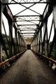
A Century Laterby pjd101Comment: Nice pattern and interesting bridge. For some reason, all the girders seem to be a bit out of focus to me. |
| Photographer found comment helpful. |
| 10/04/2009 02:35:17 PM |
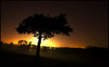
Lonely Tree Trunkby APComment: Beautiful image and excellent colors. A bit tenuous on the connection to the challenge theme though. |
| Photographer found comment helpful. |
| 10/04/2009 02:35:14 PM |
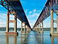
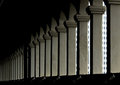
Bridge Supportsby drydocComment: Nice image and good composition. I would like to see a bit more contrast between the supports and the darker portions of the image. I really like the negative space in the upper left of the image but not sure I can say the same about the bottom of the image. |
| Photographer found comment helpful. |
Home -
Challenges -
Community -
League -
Photos -
Cameras -
Lenses -
Learn -
Help -
Terms of Use -
Privacy -
Top ^
DPChallenge, and website content and design, Copyright © 2001-2025 Challenging Technologies, LLC.
All digital photo copyrights belong to the photographers and may not be used without permission.
Current Server Time: 08/01/2025 04:17:53 PM EDT.