| Image |
Comment |
| 02/26/2004 09:18:54 AM |
Battle of Waterlooby redmoonComment: I had to study this picture a bit to understand the title. The post being right in the center of the picture detracts from the crush of folks trying to get on the train. |
 Photographer found comment helpful. Photographer found comment helpful. |
| 02/26/2004 09:16:22 AM |
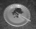
Can't Fork Thisby reagent74Comment: This photo is just plain not appealing to me in any fashion. It's not a technically bad photo, although it could be a bit brighter, and I do see the "conflict"...it's just not esthetically pleasing to my eye. |
| 02/26/2004 09:07:11 AM |
Anna Kby la magaComment: Not at all sure how this is supposed to show conflict. Not a good photo technically, either...the ribbon over the face is very distracting. The viewer has no idea of what type of balloon the ribbon is attached to; a "Happy Birthday" balloon in this setting would make all the difference in the portrayal of "conflict" |
| 02/26/2004 09:01:48 AM |
|
| Photographer found comment helpful. |
| 02/26/2004 08:59:51 AM |
|
| Photographer found comment helpful. |
| 02/26/2004 08:57:50 AM |
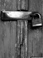
WWJD? WWYD...by jjbates4Comment: I like the concept of this picture....the cross and the lock. Just not sure exactly how it works with the topic of conflict. Could perhaps be just a bit brighter to show the details a bit better, and cropped just a little more at the bottom to get rid ofthe bottom right horizontal line. |
| 02/26/2004 08:54:21 AM |
|
| Photographer found comment helpful. |
| 02/26/2004 08:53:45 AM |
|
| Photographer found comment helpful. |
| 02/26/2004 08:50:54 AM |
Speeding Scars Encroachby ShootTechPanComment: Nice timing on this, I can see the hills as well as the lights. Could be just a little brighter / lighter, but I like the effect. |
| Photographer found comment helpful. |
| 02/26/2004 08:46:31 AM |
Just a Girlby wwfordComment: Not bad...doesn't do anything for me personally, but does reflect the topic. The lighting on the woman could be a little better. I like the choice of B/W |
| Photographer found comment helpful. |
Home -
Challenges -
Community -
League -
Photos -
Cameras -
Lenses -
Learn -
Help -
Terms of Use -
Privacy -
Top ^
DPChallenge, and website content and design, Copyright © 2001-2025 Challenging Technologies, LLC.
All digital photo copyrights belong to the photographers and may not be used without permission.
Current Server Time: 06/18/2025 04:51:29 AM EDT.