DPChallenge: A Digital Photography Contest You are not logged in. (log in or register
 
Browse Settings
Currently viewing:
Registered UserDibutil

Show comments:

Per page:

Order:

Comments:


Comments Made by Dibutil
Pages:   ... ...
Showing 151 - 160 of ~202
Image Comment
My Inspiration
02/09/2004 02:59:23 PM
My Inspiration
by goinskiing

Comment:
From critique club.

The gray silouette and the bright colored bulb make a fresh rendition of the symbol for the inspiration and idea.

I would criticize a little the geometric disposition of the figures. According to the saying: "As if the light turned on in my head..." - imagine a light bulb iside the head. Suppose your head as lantern deflector and the neck as the socket. You see? the lamp axis is aligned with the axis of the nexck! Now move the lamp out off the head along the nek's axis and place it 2 inches above the head. That would be perfect perceptual position which would not hurt the eye of the watcher :-))

Also in contrast to the blurry gray intuition and subconscious the idea is bright, distict and sharp - the edges should not be fuzzy-gray.
Photographer found comment helpful.
almost
02/09/2004 02:45:29 PM
almost
by leaf

Comment:
From critique club.

The quality of the photo is outstanding, the title and composition are ambitious enough to score high in the challenge, but somehow I did not like it when voting and I still can not persuade myself that this is better than +6... I can not formulate it yet, may be it's disturbing my spirit?
Instrument and Sound
02/09/2004 10:29:54 AM
Instrument and Sound
by Dibutil

Comment:
In fact, the reflection is falling off the polished body of the guitar and without the shadow it would not be contrast enough. I liked the fact that the shadow looks like a loudspeaker of the old days and the center of image is the ligt (sound) waves which are in focus. That is why the guitar is not sharp and not accentuated at all. My mistake is that although reflections are sharp they are not percepted correctly withthe background of blurry shadow.

Thanks everyone for comments!
Sleep tight...
02/07/2004 11:31:48 PM
Sleep tight...
by johnm

Comment:
From Critique Club.

I agree with all good words about this photo by other commenters. The lights on dolls' faces make the look alive and expressions are very intriguing. Everyone has own character and story.

The low score, however, may be explained by questionable composition. The dark spot on the top-right looks unnecessary. The center-bottom - I still can't get what is it - could be little lighter or the light could be distributed more evenly.

Overall nice, abstract and symbolic. Good idea and choice of the title.
Photographer found comment helpful.
viridis
02/06/2004 08:10:28 PM
viridis
by MJENNI

Comment:
There is no bad without good... I have lost the comment I typed in for this Critique submission and have to restore it again. But now my thoughts are better formulated.

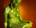
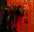
I gave this image +7 and very surprized by the overall position it got :-(

I think the author put much more subconscious artistism in this image than many people have realized.

First, the color contrast is amazing: if you negative the image the sculpture will become violet and the background - cyan. Nice complementing colors make perfectly matching antagonists when negated.

Second - the composition is very interesting. The sculpture is cropped around and does not represent point of interest by itself. In we see the background as symbolic rising sun - the figurine fills the symbol with context and does not need to be represented as a whole.

Third - the overburned hilites of the sciplture create several interesting effects. They do not accentuate the relief but look as if the sun is burning through. Also, being not bound to the characteristic shapes of the scuplture they look exactly like "painted with light"! Nice match to the challenge.

And the last but not least - the title is very good: symbolic and meaningful.

The criticism I will leave to those who dumped this picture to the 88th place...

Great work, Mark! Keep it up!
A flashy colored lighter reflection!
02/06/2004 01:41:33 PM
A flashy colored lighter reflection!
by tolovemoon

Comment:
Still, how about painting with light? The shot is made with the flashlight and the sun on the lighter body does not give the impression of light. I'd definitely like to see more details off the top of the lighter this part is lost.

The idea of mirror in the dark is quite interesting although requires a lot of effort to properly position lights and eliminate unwanted reflections. I think you need to evolve this idea, play with additional light sources and reflectors for the flash beam.
Canna flower
02/06/2004 01:29:44 PM
Canna flower
by train

Comment:
I like colors very much as well as composition - the center of interest is perfectly positioned and highlited.

Desirable is more detail in the very middle of the flower - you could try framing it at the different zooms and see which would be more distinct. I realize that 2600Z is a very limited device especially hard to use at low light.

The background could be either totally black if it's meaningful(advanced editing?) or have more recognizable light circle cast from the flower which in turn would highlite the flower and make edges glow.

Nice work and a lot of effort is seen!
Photographer found comment helpful.
The Year of the Rat
02/05/2004 07:49:50 PM
The Year of the Rat
by Sherry March

Comment:
From Critique Club.

Actually, I had to find the image of this toy on the net to compare and see what the effect has done to it. The original looks simple and dull ;-) I like the sharp geen eye and achieved expression.

Not really fond of dark feather - it better glow white, and definitely ot so wide!
"Horse people are popular."   Gung Hay Fat Choy!
02/05/2004 07:42:26 PM
"Horse people are popular." Gung Hay Fat Choy!
by sfalice

Comment:
From Critique Club.

Funny composition, I gave it +5.

The image overall has uneven light distribution and uneven gold reflection. I would like to see wider DOF but I guess it's impossible at A=16... May be the focus was set incorrectly?
Photographer found comment helpful.
Flaming Monkeys
02/05/2004 07:35:12 PM
Flaming Monkeys
by OneSweetSin

Comment:
From Critique Club.

Red, yellow and black - very chineese ;-))

The monkeys are not very sharp and I see some color patching on my monitor.

Just as an idea for exersise: retry the shot on the totally black background, so that there is no red color casting on the edges but use the additional red light to pour it a little over top. Then replace background to red in Photoshop. I think the composition will look more distinct.
Pages:   ... ...
Showing 151 - 160 of ~202


Home - Challenges - Community - League - Photos - Cameras - Lenses - Learn - Help - Terms of Use - Privacy - Top ^
DPChallenge, and website content and design, Copyright © 2001-2025 Challenging Technologies, LLC.
All digital photo copyrights belong to the photographers and may not be used without permission.
Current Server Time: 08/04/2025 07:31:00 PM EDT.