|
|
|
Showing 881 - 890 of ~1697 |
| Image |
Comment |
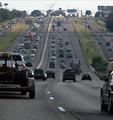
| 09/21/2005 01:10:32 PM | The 5:00pm Driver's Perspectiveby okiesisiComment: *Critique Club*
You have chosen an interesting perspective--both the point-of-view of the driver and the scene itself. The lines of the road play to the traditional "art" concept of converging lines of perspective. They show the depth of the scene well. The near symmetry of the roads offers balance to the composition. Much for the eye to travel around and visit.
The story in this photo, as I read it, is of being on the better side of the road at rush hour. I think if the truck on the left were absent the viewer would have a clearer view of the backed-up oncoming traffic...it would also lend more open space to give a stronger feel of the freedom of being on your side of the road. The near vehicle on the right contributes to the sense of being locked in as well.
The light falls on the far point of the hill. I think that helps take the eye into the distance. But once there, the sky is rather disappointing--not a huge detraction, though.
What probably hurt this most in the challenge has already been mentioned by several of your commenters--the image quality is not very strong. Grain (or noise) is fine for some subjects, but it gives this image the feel of something printed in a newspaper. I think the tonal range is also limited--again, not always a bad thing, but could the post processing have made some of those reds in the oncoming trucks "pop"? Are there undiscovered grey-tones whose detail has been lost that could make the photo richer, or more 'real'?
Normally, I'd say, "Go do it again, and try to improve your result based on the comments you find helpful..." However, I think I'd rather say, "Please drive carefully--both hands on the wheel and both eyes on the road." =)
Good luck in future challenges!
--Kadi |  Photographer found comment helpful. Photographer found comment helpful. |
| 09/21/2005 10:51:49 AM | | | Photographer found comment helpful. |
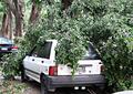
| 09/20/2005 01:44:10 PM | Typhoon Talimby eschelarComment: Since you are actively seeking comments on your entry, I'll oblige.
This feels like a snapshot to me because the composition does not seem planned. The image includes a second car and what appears to be part of the hood of another while a portion of the driver-side rear wheel is cut off. Since I have the benefit of your after-challenge photographer notes, I'll point out that even you mention it was a snapshot--something grabbed because the subject was compelling. It seems that different angle could have helped isolate the subject of your image and given the fallen limbs more prominence.
You chose to present this with bright highlights loosing some of the finer detail in the leaves and along portions of the white car. It makes it feel a little stark and perhaps a bit flat. I think there may have been more detail in the shadows as well that if a fuller range of tones were present could have made the image richer, more painterly.
It appears there could have been some serious damage to the car, but the point of view doesn't express that. The car itself is without hubcaps and has lost trim painting on the bumper--there seems to have been potential for emphasizing the lack of luck this car and its owner have had. I want the image to take me closer to the car so I can witness its character and history beter.
The title is enigmatic to me. I'm not sure if it refers to the type of car or a weather event. Overall it seems to be the kind of image one would send to their insurance company to make a claim--a document of the moment rather than an interpretation.
Again going soley on your own comments, I would suggest that you take more control of your post-processing. There are technical choices that could have been made differently. But I feel those choices are secondary to the ones you could have made on site in composing the image. | | Photographer found comment helpful. |
| 09/15/2005 07:07:25 AM | i've got a secret...by bragurComment: Love the use of the hood to frame the face. Lighting is lovely. This has a lot going for it....
....but she looks a bit sinister with no pupil showing in her right eye. | | Photographer found comment helpful. |
| 09/15/2005 07:02:15 AM | Innocenceby PatrolComment: Nice casual portrait. Wish it wasn't cropped so closely under her chin.
Eyes are odd without any hint of a iris--a little alien-feeling with those huge pupils.
Lighting is lovely. Expresion conveys the "innocence" of your title and the curiositiy of a child that age. | | Photographer found comment helpful. |
| 09/15/2005 06:54:28 AM | Just being Meby RikkiComment: Perfect expression! There's a lot of personality showing through!
Lighting is pleasing and flattering to the subject...except for the multiple lights in the eyes.
You may have been going for soft-focus here but it doesn't feel that way....perhaps the highlights on the teeth and eyes compete with the concept. | | Photographer found comment helpful. |
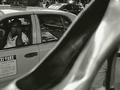
| 09/13/2005 01:26:28 PM | Stroll or cab?...she wondersby Bus352Comment: Hello from the Critique Club!
I am so happy that I drew your photo to comment on as I really wanted to leave a comment during the challenge and didn├óĆÖt!
What├óĆÖs ├óĆśright├óĆÖ:
This is so ├óĆ£New York├óĆØ! The cabby, the shoe, the moment!
The crisp, clean lines on the cab are complemented by the softness of the shoe. My eye is drawn imediately to the cabby and the direction he├óĆÖs looking. There is a beauty in the tension├óĆömy eye goes to the face and then to the shoe.
The composition demands that I think that he├óĆÖs looking at the shoe├óĆöalmost saying that if his tips were good, he├óĆÖd take one of those window items home for his ├óĆ£girl.├óĆØ There├óĆÖs ├óĆ£story├óĆØ in this image that keeps the viewer interested.
The choice of black and white helps unify the image. It ties the cab and cabby to the retail item. The ├óĆ£grain├óĆØ gives it classic appeal. The tightness of the framing holds the viewer inside the picture.
What├óĆÖs ├óĆśnot so right├óĆÖ:
I can├óĆÖt help thinking that the cabby├óĆÖs looking at me/the photographer. Is it clearly the shoe that has his attention?
Composition: The cropping helps contain the subject left to right, but the extra information in the background (the other car and the pedestrians) pulls the eye away from your two subjects, the shoe and the cabby. By cropping the top you would have avoided that and also given the image a more traditional aspect ratio, like that of a 35mm frame. However, you might have had to shoot from a higher point of view or pulled back from the shoe some to preserve the idea of the shoe since there├óĆÖs some risk of turning it into a mystery object.
Depth of Field: Because the shoe dominates the frame it creates a large, up-front object that is out of focus. I don├óĆÖt see this as ├óĆ£wrong├óĆØ but perhaps if it had been a little sharper the attraction of the cabby to the shoe may have been more convincing, the opulence of the shoe might have been more evident. It seems that the lighting would have allowed for the DOF to be brought closer as it does extend nearly to the other side of the street.
Overall I think you have a fine image that was not well rewarded by the voters. I like the rich gradation of tones and the creative perspective. The story creates interest and makes this a memorable image. It seems like the type of image that could be recreated making different choices to see what effects they could create.
--Kadi |
| 09/13/2005 01:24:49 PM | |
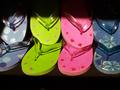
| 09/12/2005 07:15:05 PM | Flip... Flop...by o0oangeo0oComment: Hello from the Critique Club!
(I hope I do a fair job, as this is my first critique as a CC member.)
The color in your image "pops"...it's bright, cheerful, almost playful! The flip-flops create pattern by their repetition. You've isolated the subject well. It strikes me as a "well-seen" subject--it doesn't seem to be a "product shot" (something you would see in a magazine), but rather something you would notice walking past a shop window on the street.
The shadow across the top (noted by some of your commenters) draws attention. After looking a little longer, I realized that it is well balanced by the complimentary shadow at the bottom--they create a sort of framing. However, the shadow at the top does draw attention, why? It is not as symmetrical as the one at the bottom--the shelving below creates a clean line, the shadow (from the shelving above?) casts a softer edge which angles down, ever so slightly, to the right breaking balance ever so slightly.
There is also a shadow at the far left which angles down and points to the thong cut off by the frame. Because of that, the image seems incorrectly framed or cropped├óĆöit makes the shot seem off-hand and breaks the pattern set so well by the other sandals.
The light cast by the straps is interesting, it has a water-like reflective quality. The image is well exposed and evenly focused. The green color pulls the eye first and leads to the brighter, more reflective circles on the sandals at the left.
If you had full control over the situation, you could have been rigorous in arranging the flip-flops and preparing them for the shot. Things that distract include the gap between the two in the upper left which breaks the overall pattern and the rough edge of the pink one. You might have also broken out of the shadows a bit by pulling the sandals forward on the shelf letting them hang into the ├óĆ£void.├óĆØ Bringing the contrast down in post-processing could also have eliminated the brown of the shelf achieving a similar effect.
Why did you get a (perfect) five? I can├óĆÖt answer that. Maybe some voters felt you were outside of the strict ├óĆ£shoe-ness├óĆØ of the challenge. Maybe one of the things I mentioned caused them to dismiss the image quickly. Or perhaps its simplicity requires spending a little more time looking than most are willing to expend while voting. Your commenters made some good observations and then gave you an average of six├óĆöyou inspired 15 people to comment, not bad! I look forward to seeing your next challenge entry.
--Kadi Message edited by author 2005-09-12 19:20:57. |
| 09/12/2005 08:04:08 AM | Commesso di Limoncelloby tateComment: You look like you cried all night...how clear one's eyes are the day after.
Gently lit. Natural colors. Nice DOF...though a little more sharpness at the neck would keep the head connected... | | Photographer found comment helpful. |
|
Showing 881 - 890 of ~1697 |
Home -
Challenges -
Community -
League -
Photos -
Cameras -
Lenses -
Learn -
Help -
Terms of Use -
Privacy -
Top ^
DPChallenge, and website content and design, Copyright © 2001-2025 Challenging Technologies, LLC.
All digital photo copyrights belong to the photographers and may not be used without permission.
Current Server Time: 08/28/2025 10:24:17 AM EDT.
|