| Image |
Comment |
| 10/11/2005 12:41:04 PM |
Red and blue, just for youby LalliSigComment: A superb berry splash in a wine glass. I feel, however, that the reflected colors along the edges of the glass detract from the composition as a whole--perhaps a larger plain background was in order? The stem feels cut off at an odd place--something unbalanced about it too me. I'll let others help you decide if these are complementary colors... |
 Photographer found comment helpful. Photographer found comment helpful. |
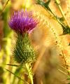
| 10/11/2005 12:38:36 PM |
Autumn In Bloomby GolferDDSComment: This image has a lovely warm glow and really feels like a field in autumn. I think that in order to really "pop" the focus on the tip of the teasle and the yellow seed head needs to be a bit crisper--the softness seems to push it toward blending with the background. There are also a few distracting elements in the composition especially around the edges, but the most egregious of these is the dard green leaves of another plant in the upper right hand corner. Overall, this has such a warm-day feeling to it that I almost want to excuse the flaws. |
| Photographer found comment helpful. |
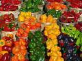
| 10/11/2005 11:40:00 AM |
Peppersby joansuzyComment: Beautiful setting. I love the way the colors are arranged and play here. Definitiely full of contrast and complements! There are a few things that detract from the success of this picture, however. It feels tilted, perhaps cropping could level it? The lighting throws harsh highligts--if you have a polarizing filter it might help pull those down a bit so the emphasis would be on the peppers. The image seems pixelated--maybe a factor of oversharpening or just having a low-resolution image to work with--but those jaggy lines draw attention. Overall, a good eye for color and form, just a little more work on the technicalities and you'd have a very pleasing image here. |
| Photographer found comment helpful. |
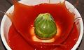
| 10/11/2005 11:34:41 AM |
The only way they'll eat them...by bertiebassetComment: The splash has interest and is a good study in timing. The background is distracting however--perhaps a larger bowl? This just seems like a great idea with an "almost" execution. Definitely has the yuck-factor you were apparently trying for, though. :) |
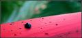
| 10/11/2005 11:32:45 AM |
Black Ladyby anthonyczajaComment: The red and green divide the photo in a pleasing way. I like the contrast of sharp and unfocused parts and it gives depth and texture to the image. The bug(?) seems to lack focus, and since it wants to be the focus of attention it would help if it were better defined. |
| Photographer found comment helpful. |
| 10/11/2005 11:30:20 AM |
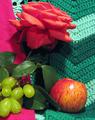
Study in reds and greensby VanGoghComment: I see the several reds and greens and thus a "reason" for a study. But the colors and composition seem haphazard and so the reason for the image disappears. |
| 10/09/2005 02:20:36 PM |
dreaming in colourby xtineComment: Pleasing composition. The dynamic of the diagonals helps provide contrast to the sleeping child. |
| Photographer found comment helpful. |
| 10/09/2005 02:19:19 PM |
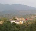
Flagby avermaaComment: Composition had potential here. The haze lends a desolate quality to the photo. Since your subject (according to the title) is the flag, I feel it should be in focus. |
| 10/09/2005 02:17:33 PM |
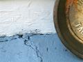
Intersectionby Dani120Comment: Interesting study in shape and line. The orange rust and the pale blue paint almost make this fit the challenge. |
| Photographer found comment helpful. |
| 10/09/2005 02:16:30 PM |
the simple thingsby irish_eyesComment: A colorful photo. Is it a good example of complementary colors? I don't think so. The orange and green crayons in the foreground could have helped satisfy the challenge topic if they were more present in the picture, perhaps. The objects and the top distract, the white to the right seems unnecessary--perhaps cropping in a bit more would have improved this composition. |
Home -
Challenges -
Community -
League -
Photos -
Cameras -
Lenses -
Learn -
Help -
Terms of Use -
Privacy -
Top ^
DPChallenge, and website content and design, Copyright © 2001-2025 Challenging Technologies, LLC.
All digital photo copyrights belong to the photographers and may not be used without permission.
Current Server Time: 08/28/2025 03:41:05 PM EDT.