|
|
|
Showing 351 - 360 of ~1697 |
| Image |
Comment |
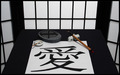
| 03/05/2007 01:54:18 PM | Love in Chineseby fas-ligandComment: Greetings from the Critique Club. The following comments are in response to your request for a critique on your challenge submission. Please feel free to send me a PM concerning my comments.
The first thing that strikes me about this image is the near perfect symmetry that frames the main subject. The repetition of lights and darks hold the theme together. I like the rhythm of lines as they repeat throughout--in the background, in the ink stone, and in the calligraphy. The composition seems carefully planned. It feels like a black and white photo in color...very controlled and interesting.
As a couple of your commenters mentioned, I too would like to see something a bit different with done with the lighting. I think, first, the white balance could be improved in post-processing to make the whites really white--they seem a bit grey and make the image feel a little dull on the whole. The greyish tones in the side panels indicate depth...but I wonder if their difference in tone doesn't hurt the graphic quality of the presentation.
I think lighting would also help define the center of interest. I'm not sure where exactly my eye should rest...I keep being drawn to the cross reflected in the puddle on the ink stone and keep wanting to explore the brush more but am drawn away. I wonder if the scene were not so evenly lit if a center of interest could be defined a bit more and if there might be a bit more energy in the image.
One of your commenters mentioned that the character does not seem like it was made with that brush and I agree. It seems slightly out of place because the scale does not appear correct for the tool. If, instead, you had made many of the characters on the paper as if a teenager were practicing...well, that would be a different image then, I suppose?
I think this image relates to the challenge "Love II" fairly well for those familiar with the character. The title really is needed for those who are not familiar with it. If the English word "Love" had been drawn on the paper instead I'm fairly sure the image would have scored lower as inconsistent with the setting. But because we are primarily looking at a word and there is nothing else here that necessarily conveys the concept of love the connection with the challenge is not as strong as it might be.
Overall, this is a wonderfully graphic image that has appeal. It would make a perfect cover for a greeting card.
Keep creating!
--Kadi |  Photographer found comment helpful. Photographer found comment helpful. |
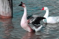
| 03/04/2007 06:00:42 PM | Back Off She's Mineby actnoutComment: Greetings from the Critique Club. The following comments are in response to your request for a critique on your challenge submission. Please feel free to send me a PM concerning my comments.
First impression, this image was taken at the right moment. The raised wings of the male and the way his eye meets the gaze of the camera convey the concept of warning an intruder. It makes me feel like I'm right there confronting this scene.
I'm drawn to the detail in the feathers on the male and the curve of his extended neck. I like the contrast between his alarmed pose and the more complacent mood of the female he protects. I like that the curves of their necks echo each other creating a rhythmn within the image.
I do find that the composition feels a little cramped. At first, I felt the post on the left really didn't belong since it somewhat stops the progress of the geese. Had the male somewhat overlapped the post it wouldn't feel like such a barrier. But, upon reflection, I find it helps to keep me in the frame sending me back to the subjects. However, the nearness of the one goose to the top of the frame of the image does cramp the view (in my opinion). I'd like to see just a bit more room at the top--either by stepping back a bit from the subject (or zooming out), composing the shot vertically, or choosing a lower angle of view. I think bringing the camera view back a little would also allow the inclusion of the female's tail which seems awkwardly chopped off by the image frame.
The lighting is clearly mid-day, a situation that causes harsh shadowing. In this case it doesn't seem to hurt the image very much but it does make it hard to retain detail in the white feathers of the female. Blowing out the highlights there causes a minor distraction.
The color in this image feels a little oversaturated. The cyan in the water creates a cold, icy feeling. At the same time the bill of the female seems unrealistically red. It appears that hue/saturation might have been increased on all colors at the same time, choosing individual color channels would provide more control to these two areas allowing you to bring up the lovely red-browns in the image while holding back the cyan in the water a bit.
Love, the subject of this challenge, certainly can involve protection. But I'd also like to see a stronger connection between the "lovers"... There is a start to connection in their similarity of poses and their proximity to each other. To me, however, love is something of a human concept. In order to relate this concept to animals, to get the viewer to anthropomorphize, it seems there needs to be something more human-like in their relation to each other....I'm not sure exactly what that would be. Perhaps more similarities, more proximity...or something else conveyed in a harmony of color or texture that would emphasize their relationship and help me empathize with their bond.
Overall, I think this is a technically good image taken at an interesting moment.
Keep shooting!
--Kadi
| | Photographer found comment helpful. |
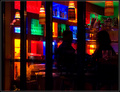
| 12/20/2006 01:11:10 PM | Shopping Spiritsby scarbrdComment: I like the patterns of color in this image. The dark mood of the bar seduces me. I wish this image delivered more in the silhouettes...were the profiles more distinctive, the heads turned a bit more toward each other, I might have felt the subjects connecting more strongly to each other and, by extension, to me as the viewer. Were I cropping this, I would have trimmed the black window frame(?) from the left so that it would balance with the open colors on the right...then cropped up a bit from the bottom as there is no real need for the extra black nor that annoying little object in the lower left.
--comment left per request in this thread. | | Photographer found comment helpful. |
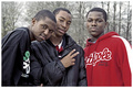
| 12/20/2006 10:08:06 AM | 3 Friendsby msdoubletroubleComment: I really like this casual portrait! The expressions are beautiful. The red of the one sweatshirt, for me, detracts from the concept of "brown" for this challenge. Perhaps if it were turned cliche with sepia toning....but then you might have lost the skin tones to it. Ah well, it's a lovely image wherever it places. :) | | Photographer found comment helpful. |
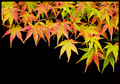
| 12/01/2006 11:26:26 AM | November Colorsby tamatamaComment: Love the use of negative space...gives it a wonderfully graphic quality. Pretty and bold! | | Photographer found comment helpful. |
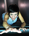
| 12/01/2006 11:25:08 AM | Climbby stare_at_the_sunComment: I like the expression in this image. I think the point of view is interesting and the lighting enhances it. Because of the lighting the right hand becomes, for me, the major feature of this image...its shape is interesting. However I feel that it is the element most in need of improvement because of the attention it draws. For me, it would be better if the hand did not so nearly merge with the edge of the image and, perhaps, a little more definition in it would be an improvement as well--a little more focus or just a little less light to help the features of the hand relate to the rest a bit more. Well done, nonetheless. | | Photographer found comment helpful. |
| 12/01/2006 09:18:02 AM | Tim Burtons Summer Homeby timfythetooComment: I like the composition and the over-all mood of this image but the lines of the tree branches appear un-smooth and have a slight halo effect against the lighter sky...perhaps it's oversharpened? | | Photographer found comment helpful. |
| 11/28/2006 04:37:47 PM | Cute little monsterby Gaby_GComment: Oooh! Somebody needs a hug!
Adorable and full of emotion! What a nice portrait of a (possibly naughty?) pup! | | Photographer found comment helpful. |
| 11/28/2006 04:36:55 PM | Rivetedby pointandshootComment: I like this! It makes me smile. The grainy quality is appealing to me. Might suggest you clone out the competing red bits on the metal wall. Otherwise, just sweet! | | Photographer found comment helpful. |
| 11/28/2006 04:35:32 PM | softlyby silverfoxxComment: Pretty tones here. I think the softness is a bit over the top, though, and the pose (rotated 90 degrees?) seems oddly unnatural. | | Photographer found comment helpful. |
|
Showing 351 - 360 of ~1697 |
Home -
Challenges -
Community -
League -
Photos -
Cameras -
Lenses -
Learn -
Help -
Terms of Use -
Privacy -
Top ^
DPChallenge, and website content and design, Copyright © 2001-2025 Challenging Technologies, LLC.
All digital photo copyrights belong to the photographers and may not be used without permission.
Current Server Time: 08/26/2025 10:14:45 AM EDT.
|