|
|
|
Showing 241 - 250 of ~1697 |
| Image |
Comment |
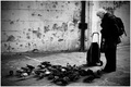
| 08/08/2007 05:05:16 PM | Pidgeon Ladyby PixelstateComment: Greetings from the Critique Club!
Just my luck...my 13th critique of the day and I draw a high-scoring, well-placed image from a two-time blue ribbon winner! Well, it's no holds barred, baby! ;)
First impression: An interesting image that makes me pause to consider the relationship of the woman to the pigeons. She's standing there passively looking at the birds on the pavement. The pavement is old and worn. The wall looks like it's been shot at by a machine gun...or just pitted by weather and neglect. Where is she?
Because the birds are contentedly milling about one can gather that they've been fed. But, to me, she doesn't seem much like a "pigeon lady"...there is a lack of interaction between her and the birds. Her posture is so disengaged with the "event" that one could think she'd just wandered out from the local train station on her way to somewhere and has paused to contemplate the urban birds. She doesn't seem particularly homeless or street bound to me...
Technically this is a fairly competent image. I like the choice of B&W but wonder if it was actually necessary...even sepia (or some other toning) could have injected some life, some drama(?) into this image. I agree with the commentators who point out the blocked blacks...I don't think the lack of detail in those areas really adds to the image. The vignetting is obvious and, though probably needed to contain the image within the frame, feels a bit over-done.
Overall, it's a good image. Had I voted in the challenge I likely would have given it a 6 (as many other voters did) because it is a clean image...there's just nothing else to raise it above average for me. More emotion! More engagement! More story or "reason to be"!
(Sorry if it seems that I'm being unduly harsh but I'd rather call it like I see it and take on argument than give you some kind of smiling nod of approval.) |  Photographer found comment helpful. Photographer found comment helpful. |
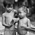
| 08/08/2007 04:30:53 PM | Brothers at the Railroadby davidus428Comment: Greetings from the Critique Club!
A lovely image! Nicely made. The tones are superb! Technically crisp and a delight to view. The toys they hold (yo-yo's?) hint at the poverty of their situation as do the clothing and lack of clothing and the bare spots on the younger child's scalp. However, without more context, without seeing their surroundings, I am not moved. After reading the other commentators, I wonder if I'm naive or callous (though I don't consider myself either of those.)
Perhaps, what I'm missing is what the image is missing...the story. Where are they? Who are they? Why should this image compel emotion in me? Outside of the challenge, I have the benefit of the photographer's comments. If this were in the media, I'd have the benefit of a caption and/or story. But the title and the image alone do not pull at my heart strings. To me, it appears to be two poor but healthy children in the moment of a sunny day. They are distracted by different concerns which I can not see. There is no apparent danger. They seem to casually wrestle with each other, the older trying to separate himself from a clingy younger child.
Overall, this is technically lovely but lacking in its descriptive quality, in my opinion.
Congratulations on a well-placed, journalistic-like portrait. | | Photographer found comment helpful. |
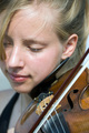
| 08/08/2007 03:59:51 PM | Tchaikovsky At The Farmers Marketby QuigleyComment: Greetings from the Critique Club!
Lovely! What a wonderful expression on her face! I first thought this was soft-focus until my eyes found the sharp focus of the bow on the strings...
When a person's face is present in an image the typical viewer tends to go there first and stay...and then, looking at the eyes, wants to follow their gaze. I think that to some extent this is where the image hangs up. Not only can't I follow her gaze her right eye is cut off, first by the lock of hair then by the framing of the image.
I like that the emphasis has been put on the drawing of the bow across the strings...it speaks of music and the listening of the musician. So, even though it's an unlikely option for an image, I'd like her ear in focus. Nothing more but the ear added to the image. It'd have to be faked...or shot with a deep DOF and the softness restored to the rest of the image. But the image seems to be about listening and the pleasure of it. So natural and content to play...not straining and concentrating or struggling with the music.
I'm amazed at the low score! I'm befuddled that anyone could mistake this lighting for anything but outdoors! However, as some of your commentators mentioned, for this challenge more street context would have helped. If the blue background were instead made of brick it might have carried the idea the voters were looking for...but who knows?
I do think that shifting the entire crop to the left--eliminating the light blue background on the right of the image and including more of her cheek on the left--would be an improvement. It feels a bit awkward as is. Perhaps slightly vignetting the right and lower edges would do nearly the same thing? Oddly, that light spot on her chest stands out after viewing the image for awhile...but that's just me being picky.
Overall, a lovely and expressive moment that leaves no question of the subject's mood. On it's own (outside of the challenge) I think this is a very successful candid portrait. I have never suggested this before but perhaps you could post this in the forums for more feedback...something like, outside of the challenge what do you think?
Thank you for presenting this image! I like it more the more I view it. Nicely seen! | | Photographer found comment helpful. |
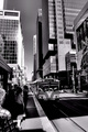
| 08/08/2007 03:39:02 PM | Dalhousie Boundby CitadelComment: Greetings from the Critique Club!
I like this photo! I'm standing on the street waiting for the train in a surreal world. I'll admit my first reaction was...ow! too much smoothness! But I prefer pinepple's considered characterization of the graphic quality of the image much better than my first impression.
I like the drama of the lines. The graphic tones and patterns they create are really quite pleasing. There are enough plain spaces to balance the patterns. Plenty to lead the eye around the photo and let the viewer explore the scene.
I least like the slicing in half of the man in the lower left. It's not that he's cut off by the frame but that 50% or less of him is showing...just feels haphazard. I do like that he along with the other people waiting provide a lead-in for the viewer, though. At the other edge of the frame the foliage has quite a dramatic contrast (maybe too much) but is also, like the man, sliced in half. On the whole, I think the composition is there but the edges of the frame are being ignored.
Overall, a fine image with impact and moment. Well seen! | | Photographer found comment helpful. |
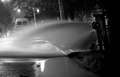
| 08/08/2007 03:13:08 PM | Urban Waterfallby RoosterComment: Greetings from the Critique Club!
I really like this shot! It reminds me of a night, quite late, some years ago when I heard a terrible gushing sound outside in the quiet suburban neighborhood where I lived. Going out to investigate rivers of water flowed down two streets toward the street drain in front of my home...the hydrants had been opened for blocks around. I went in and got my husband. We danced barefoot in the unexpected stream. Then wandered up the street to ask the workers what they were doing. "Flushing the hydrants." A stoic and unsatisfactory answer. We sloshed back dancing down the street kicking water. So...I love this shot!
The technicals are all there...great contrast, sharpness, focus, texture, light... I feel a little cheated by the cropping on the left--I'd prefer to see a bit more of the end of the stream of water there. I like the starbursts on the lights. I like the choice of B&W that eliminates the red of the cross-walk light and graffiti.
What more can I tell you? It evokes a memory. It's fun because it's unusual. It's full of textures and light and shadow. It got voted down because some people can't get beyond a general suggestion that "street photography" is only often about people and not always...but you knew that going in....
Well done! Do more! I've always liked your work. |
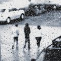
| 08/08/2007 02:56:48 PM | Three in the Rainby tonyvComment: Greetings from the Critique Club!
I love this shot! Wow! I've read the comments and agree with the majority, this works! (Okay, except for the skinny gray triangle in the lower left...but that's fixable.) So, what can I tell you? I suppose I can only express why it works so well for me.
The Impact is immediate. I know exactly who I am as a viewer...inside on a dreary day separated from the group outdoors...alone. I feel distanced from the brave or foolish souls in the street.
The focus on the water drops pulls me inside more. Creative in interpretation of the scene! I feel as if I've stared at the droplets on the window for hours waiting for the world to mutely pass by without care if it does or not.
The composition is superb! The three figures, a group but separate individuals, passing from light toward gray. The diagonal leads them along through the frame. The parked cars top and bottom define the scene. The square crop suggests an abstract piece composed by a view camera rather than a 35mm snapshot. Classic in the realm of photography rather than landscape painting.
I love the grain and the timelessness it conveys. This could have been almost any day of the past century. I don't miss the lack of perfect focus on the droplets...that would have put the emphasis too far in that one direction.
Yes. DPC needs more of these images. The world needs more of them! Whatever the motivation, this is a great reaction to the world and a wonderful conveyance of a personal vision. Moody. Lovely. Graphic. Wow! | | Photographer found comment helpful. |
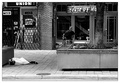
| 08/08/2007 02:39:59 PM | no nameby pearlseyesComment: Greetings from the Critique Club!
First, congratulations on getting out of your comfort zone to shoot for the challenge...way to go!
I like this image. I like having to find the subject of the person resting on the sidewalk seemingly lost in the environment. The patterns of the store grates and walk and all things man-made contrast nicely with the human form. Even the texture of the tree trunk in its planter seems fabricated and unnatural.
I agree with  jblaylockrayner jblaylockrayner that the cyclist provides a distraction. If he were absent the loneliness of the street person would be enhanced. If he were just riding through there would be contrast between the resting figure and the vitality of the cyclist. If there were many more people in the image it probably wouldn't matter as much.
I do think this is one example of when placing the primary subject away from the thirds or the center makes a stronger statement...discarded, side-lined, ignored, incidental. Had you cropped up from the bottom so that the person was cramped into the corner of the image it would only heighten that feeling.
Maybe it's just me but I don't see a problem with focus in this image. I think the technicals are very well done!
Overall, a compelling scene with a reason to be...nicely titled and sensitively portrayed. |
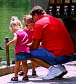
| 08/08/2007 02:22:37 PM | Lets Feed the Ducks, Dad!by dtremainComment: Greetings from the Critique Club!
Color certainly makes the loudest statement in this image. It's kind of fun to see the jarring pink and red combination. But if the color is taken away what's left? A man with two little girls doing something that isn't quite clear.
The title tells me there are ducks...but I only see bits and pieces of ducks. I think they need to be included in the image, especially because that's what the people in the image are engaged with.
The part that is in focus appears to be some sort of pier structure in the background. Attention is withdrawn from subjects that are not in focus...and especially by something as contrasty as that background structure.
You mention that you didn't care for the green water. In that case Black and White conversion might have solved the problem. Or selective desaturation. But I find the pink color cast on the pavement more "off" than green water. I think making sure that you've got your white balance correct, whether in camera with the appropriate WB mode selected when shooting or after the fact in post-processing, can improve the way an image is received.
It appears that this event would have continued for more than a fleeting moment. In that case taking more shots to capture the faces and expressions can give you more to choose from later on.
Overall, this feels like a poorly planned image. Sorry if that sounds harsh but it seems that a little more care in the taking and a bit more mastery of the equipment will improve this type of shot for you.
Keep shooting and good luck! | | Photographer found comment helpful. |
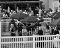
| 08/08/2007 01:52:34 PM | Party with Jerry "the Geator" Blavat in Atlantic Cityby PhillydigishooterComment: Greetings from the Critique Club!
This image is very busy! So much happening...what should I look at? Maybe it's about the women greeting each other? A glance at the title tells me that's probably not the intended subject...but where's "Jerry"?
I can appreciate the difficulty of getting a good angle to capture the subject at a busy venue like this. Nonetheless, the photographer somehow has to overcome the obstacles to capture the intended subject. I think there are several things getting in the way of your success.
Defining the subject: The people in the foreground of the image mostly have their attention on the woman in the black dress and her interaction with the other woman. Because one tends to look where other people are looking the viewer is likely to think that is the subject. Even the person I think is "Jerry" (the guy in the white cap with the microphone) is looking that way. If this is to be about Jerry then Jerry needs to be the focus of attention.
Overcoming distance: A long lens would help a lot to close in on the subject and provide the chance for a narrower depth of field in this case. Barring that, shooting to crop is another option. I'd try to wait until the subject had a plainer background behind him...the fence would be an improvement over the people seated behind him in this image. Then, the image could be tightly cropped to further define the subject.
Eliminating distractions: Though the fencing might feel like a liability I think the crowd in the background is much more distracting. In fact, cropping down from the top would put more emphasis on the repetitive pattern of the fence and the umbrellas. The repetition could be pleasing and easily would recede from the viewer's primary attention as the eye would have places to rest while exploring the remaining people. I also think that seemingly minor things like the black haired woman who appears to be distracted and is looking downward can undermine an otherwise nice moment... I shoot in burst-mode when in situations like this so I have variations to choose from...so much goes unseen at the time of the taking that shows up when viewed on screen.
Black and White is often a good choice to help simplify the surroundings but it does make pattern more prominent. I think it's good to try and think in tones when shooting for B&W and really nail the black blacks, the white whites and strive for a full range of grays...really look to bring out the details in the shady areas of black, such as the clothing of those present, to best define forms.
Overall, a good effort in difficult conditions. Most likely more meaningful to someone familiar with the celebrity, however.
Keep shooting and always remember to have fun doing it! :) | | Photographer found comment helpful. |
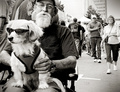
| 08/08/2007 12:47:23 PM | Bele Chereby akioeComment: Greetings from the Critique Club!
What a fun shot! The subjects of the man and dog provide an interesting topic. I like the angle--shooting from below the eye level of the seated man. The B&W conversion is nice...though I think it could have a bit more tonal range.
I think what I like about this image most is the similarities and contrasts one can draw between the man and his dog. I like that they are alike in their glasses, their shaggy beard and fur, and the repetition of design in the dog's vest, the man's shirt and his tattoo.
The background, however, is a distraction. As much as I want to keep looking at the man the two oncoming walkers demand a lot of attention. A few moments later they would have cleared the field of view. Even if it remained a crowded site, having people walking away from the camera would be better, in my opinion. Perhaps, too, a shallower depth of field would have blurred the surroundings enough to keep the attention more fully on the subjects.
Clearly "street" and sufficiently in the moment to feel candid despite the direct gaze of the man. Overall, I like this image a lot and enjoy the momentary glimpse at this interesting character.
Congratulation on a well-placed image as a new member! |
|
Showing 241 - 250 of ~1697 |
Home -
Challenges -
Community -
League -
Photos -
Cameras -
Lenses -
Learn -
Help -
Terms of Use -
Privacy -
Top ^
DPChallenge, and website content and design, Copyright © 2001-2025 Challenging Technologies, LLC.
All digital photo copyrights belong to the photographers and may not be used without permission.
Current Server Time: 08/24/2025 10:06:14 PM EDT.
|