| Image |
Comment |
| 04/28/2004 05:46:49 PM |
Cut Flowersby scottwilsonComment: Hilarious! Wish you could eliminate the red bush behind the one vase--it fights for attendtion. Perhaps a different point-of-view, if possible? Closer cropping might help the viewer see the intention. And, now that I think about it is the vase with flowers really helping here? Neat idea. |
 Photographer found comment helpful. Photographer found comment helpful. |
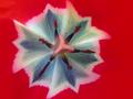
| 04/28/2004 05:41:43 PM |
Proportion by Red Tulipby prkembyComment: Intense close-up! Very nice pattern. Greater depth of field would have brought the sepa into the pattern more--don't know if it would also flatten the subject too much, though. And just to be really, really picky--the pollen flecks dirty up the image. Nice one. Luck! |
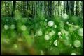
| 04/28/2004 05:38:23 PM |
life is mostly waterby ursulaComment: Nice perspective. A little more sharpness on the foreground would be my preference. The one largest circle at top left and its associated blur are bothersome to me. Rainbows seem to draw too much attention to themselves. Good idea overall. Worth a re-visit. |
| Photographer found comment helpful. |
| 04/28/2004 05:34:39 PM |
small bby beckettbootsComment: Great capture! Love the light in the bee's eye! Color seems a little pale but it doesn't really detratct that much. Graininess at the extremes doesn't feel right though. |
| Photographer found comment helpful. |
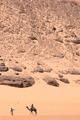
| 04/28/2004 04:47:12 PM |
Alone in the vastness of the desertby alexvoloComment: Beautiful use of proportion to place the subjects. Would be nice if the people and camel had a crisper focus--perhaps this is a remant of the distance to lens? Color is unbelievable! Very poster-like. Luck! |
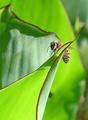
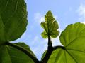
| 04/28/2004 04:44:57 PM |
Adam and Eve's Closetby autoolComment: Sweet! Lovely texture and lighting! Nice isolation of subject leaf. Good use of negative space. Luck! |
| Photographer found comment helpful. |
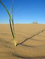
| 04/28/2004 04:43:24 PM |
The Shady Proportions of Time.by boredComment: Nice use of proportion to create importance for a small subject. The distant clump of grass adds context and emphasizes the solitary nature of the subject. Beautiful color, shadow, texture.... Luck! |
| Photographer found comment helpful. |
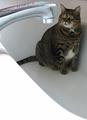
| 04/28/2004 04:23:48 PM |
Big cat in a small bathby menardmamComment: Actually, the way you've cropped this it looks more like a small (though chubby) cat in a big sink--which is really very funny! Love the expression on the cat! The whole arrangement really conveys the cat's sense of proportion concerning the threat of the tap being turned on. Unfortunate red reflection on the chrome. Otherwise, nearly perfect. Hope the cat haters don't bring you down. Luck! |
| Photographer found comment helpful. |
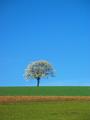
| 04/28/2004 04:09:18 PM |
Spring lonelinessby cmartosComment: Beautiful and a nice idea for the challenge. I think it would look a little more lonely cropped from the bottom and the left a bit more. Gorgeous color--simply composed--effective. |
| Photographer found comment helpful. |
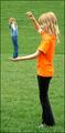
| 04/28/2004 10:04:49 AM |
|
| Photographer found comment helpful. |
Home -
Challenges -
Community -
League -
Photos -
Cameras -
Lenses -
Learn -
Help -
Terms of Use -
Privacy -
Top ^
DPChallenge, and website content and design, Copyright © 2001-2025 Challenging Technologies, LLC.
All digital photo copyrights belong to the photographers and may not be used without permission.
Current Server Time: 08/24/2025 02:05:48 PM EDT.