| Image |
Comment |
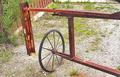
| 05/05/2004 12:42:38 PM |
Rusted Gate Wheelby TommyMoe21Comment: Interesting rusted gate. The cropping could be improved--the right hand third of the photo conveys little of interest to me. I understand the point of view was probably chosen to eliminate a distracting background but perhaps it also needs a more limited depth of field. A little oversharped? |
 Photographer found comment helpful. Photographer found comment helpful. |
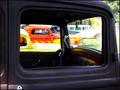
| 05/05/2004 12:38:48 PM |
Wanna Beby prettyshoes1Comment: Interesting choice of perspective and subject. The harsh lighting through the windshield detracts from the overall effect--perphaps a polarizing filter would improve this. |
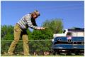
| 04/29/2004 09:55:51 AM |
Attack of the 40 Foot Womanby drgsoellComment: The background gives this forced-perspective shot away too much and has many distracting elements. The most unfortunate of these is the top of the chain-link fence cutting through your subjects. |
| Photographer found comment helpful. |
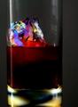
| 04/29/2004 09:49:38 AM |
The Right Proportionby MichaelsComment: That sure is strange ice! I like the rainbow effect on it but wonder why it floats so high. More backlighting might define the edges of the class. Feel that the reflected light in the base competes with the "ice". |
| Photographer found comment helpful. |
| 04/29/2004 09:47:21 AM |
"not my slice"by sevenine0Comment: The idea for proportion is alright--just not sure about the lighting. By backlighting the small piece you do make it stand out--but it's a little overly bright. The top of the pizza looks unappetizingly old, therefore not my slice either. |
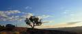
| 04/29/2004 09:44:25 AM |
Untitledby neehaiComment: Pretty sky. The car/person element and the tree compete with each other--partly because the tree stands in the way of the person's gaze. Differently composed this might have worked for me. |
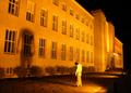
| 04/29/2004 09:37:27 AM |
Depressionby Mad-DComment: Good idea for the challenge! Somehow I think it would be better if the subject were not facing his shadow, but otherwise perfectly posed to create the effect. The skewed horizontal adds to the effect of your theme. Not crazy about the orange tone, but maybe you meant it to be disturbing. |
| Photographer found comment helpful. |
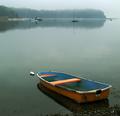
| 04/28/2004 06:33:15 PM |
Mint Julepby OlyuziComment: I love the peaceful tranquility of this photo. Good eye to capture the color on the one boat without the distraction of color occuring elsewhere. Subject is expertly placed. If there's one thing to quibble with it's the jaggy edges on the the rim of the near boat--perhaps a result of oversharpening? (I don't think it's my screen, apologies if it is.) |
| Photographer found comment helpful. |
| 04/28/2004 05:53:03 PM |
Divine Proportions ?by t_onlineComment: Really nice idea! I like the limited use of color, the contrast of natural and line forms, and the balance of the lighting. The cropping bothers me, though--I wish the tip of the middle finger and the crotch of the thumb were in the frame. Luck! |
| Photographer found comment helpful. |
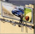
| 04/28/2004 05:50:18 PM |
Transitionsby garrywhite2Comment: This photo has a lot going on! Make one want to study it.
Odd thing happens to me when I view it--it flips in and out so that the lower left of the billboard seems to be the near corner at times. (Weird.) |
| Photographer found comment helpful. |
Home -
Challenges -
Community -
League -
Photos -
Cameras -
Lenses -
Learn -
Help -
Terms of Use -
Privacy -
Top ^
DPChallenge, and website content and design, Copyright © 2001-2025 Challenging Technologies, LLC.
All digital photo copyrights belong to the photographers and may not be used without permission.
Current Server Time: 08/24/2025 03:10:17 PM EDT.