| Image |
Comment |
| 09/20/2004 12:35:42 PM |
|
 Photographer found comment helpful. Photographer found comment helpful. |
| 09/20/2004 12:34:11 PM |
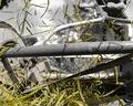
The Mowerby mrorange002Comment: Clever subject! I like the selective desaturation, but the grass seems a little too yellow. The title helped me understand the subject, I wonder if more of the wheel were showing if it would have been so necessary. Luck! |
| Photographer found comment helpful. |
| 09/20/2004 12:25:56 PM |
|
| Photographer found comment helpful. |
| 09/20/2004 12:23:26 PM |
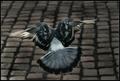
Flightby leafComment: I like the way the light catches the wing feathers and the cobblestone background adds interest. I wish the head was more present. The bird looks slightly decapitated. Not a "perfect" stop action as there is motion blur, but if it weren't in the challenge description it wouldn't bother me at all. Nice choice. Interesting shape. |
| Photographer found comment helpful. |
| 08/14/2004 09:02:31 AM |
|
| Photographer found comment helpful. |
| 08/11/2004 11:52:21 AM |
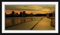
Walk with me.by jkuangComment: Lovely photo--the colors are gorgeous. Unfortunately, I think, your frame is too dominant and takes up valuable pixel real estate that could be used by the picture itself. |
| Photographer found comment helpful. |
| 08/11/2004 11:46:37 AM |
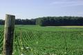
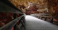
MKT Trail, Columbia, Missouri-2004by dustin03Comment: Beautiful. Love the low angle of the shot. Interesting choice in post-processing to desaturate the blues and greens to achieve a lovely palette of warm tones. (At least, given the season and your location, I assume that's what you did.) |
| Photographer found comment helpful. |
| 08/11/2004 11:43:46 AM |
Going away ...by smr78Comment: The color in this is stunning! What a nice composition the way you have framed it. I don't know that it demonstrates the parallel lines converging at the horizon concept of the challenge--though the ship lends itself to that objective somewhat.... |
| Photographer found comment helpful. |
| 08/11/2004 11:06:31 AM |
The SeaPointby sandabellaComment: I like the subject. The rust plays well off the blue sky and water. I think the composition would be improved by cropping out some of the "extra" sky at the top. And the lighthouse seems overexposed and out of focus detracting from the otherwise strong lines. |
| Photographer found comment helpful. |
| 08/11/2004 11:03:28 AM |
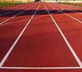
9.77 Seconds to Gloryby FirstyComment: Striking lines and colors! Illustrates the challenge concept well. Don't know why, but I'm wishing for a little less cropping at the top--maybe I need to see the roof lines? |
| Photographer found comment helpful. |
Home -
Challenges -
Community -
League -
Photos -
Cameras -
Lenses -
Learn -
Help -
Terms of Use -
Privacy -
Top ^
DPChallenge, and website content and design, Copyright © 2001-2025 Challenging Technologies, LLC.
All digital photo copyrights belong to the photographers and may not be used without permission.
Current Server Time: 08/26/2025 04:35:04 AM EDT.