| Image |
Comment |
| 10/16/2004 01:33:41 PM |
Do you hear me?by funpixComment: My first thought was that your subject wasn't something used to convey ideas between people. It seems more like a receiver. Yes, though, it does communicate outside noise to the listener's brain....so. o.k. But on the whole the image is unappealing. |
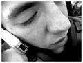
| 10/16/2004 01:31:44 PM |
Telepho-nationby FotowereldComment: Interesting interpretation of cellphone use. The wide-angle view, lighting and focus, seem to make the person's nose the subject of this shot, however. |
| 10/16/2004 01:30:36 PM |
2 Crabsby wchatchaiComment: Unless these crabs are using little semiphore flags that I can't see.....nevermind.
Seems to me your subjects are out of focus. Composition could be improved by moving the crabs off center. Nice tonal range. Overall, it just doesn't say much to me. |
| 10/16/2004 01:28:54 PM |
Honey, I'm Pregnant !by quarxComment: Sweet shot of kids. But a real stretch for the challenge. I like the lighting. Wish the expression on the child in the background was more visible. Just too much like a crop of a snapshot for my tastes. |
 Photographer found comment helpful. Photographer found comment helpful. |
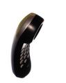
| 10/16/2004 01:27:30 PM |
Push My Buttons Big Boyby ChefbozComment: This has interesting form. I like the way it floats in the frame. Lighting and limited depth of fierld lend character. The title, however, doesn't fit for me...it seems more like a sad phone than a seductive one. |
| 10/16/2004 01:21:46 PM |
Tin Can Phonesby KaBooMComment: This would have more graphic appeal, to me, if the nearest can was in focus. The shadows are harsh, a second light source would reduce that and give more modeling to your subject. Black and white a nice choice for your subject. |
| Photographer found comment helpful. |
| 10/16/2004 01:14:16 PM |
I love you...by macgeek007Comment: Backlighting on the bleeding hearts is pretty. The background is, however, distracting. It competes with your subject and lines of composition. Perhaps if you had isolated one of the blossoms? It's also a liberal interpretation of the challenge...do we really use these to convey ideas between people? |
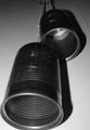
| 10/16/2004 01:11:37 PM |
Fading Into Extinctionby rayg544Comment: Removing the phone entirely from context makes it look like an ad picture....it doesn't seem to say much more to me than "this is a phone." The low contrast and grainy appearance don't create mood or tell me more about the subject. Sorry. Just the way I see it. |
| Photographer found comment helpful. |
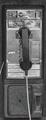
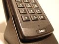
| 10/16/2004 01:08:25 PM |
AT&T. How can I help you?by ArnarpComment: Choosing to photograph only a portion of the phone means to me that you're thinking about your subject. But it seems that the composition is lacking in interest. You've used shallow depth of field, but it's not helping to point me to what must have been interesting to you. There's also a reddish cast to this....perhaps accentuating the contrast betwen the black phone and it's surrounding white would give this more graphic impact. |
| 10/16/2004 01:05:41 PM |
I love you mommyby NRRonComment: There's a lot of feeling in this photo....the look, the smile. Unfortunately the out of focus subject make this too much of a snapshot. Some color adjustment, also, might help balance in yellow glow of the indoor lighing. |
| Photographer found comment helpful. |
Home -
Challenges -
Community -
League -
Photos -
Cameras -
Lenses -
Learn -
Help -
Terms of Use -
Privacy -
Top ^
DPChallenge, and website content and design, Copyright © 2001-2025 Challenging Technologies, LLC.
All digital photo copyrights belong to the photographers and may not be used without permission.
Current Server Time: 08/26/2025 07:39:57 AM EDT.