| Image |
Comment |
| 01/20/2003 09:34:23 PM |
|
 Photographer found comment helpful. Photographer found comment helpful. |
| 01/20/2003 09:32:54 PM |
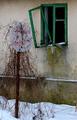
Abandonedby miracComment: It's a very nice photo although the window steals the show, so to speak. |
| Photographer found comment helpful. |
| 01/20/2003 09:31:30 PM |
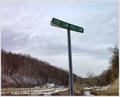
Directions To My Houseby bamasterComment: The colours and exposure are near perfect. I would have liked to see what lay beyond the "dead end" sign though. |
| 01/20/2003 09:30:04 PM |
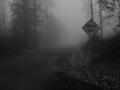
Onward by AlecComment: That fog machine must have cost a fortune to create this shot... IE: I love the fog. It has a eerie quality that complements the "dead end" sign lovely. Black and white is also very effective with this photo. Well done. |
| 01/20/2003 09:27:58 PM |
Stopby rj324Comment: Well the message of this photo is obvious enough - as indicated by your title! The only thing I'm not that keen on is the border - it's quite harsh compared to the rest of the image which is soft. I think it would be a stronger image without the border, or perhaps a subtle dark border. Your framing of the sign is good. |
| Photographer found comment helpful. |
| 01/20/2003 09:26:03 PM |
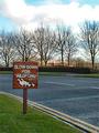
No Crime Zoneby DianaComment: The photo looks blurry, but it kind of adds a hand-painted feel to the drawing and I think it actually works fairly well. Composition of the image is good and the muted colours work well. |
| Photographer found comment helpful. |
| 01/20/2003 09:23:14 PM |
Milestoneby ManicComment: Nice photo - it made sense to centre this photo like you have. I might have tried a more shallow depth of field to really blur the bushes in the background (if that option is available to you). Good work |
| 01/20/2003 07:43:07 PM |
|
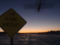
| 01/20/2003 07:42:30 PM |
Low Flight at Nightby av8orboyComment: I realise the difficulty in getting this shot, but the sign is too dark. Perhaps you could have lit it slightly to make it the highlight of the photo and then the plane flying over would have been a lovely complement. It's still a pretty good photo though. |
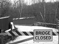
| 01/20/2003 07:40:39 PM |
Bridge Closedby BodhiComment: Lovely black and white. You have positioned the sign perfectly (a composition I probably wouldn't have thought of trying myself). Focus and exposure are lovely. Good work. |
Home -
Challenges -
Community -
League -
Photos -
Cameras -
Lenses -
Learn -
Help -
Terms of Use -
Privacy -
Top ^
DPChallenge, and website content and design, Copyright © 2001-2025 Challenging Technologies, LLC.
All digital photo copyrights belong to the photographers and may not be used without permission.
Current Server Time: 08/14/2025 08:37:27 AM EDT.