| Image |
Comment |
| 01/21/2003 07:48:36 PM |
Quantity or Speedby sulamkComment: I think that perhaps your white balance is a little bit off. I think the image would have been better if the sign was brighter (perhaps a different time of day). |
 Photographer found comment helpful. Photographer found comment helpful. |
| 01/21/2003 07:45:32 PM |
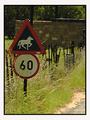
Redundancyby ClubJuggleComment: Where I live we have a "High Street Road" - it invariably gets confused with High Street. You have framed the signs very well - perfect balance on all four sides - and it really helps to make this image for me. Perhaps a tad underexposed but nothing too severe. |
| Photographer found comment helpful. |
| 01/21/2003 07:39:23 PM |
Ironicby teachme53Comment: Yes, very ironic. Everything is a little bit soft, although I suspect that's a result of struggling to get enough depth of field to include both objects. |
| 01/21/2003 07:37:42 PM |
Who's to blame?by AzrifelComment: I actually had Lego as one of my ideas - being a great fan of Lego. You've done quite well - focus is good, composition is good, lighting is very good (only a couple of reflections in the ladies hair). Well done. |
| Photographer found comment helpful. |
| 01/21/2003 06:46:19 PM |
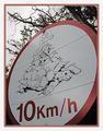
As Slow as a Tortoiseby JeanComment: I love the diagram on the sign - I wish our signmakers were as creative. Your focus is very good and centring the image, instead of the sign overall, works kind of well. |
| 01/21/2003 06:43:04 PM |
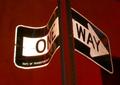
...Which Way?by catpixelComment: Why is everything so red? It's kind of uncomfortable to look at. Other than that I like the framing and the whiteness of the sign does make it stand out as the centre of attention. |
| Photographer found comment helpful. |
| 01/21/2003 06:33:02 PM |
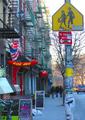
signs of the timesby tomzinhoComment: There are at least four signs which grabbed my attention initially (Hot Chili, Eat Me, No Standing and Pedestrian crossing). Later the apple and pirate sign appeared. In this way the photo is interesting, signs gradually appeared. Cropping is good, although including the very bottom of the hot chili sign would have been nice. Well done. |
| Photographer found comment helpful. |
| 01/21/2003 06:29:22 PM |
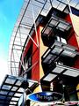
Crossroad Trafficby juhaseilaComment: Why is the sign partially cropped? My only guess is that the original was partially cropped also. The composition of the plane is perfect. Unfortunately the sign and plane compete for attention, and I can't really make a connection between them since the sign is about pedestrians. Colour and focus is good. |
| 01/21/2003 06:27:07 PM |
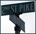
The High Streetby GinaRothfelsComment: That's a pretty trendy streetsign. It looks like you've done some trendy editing to this photo - I'd love to compare the original. Perhaps its worthy of a "How'd they do that" type tutorial. Focus and exposure is great, composition is good (shame about the partial sign in bottom right corner) and overall it has a real magazine / brochure type quality to it. Well done. |
| Photographer found comment helpful. |
| 01/21/2003 06:18:06 PM |
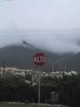
ALTOby bmarquezComment: Ok, I think I've just learnt "stop" in a different language. It looks like you were dealing with some adverse weather conditions here, which have made the photo rather dark. I think you may have included too much sky in the photo. |
| Photographer found comment helpful. |
Home -
Challenges -
Community -
League -
Photos -
Cameras -
Lenses -
Learn -
Help -
Terms of Use -
Privacy -
Top ^
DPChallenge, and website content and design, Copyright © 2001-2025 Challenging Technologies, LLC.
All digital photo copyrights belong to the photographers and may not be used without permission.
Current Server Time: 08/14/2025 08:58:56 AM EDT.