| Image |
Comment |
| 02/03/2003 08:32:51 PM |
Beauty In Winterby ErastisComment: There are a lot of artifacts in the petals - perhaps more light was needed for this shot? The shallow depth of field works well to blur the background - keeps eyes on flowers well. |
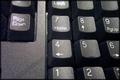
| 02/03/2003 08:29:12 PM |
Dust on the Key Boardby DianaComment: Lighting and exposure are both good, however I'm not so sure about the chosen crop. Perhaps you could have focused purely on the keypad, especially since there is flar on both "Page Down" and "[num] Lock". |
 Photographer found comment helpful. Photographer found comment helpful. |
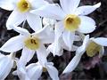
| 02/03/2003 08:18:22 PM |
The old "flower cliché"by xertionComment: I like the way the flowers appear to be floating over the background. I don't think there is enough contrast between the petals and the background though, also the flowers look a little weathered. |
| Photographer found comment helpful. |
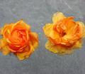
| 02/03/2003 05:13:18 PM |
Splashby ChaszmyrComment: Cliche? Yes, it certainly is. It's quite similar to the water drop in the "how'd they do that" section. The blue is fairly speckled - perhaps you didn't quite have enough light - which gives the image a soft look. |
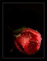
| 02/03/2003 05:06:06 PM |
Frost Roseby arnitComment: You've chosen an interesting composition and I kind of like it. Personally I might have tried to light the centre of the rose a little more, but it does have a very moody effect as it is. My biggest complaint is what looks like a blurred leaf at the top left of the rose - I'd probably erase that if printing the photo. Generally though it's a very good photo. |
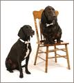
| 02/03/2003 05:03:29 PM |
Bahsworth & Brodamireby GotchaComment: Great work - composition and framing are near perfect, focus is very good and the dogs are lovely. Probably the biggest distraction I have are the shadows (especially around the chair). Everything else is wonderful though. |
| Photographer found comment helpful. |
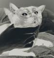
| 02/03/2003 12:30:32 AM |
Look here dammit!:-)by ParentxComment: Interesting shot, although I don't feel it's "the best you can" - it's a little unconventional for a pet photo. As an artistic photo though it works very well - it certainly held my attention for a while. |
| Photographer found comment helpful. |
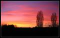
| 02/03/2003 12:26:15 AM |
Winter Sunsetby ManicComment: The colour is great and the silohuette works well. The balance between sky and land is also good. I think it would have been better if it only featured the tress though, and not the buildings in the distance - they compete a little and I think the trees would always win. The aspect ration of your final image is well suited to the topic. |
| 02/03/2003 12:19:52 AM |
All grown up and ready for college!by svitalComment: This is a pretty good portrait although my eyes are drawn to his hands rather than his face. I think it's because they are lighter. Composition is very good although the white background is perhaps a little too stark. Focus is good, colour is good. Finally, the shadows are a little harsh - perhaps a second light source would be good. Having said all that though - still a lovely portrait. |
| Photographer found comment helpful. |
| 02/03/2003 12:13:59 AM |
Two Classics by JackoComment: Very cliche and very well done! The reflection of the board in the very top drop really makes this photo for me. The border is simple and appropriate. A really good photo - the only critical comment is the reflection of the room where the drop meets the water, but it's only a minor thing. |
| Photographer found comment helpful. |
Home -
Challenges -
Community -
League -
Photos -
Cameras -
Lenses -
Learn -
Help -
Terms of Use -
Privacy -
Top ^
DPChallenge, and website content and design, Copyright © 2001-2025 Challenging Technologies, LLC.
All digital photo copyrights belong to the photographers and may not be used without permission.
Current Server Time: 08/15/2025 09:16:24 AM EDT.