|
|
|
Showing 551 - 560 of ~1183 |
| Image |
Comment |
| 05/08/2003 07:13:55 PM | |
| 05/08/2003 07:08:58 PM | |  Photographer found comment helpful. Photographer found comment helpful. |
| 05/08/2003 07:03:18 PM | Unitedby MusicmanComment: I like the balance and composition but the low lighting makes the image dull and soft. Also, there is some reflection in the right glass - it's very difficult to photograph well. | | Photographer found comment helpful. |
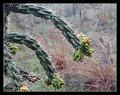
| 05/01/2003 12:27:26 AM | Prickly Prairieby moodvilleComment: Critique Club
Composition: I like the positioning of the cactus. I think the crop might be a little close on the bottom, but it's hard to say without seeing what was further down (it may have looked worse). In general though the composition is quite good.
Technical Quality: I like the sharpness of the main subject and the blurred background, although the blur looks more like camera shake than just a natural lack of focus. The clarity of the cactus is very good and you've done well to get some contrast between the main subject and the background.
Meeting the Challenge: It definitely meets the challenge - there is nothing non-flora in the photo to distract the viewing, and your chosen subject is quite obvious thanks to the shallow depth of field.
Creativity: It's a very interesting subject, although there is nothing specifically creative about the technique you have used. That's not to say I don't like the photo though.
Border / Title: The border is alright, but just on the edge of being too large. The title is witty and interesting.
Overall: I like the image and to be honest I'm slightly surprised at the position it finished in - obviously there was some strong competition.
| | Photographer found comment helpful. |
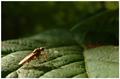
| 04/30/2003 09:59:36 PM | Bug on leafby e301Comment: Pseudo Critique Club comment (since you requested):
Composition: I like the inclusion of the background in this shot. As you said it puts the insect into context. I think the insect is perhaps a touch close to the bottom of the image - the classic "rules of thirds" would apply well to this image I think.
Technical Quality: In general the image is quite good. The lighting on the leaves is wonderful - the shadows bring out the texture. The bug is perhaps a little dark though since the light is from behind and above - I realise you would have had very little control over that though unless you could bounce some light in (using a mirror) or shot from the other side of the bug. Finally there seems to be a focus problem... The shallow depth of field is wonderful, but looking at which parts of the leaf are in focus show why the bug is slightly blurry. He is at the very front edge of the focus area, and his nearest legs are out of focus. With such a short range in focus, moving the camera one centimetre would have changed this. Having said that, the area in focus is incredibly crisp and sharp - well done.
Meeting the Challenge: Fauna - yes, and in it's natural environment (which a lot of people felt was necessary for "fauna").
Creativity: I like the inclusions of the leaves, they add so much interest to the photo, and the shallow DOF brings attention to the insect, which is very appropriate given the challenge topic.
Border / Title: The border is relatively simple (simple is good) and the title is perhaps a bit plain. I can't really think of a better title, perhaps something to put his size into context like "its such a big world when you are so small".
Overall: I think the minor focus issue detracts from this image, and the lighting makes the bug a little hard to look at. You have done well to capture a living insect in it's natural environment, so I can sympathise with the technical difficulties. Well done and good luck.
| | Photographer found comment helpful. |
| 04/27/2003 08:52:53 PM | NEVER LOOK DIRECTLY AT THE SUNby TiNComment: Critique Club
Composition: I like the inclusion of the trees at the bottom of the image - they add an interest point. Presumably the cropping at the top was dictated by the lens reflections. Some people commented that they should be removed, but I disagree totally - to me they make an important contribution to the image.
Technical Quality: The focus on the branches is pretty good - no doubt helped by such a fast shutter speed. In some respects the photo isn't technically excellent (ie: lens flare), but I think the shot requires the lens flare to be interesting. The colour of the sky is quite pleasing, and the colours of the flares are good also.
Meeting the Challenge: I guess the sun plays a big part in the weather, however your title makes the photo more specifically about the sun.
Creativity: I like the message conveyed by the photo, and you have executed it well.
Borders / Title: Your title is fine, although I don't know that uppercase helps it at all. A title like "what a sunny day" might have been more appropriate for the challenge topic, but I prefer your title in general.
Overall: It's an interesting photo. Hopefully you didn't damage the camera by holding it there for too long. I like the colours, I like the silohuette, and I really like the flare of the sun.
|
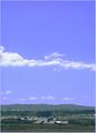
| 04/14/2003 12:37:43 AM | Forecast-Fineby chickadeeComment: Hey - I think I know where this was taken. Choosing portrait was an interesting option, which works well for this challenge. | | Photographer found comment helpful. |
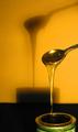
| 04/10/2003 11:14:12 PM | Golden Syrupby GussiComment: Critique Club
Composition: In general I really like the composition of this image - the inclusion of the shadow is very important. It does seem like the image is a bit too concentrated on the right side - you could have turned the camera very slightly (and had a bit more space on the right side of the jar/tin. The miniture drop coming off the spoon creates an annoying shadow, but it's quite minor until you look a lot.
Technical Quality: The focus on the spoon is very good, with the blurred shadow. The whole image has a golden glow about it - kind of appropriate for the subject. I like the light reflected in the syrup and tin, although the light in the spoon is a bit too bright (very hard to control though).
Meeting Challenge: As others have commented it's probably not close enough to be considered a macro. An example of a macro might be just the spoon head. I tend to think of macro as roughly meaning "printed larger than real life".
Creativity: I like the subject, and the shadow created from the lighting makes it quite an interesting shot.
Border / Title: No border, but this isn't a problem. The title is ok but not terribly creative. Given that english probably isn't your native language though it's fine.
Overall: It's a good shot that probably suffered (in terms of score) because it isn't really a macro. Very good otherwise though.
| | Photographer found comment helpful. |
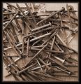
| 04/10/2003 10:58:36 PM | On Pap's Workbenchby OneSweetSinComment: Critique Club
Composition: The composition here is actually quite good. Lot's of interesting nails and bits and pieces, as well as some lovely detail in the timber behind them.
Technical Quality: Technically I think this image suffers most from a lack of sharpness. Given the long shutter time I hope a tripod (or some stand) was used. Otherwise, perhaps the focus wasn't quite right (or you may have even been within the minimum focal length of the camera). I like the lighting and exposure of the image. Choosing to use a sepia kind of colouring works very well for this image.
Meeting Challenge: It's definitely a macro - perhaps not as close as a macro of a single nail, but certainly close enough to qualify in my book.
Creativity: It's a nice photo that has a feeling of age about it. I'm sure it reminded lot's of others of their pap's workbenches.
Border / Title: As someone commented - the brown component of the border isn't that good. Perhaps replacing the inner half of the brown with black would have worked (see my Symmetry entry for an example). Having an inner black line helps define the photo I think. The title is very nice - like I said it triggers memories for people.
Overall: It's a lovely subject and the title is good, however the technical qualities need some work - mainly the sharpness / focus. Great otherwise though.
| | Photographer found comment helpful. |
| 04/10/2003 02:32:35 AM | Marching Columnsby MusicmanComment: Critique Club
Composition: The subject is very nice, but you took the photo from slightly off-centre. You probably should have taken it from head on, or way off-centre (making it look deliberate). The result is a slanted horizon line (especially obvious across the bottom) - which a lot of people vote harshly. Other than that, the framing is very good and well balanced and the piece of blue sky adds nicely to the subject.
Technical Quality: The exposure is great - the sky looks wonderful. The sharpening is spot on - not over sharp, nor soft. Focus is crisp. As mentioned though - the horizon is crooked which has cost you dearly.
Meeting Challenge: There's plenty of obvious symmetry in this photo, so no problems with meeting the challenge.
Creativity: I like the building and the small spots of yellow really got me thinking. Did you saturate the image to achieve this, or is that the natural colour balance of the building? (No problem - just curious)
Border / Title: No border - none required. The title is pretty good, but I didn't understand the "Marching" part - perhaps because of my nationality.
Overall: It's a very good image minus the crookedness aspect. You could even try a rotate in an image editing program - although it won't quite fix it. Well done though.
|
|
Showing 551 - 560 of ~1183 |
Home -
Challenges -
Community -
League -
Photos -
Cameras -
Lenses -
Learn -
Help -
Terms of Use -
Privacy -
Top ^
DPChallenge, and website content and design, Copyright © 2001-2025 Challenging Technologies, LLC.
All digital photo copyrights belong to the photographers and may not be used without permission.
Current Server Time: 08/17/2025 02:49:28 AM EDT.
|