| Image |
Comment |
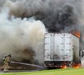
| 01/08/2006 12:47:16 AM |
Downtown Box Truck Fireby CamComment: Good work, capturing some real life action - maybe could have provided the shot to a newspaper or something. Composition is good and the smoke makes a great interesting background. A more witty title might have worked - the truck looks like it belongs to a cooking company, based on the chef's hat. Maybe something like "Bertrands new flame-grilled range of foods" or "Bertrands cancels 'Cook-while-delivering' strategy"? |
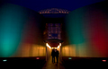
| 01/08/2006 12:43:23 AM |
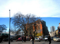
Just Hangin'by magnusComment: Great colours, nice symmetry and the people form a strong focal point by being silohuetted. Good work - it makes me want to know more about where they are and what they are waiting for. |
 Photographer found comment helpful. Photographer found comment helpful. |
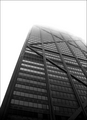
| 01/08/2006 12:42:16 AM |
The sky is Not the limitby DsealeComment: I love the transition from dark to light. I'm also a sucker for architecture and symmetry, so I think this shot is wonderful. The way it disappears into the cloud is great. Finally, your choice of black+white is brilliant - it really simplifies the shot and let's the viewer focus on the building and it's patterns. Great work! PS: Composition is also particularly good. |
| Photographer found comment helpful. |
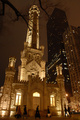
| 01/08/2006 12:40:15 AM |
American Gothicby flip89Comment: I like the contrast of the old church against the modern sky-scrapers. The shot looks a little soft - perhaps a bit of shake with the long exposure? |
| 01/08/2006 12:39:07 AM |
Not looking up?by QuickeyeComment: That looks like an interesting cloud formation. I'm guessing your title implies that you were surprised other people weren't interested in it. The clouds are a little overexposed though and the people are a bit dark so I'm not sure what you wanted the focal point to be. If it was the cloud I would have exposed less to keep more detail in them. |
| Photographer found comment helpful. |
| 01/08/2006 12:37:16 AM |
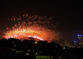
Welcome 2006by pfoyeComment: I'm surprised there isn't more New Years shots in this challenge. This looks suspiciously like the back of the Sydney Harbour Bridge. I think you could have cropped the bottom edge a bit more to remove the greenish mass in the centre of the frame. |
| 01/08/2006 12:35:29 AM |
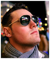
Time to Reflectby AlexSaberiComment: Great work - the colour is great, the expression is good and the composition/framing is very well done. The sharpening is taken too it's limit but I wouldn't say it's oversharpened. Having the person generally lighter than the background works extremely well - but something tells me you know enough about photography to realise that yourself. Great work - at the top end of the results for me. |
| Photographer found comment helpful. |
| 01/08/2006 12:33:25 AM |
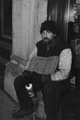
why lie?by muckpondComment: Not a bad shot - quite dark and gloomy, but that's kind of appropriate. |
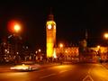
| 01/08/2006 12:32:17 AM |
Policing Londonby DoigComment: It took me a minute to get the title - instinct made me look for a bobby somewhere in the shot. Having the car blurred is fine, but it would have been nice if the buildings were sharp. Try a tripod, or at least sit the camera on or against something solid to help you out maybe. |
| Photographer found comment helpful. |
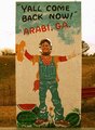
| 01/08/2006 12:30:38 AM |
hey!!!from arabi,georgiaby melodeeComment: Something tells me that your "City" is a little bit "Country" - but, hey, that's cool. The image looks a bit blotchy and the colour is a little off - perhaps if you could have taken the shot when the sun was behind the camera, rather than behind the sign. I love the inclusion of a person (perhaps yourself even) in the shot! |
| Photographer found comment helpful. |
Home -
Challenges -
Community -
League -
Photos -
Cameras -
Lenses -
Learn -
Help -
Terms of Use -
Privacy -
Top ^
DPChallenge, and website content and design, Copyright © 2001-2025 Challenging Technologies, LLC.
All digital photo copyrights belong to the photographers and may not be used without permission.
Current Server Time: 08/14/2025 02:04:07 AM EDT.