| Image |
Comment |
| 02/26/2014 07:10:36 PM |
|
 Photographer found comment helpful. Photographer found comment helpful. |
| 02/26/2014 06:59:22 PM |
|
| 02/26/2014 06:57:50 PM |
stop teasing me daddyby FourPointXComment: Stop teasing the dog, already! :-)
Love the idea, but i have remarks about the execution.
- Is that motion blur or bokeh on the ears? looks like motin blur to me
- Too much bokeh on the biscuit.
- The composition is to straight on for me. I would have went with a little pan to the left and the biscuit further to the camera left (closer to the lower left corner of the frame). |
| Photographer found comment helpful. |
| 02/26/2014 06:46:17 PM |
|
| Photographer found comment helpful. |
| 02/26/2014 06:42:39 PM |
The Lakeby the_rkpComment: The bokeh in the foreground dosen't look much effective to me.
That aside, it would have been a pretty good landscape photo (the colors especially on the layers of mountains in the background) if only that darn horizon wasn't dead center. |
| Photographer found comment helpful. |
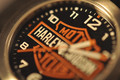
| 02/26/2014 06:39:34 PM |
Harley Timeby DCrest01Comment: I both love it and hate it.
I would have rotated the subject ~120 degrees to the left and focused on the part with the hands (1,2). Or set the watch/clock to 09:45, or maybe 11:40 :-) |
| Photographer found comment helpful. |
| 02/26/2014 06:30:28 PM |
Bokeh With Added Saltby stphqComment: WOW!
Love it.
I would have gone with more contrast. Whiter whites and darker blacks.
The tilt to the right is also effective. |
| 02/26/2014 06:27:23 PM |
|
| Photographer found comment helpful. |
| 02/26/2014 06:15:07 PM |
A Subtle Syncopation by CuttoothComment: WOW!
I have no idea where to horizon is... and i love it! The blurry sand (or whatever it is) simply guides you towards the boats.
I wonder how it would look like in B/W and with some more contrast. Or with more saturated colors. I have a feeling that there is even more potential in this photo if only the rules were not Minimal Editing. |
| Photographer found comment helpful. |
| 02/26/2014 06:08:24 PM |
|
| Photographer found comment helpful. |
Home -
Challenges -
Community -
League -
Photos -
Cameras -
Lenses -
Learn -
Help -
Terms of Use -
Privacy -
Top ^
DPChallenge, and website content and design, Copyright © 2001-2025 Challenging Technologies, LLC.
All digital photo copyrights belong to the photographers and may not be used without permission.
Current Server Time: 08/22/2025 11:05:54 PM EDT.