| Image |
Comment |
| 03/17/2015 06:30:41 PM |
Nikon D-810 pipe.by LoViComment: Interesting concept. Candid portrait of a camera :-)
The cables are distracting and the image lacks sharpness. |
| 03/17/2015 06:27:44 PM |
Portrait of a Beautyby GlieseComment: The mixed-colour lighting is a white balance nightmare. Unless this is a desired effect, B&W might be a solution for this.
Nice tight crop, BTW. Brave on your side not including the lens. It is a bit like a human portrait without including the eyes. It might work. |
| 03/17/2015 06:22:13 PM |
2009 - Bought my first DSLR (D70) and joined DPCby SEGComment: One of the rare specimens of a modern digital camera in the challenge. The majority of us opted for a vintage subject.
The B&W approach works well, but the inclusion of colour might have been effective as well. Nikon DSLR cameras have that red triangular element on the grip, below the shutter button, that might be interesting element, as well as the gold on the topp of the lens. DoF is spot-on.
There is some visible noise on the lens cap and the very front of the lens that is a bit distracting. |
 Photographer found comment helpful. Photographer found comment helpful. |
| 03/17/2015 06:14:42 PM |
|
| Photographer found comment helpful. |
| 03/17/2015 06:12:33 PM |
planned obsolescence by MarfunComment: 27 exposures? I have never seen a film with 27 exposures. What kind of film it uses, 110? It might as well be 135 (35mm) judging by the size of the camera. |
| Photographer found comment helpful. |
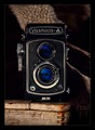
| 03/17/2015 06:10:33 PM |
Yashica-Aby glad2badadComment: I can't help but notice that twin lens reflex cameras are beautiful portrait subjects. There are a bunch of TLR entries in this challenge (mine included).
Lighting is spot on, as well as the sharpness and DoF. Colours work nice here, as well. |
| Photographer found comment helpful. |
| 03/17/2015 06:02:22 PM |
Red and Yashicaby Alex_PetriniComment: Excellent lighting. I love the red strap and the way the the foreground gradually blends into the background. The subject is beautiful, as well.
A bit more depth would benefit the image and maybe cropping out a bit from the bottom.
As for that hint of a reflection at the bottom, i would prefer if it was either not there or more prominent, but it's not a distracting element in the image as it is. |
| Photographer found comment helpful. |
| 03/17/2015 05:53:11 PM |
“A portrait is not made in the camera, but on either side of it" ~ Edward Steichenby LuciemacComment: I love the tight crop and the DoF.
The lighting in general is good, except for the mixed colours. The combination of bluish, white and yellowish highlights is a bit distracting. If it wasn't correctable in post, you should have gone with B&W (maybe recover the color on the red elements afterwards). Unless, of course, the mixed lighting was your intention. A bit more microcontrast/structure/clarity would have been nice, as well.
All in all, a solid take on the camera portrait challenge. |
| Photographer found comment helpful. |
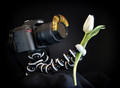
| 03/17/2015 05:44:15 PM |
Ready for my Portraitby DCrest01Comment: One of the rare entries that emphasized the "portrait" part of the challenge. I like that. Maybe the golden eyelashes were a bit of an overkill, but maybe not :-) |
| Photographer found comment helpful. |
| 03/17/2015 05:43:58 PM |
Old School by ecmguyComment: Good one. Hats down to the idea and the execution.
I almost tried a similar approach. A shot through the vertical viewfinder of a TLR. Instead of a cityscape, the subject's subject would have been another vintage camera. The orientation and the size of the viewfinder made it a very tough shot and i gave up. I wouldn't have been as effective as yours, anyway. |
| Photographer found comment helpful. |
Home -
Challenges -
Community -
League -
Photos -
Cameras -
Lenses -
Learn -
Help -
Terms of Use -
Privacy -
Top ^
DPChallenge, and website content and design, Copyright © 2001-2025 Challenging Technologies, LLC.
All digital photo copyrights belong to the photographers and may not be used without permission.
Current Server Time: 08/24/2025 01:44:15 PM EDT.