| Image |
Comment |
| 10/20/2004 03:08:49 PM |
Relaxationby KekiinaniComment: this image is perhaps a tad too light, or low contrast. It also seems that it was taken with a long delay, with a sligh breeze in the air, creating what seems to be camera shake... which i imageine is not. I think the biggest problem with this image is the range of shades of black to white.... it seems very middle grey. |
 Photographer found comment helpful. Photographer found comment helpful. |
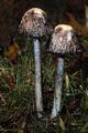
| 10/20/2004 03:05:44 PM |
Ghostly Delightby eaponygyrlComment: This image is very blurry which is one reason i gave it a low mark. Perhaps you were wanting to use that as part of the effect, but i don't feel it helps it at all. The subject is also placed DIRECTLY in the center of the image which makes for an 'uninteresting' composition... perhaps if it was moved to the left side more, that would help. |
| Photographer found comment helpful. |
| 10/20/2004 03:04:40 PM |
Autumn Night Coloursby SteveJComment: the direct lighting of the flash makes for a very cotrasty stagnant photo. The subject is nicely colored, but is the subject is not presented in a way that makes me think, or is anything other than what i would see if i looked at it for one second in real life. show me something i would miss if i wa walking by. The image also does not show any 'night' in it... it just happened to be dark when you shot the image. |
| Photographer found comment helpful. |
| 10/20/2004 03:02:39 PM |
Standing Tall - Against The "Flash"by DrakeComment: An allright, image, with decent cropping, but it doens't have much appeal for me. It appears there is one direct light sourche which makes for a very contrasty uninteresting image.... i guess the subject doens't appeal to me that much.. it would take a creative viewpoint to creat interest for me. Perhaps next time, take an obscure vantage point, or one not normally seen. |
| Photographer found comment helpful. |
| 10/18/2004 12:20:36 PM |
Curlby blemtComment: nice detail and attention to parts. it is not quite as sharp as i would like it.. perhaps a square framing would work better for this, i am not sure what bothers me about it. Decent image.. good background color, perhaps a little boost of contrast would help this image a little.
-from the critique club. |
| Photographer found comment helpful. |
| 10/18/2004 12:19:24 PM |
The heart of Sampdoria Stadiumby manimanComment: looks like a lot of action. All the people make an interesting composition. it is very busy, which can be ok and the people make a nice sort of 'blank' background, but the action in the image, which is perhaps the large flag, is very centered and in a 'boring' position in the photo. It is perhaps a little light, or too low contrast. I don't see any dark blacks... it is good to see the whole range of grey, from total white, to total black, with grey's in the middle.. even if it is a high key (very white) or dark image... there should be a good tonal range.
from the critique club. |
| 10/18/2004 12:17:39 PM |
A flower for you.by slynneblarpComment: good focus on the flower, and somewhat interesting photo. I am not sure the hand adds to the picture or not. It is blurry which brings out the flower, but it is still visible enough to know it is a hand.. and makes us think about it.. but not rellly intersting enough to keep our attention. Perhaps if a bit of the child was in the background, or no hand, or something. Good colors in the flower.
-from the critique club. |
| Photographer found comment helpful. |
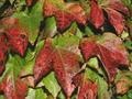
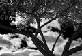
| 10/18/2004 12:15:51 PM |
Part Tree Part Skyby chakaComment: Interesting image. it looks like you burned the sky or did something selectivly to the sky, or tree as there is a visible line on the left most branch. .. nice background and nice contrast between the branches and sky. The framing is a little stale perhaps.. it is rather locked and doesn't create tons of interest. Perhaps up the constrast a bit.. the image is pretty middle grey everywhere...
good start.
-from the critique club. |
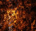
| 10/18/2004 11:49:14 AM |
Nightfall on a Fall Nightby dphillipsComment: perhaps the tree's were moving.. perhaps you liked the sort of abstract look, .. it is a nice blend of color.. but it doesn't appeal to me very much. |
| Photographer found comment helpful. |
| 10/18/2004 11:45:12 AM |
|
| Photographer found comment helpful. |
Home -
Challenges -
Community -
League -
Photos -
Cameras -
Lenses -
Learn -
Help -
Terms of Use -
Privacy -
Top ^
DPChallenge, and website content and design, Copyright © 2001-2025 Challenging Technologies, LLC.
All digital photo copyrights belong to the photographers and may not be used without permission.
Current Server Time: 08/27/2025 12:45:50 AM EDT.