| Image |
Comment |
| 11/04/2004 05:05:50 AM |
|
 Photographer found comment helpful. Photographer found comment helpful. |
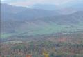
| 11/04/2004 05:03:59 AM |
Pendelton County WVby Crafty SueComment: Good vantage point (position to take the photo from), however the yellow leaves on the bottom are very distracting and should have been cropped out. On the left side of the image there is a dark line.. i am not sure what it is from, but it is also a bit distracting. The image looks very soft and sort of washed out, i think it could have benefited from a boost in saturation and contrast. |
| Photographer found comment helpful. |
| 11/04/2004 05:01:17 AM |
Wisdomby FanderComment: it bothers me that the chin is cropped off just tehre, and that it is such a direct front shot. The lighting seems to be perhaps a single sorce from the front, which creates often harsh lighting wth darkness around the eye's and mouth.. good start and idea, execution needs some work. |
| Photographer found comment helpful. |
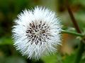
| 11/04/2004 04:59:00 AM |
Dandelion Generation 2005by FirstAidComment: i would sudjest making your images the full 640 pixels. People really vote images down for not being large. Other than that.. nice color and good isolated on the dandilion. Perhaps you could benefit from reading the tutorial on rule of thrids... in the learn section of DPC. |
| Photographer found comment helpful. |
| 11/04/2004 04:57:59 AM |
Alexandraby PepetteComment: well cute kid picture, nice framing and decent light. Good use of negative space. It does have a 'cute kid' 'feel' but not much more than that... which stops it from being a 'great' photo... great for the parents or family but not that great for anyone else. |
| 11/04/2004 04:56:38 AM |
Just Out of Reachby jimmyn4Comment: great expressions... the framing bugs me a little bit but i am not sure what i would do different. I like how the one reaching is just out of the frame.. so perhaps it works well.. and i like the negative space.. perhaps i would have like it with a little more space above and below the players.. and a little more space to the right... but yeah.. still great image. |
| 11/04/2004 04:54:28 AM |
Renewed Loveby tristaliskComment: i do like dark photo's.. but this one is a bit too vague, or tough to tell what it is to get a 'feel' for it. I think more context would be good... perhaps taken from a little farther away would help... or from a different angle.. |
| Photographer found comment helpful. |
| 11/04/2004 04:53:21 AM |
Red House of Baselby _wu_Comment: nice eye for detail and framing. Nice sky to put this building up against, and good saturation of color. |
| Photographer found comment helpful. |
| 11/04/2004 04:52:54 AM |
F-18 forming vapor burstsby jas0420Comment: wow, how great to capture that....nice shot. i guess i could say something about the plane being fery 'flat' and almost the same color as the background.. but you didn't have much choice... |
| Photographer found comment helpful. |
| 11/04/2004 04:51:51 AM |
Shifting Sands by photomComment: This image is really great. I love the simplicity of the deep blue sky and the yellow sand. It looks quite neatimaged and soft.. and i think it is a bit overdone... but it is still a very nice image, with great abstract shapes. |
| Photographer found comment helpful. |
Home -
Challenges -
Community -
League -
Photos -
Cameras -
Lenses -
Learn -
Help -
Terms of Use -
Privacy -
Top ^
DPChallenge, and website content and design, Copyright © 2001-2025 Challenging Technologies, LLC.
All digital photo copyrights belong to the photographers and may not be used without permission.
Current Server Time: 08/26/2025 07:19:38 PM EDT.