| Image |
Comment |
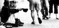
| 06/24/2004 10:43:17 AM |
Walked away, heard them say "Poison hearts will never change"by artvetComment: Very evocative image. The grain and slight unsharpness are very fitting. For a newspaper item the title doesn't seem appropriate though. Also, I would have cropped out the two pedestrians to the right, leaving only the guy seen from the back walking away from the beggar. 7 |
 Photographer found comment helpful. Photographer found comment helpful. |
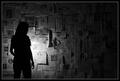
| 06/24/2004 10:33:23 AM |
Power Forwardby epeterandersonComment: Great action capture! Would have been even better with just a little bit more of their shoe soles, and the left and right cropped off. |
| 06/24/2004 10:24:48 AM |
"With our thoughts, we make the world." - Buddhaby mffnqueenComment: I think you misunderstood the challenge: the target was not to take a picture with newspapers in it, but a picture that could appear in a newspaper. Your title doesn't make this appropriate for a newspaper article. Still a 7 because I like the image very much. |
| Photographer found comment helpful. |
| 06/23/2004 10:10:53 AM |
|
| Photographer found comment helpful. |
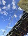
| 06/22/2004 04:16:59 PM |
George Washington Bridge Pre-Faceliftby BikeRacerComment: In reply to your request in the forums: I scored this a 7. Overall, it seems like a good picture, especially the composition is powerful to me. Some details that could account for the low score you received: lighting on the underside of the bridge is uneven, is that reflections from the water? Also the lines between the bridge and the cables from which it is hanging seem out of focus, maybe because they're moving (you don't specify shutter speed, so I may be wrong here). And the fact that the sky in the bottom left corner isn't as saturated as the rest makes this less than perfect. I do feel that these details aren't major, your overall score seems a bit low to me. |
| Photographer found comment helpful. |
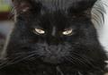
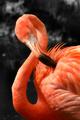
| 06/22/2004 01:13:25 PM |
Pretty in Pinkby tyt2000Comment: Very nice capture with good lighting. However, desaturating the background was not really necessary to make the bird the focal point of the image. To better tie in with the challenge you could have used more background, would have made contrast between bird and background more apparent. Nevertheless, very good picture. 7 |
| Photographer found comment helpful. |
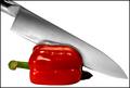
| 06/22/2004 12:05:00 PM |
Cutting Edgeby maelmsComment: I'm hesitating between "Great!" and "Yuck!" Since it's so good technically I'll settle for "Great!" Would have liked to see a little bit more space at the bottom. 8 |
| Photographer found comment helpful. |
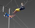
| 06/22/2004 12:02:39 PM |
Catchby FirstyComment: Wow, great capture! Pity that the selective desat is a bit messy around the arms and hands, I know how difficult and time-consuming that can be to get it right. I would have cropped a bit more from the bottom and the right to have the guys at thirds of the image. An alternative would have been to include more at the bottom to give a sense of space and height. 7 |
| Photographer found comment helpful. |
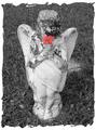
| 06/22/2004 11:59:32 AM |
In Loving Memoryby lilnukeeComment: Sorry, I hate the border, it's too cluttered and draws attention away from the image. Ignoring that, the image is great, good lighting, good focus, and very nice contrast between the flower and the weathered statue. 7 |
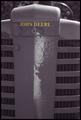
| 06/22/2004 11:57:12 AM |
John Deereby agrimaceComment: Very effective! The glare down the middle is a bit distracting, would have been nice if you could have eliminated that. |
| Photographer found comment helpful. |
Home -
Challenges -
Community -
League -
Photos -
Cameras -
Lenses -
Learn -
Help -
Terms of Use -
Privacy -
Top ^
DPChallenge, and website content and design, Copyright © 2001-2025 Challenging Technologies, LLC.
All digital photo copyrights belong to the photographers and may not be used without permission.
Current Server Time: 09/03/2025 06:37:54 PM EDT.