| Image |
Comment |
| 04/12/2011 10:34:44 PM |
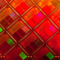
raw chips by ralphComment: nice graphic study with lovely colors, top five. |
| 04/12/2011 10:34:04 PM |
|
 Photographer found comment helpful. Photographer found comment helpful. |
| 04/12/2011 10:33:13 PM |
The IKEA Collectionby wbanningComment: A lovely study of light and texture. I have Ikea plate that have similar signs of use. I don't much like the hotspot along the rims on the left side, but that is pretty minor. My pick for red. |
| Photographer found comment helpful. |
| 04/12/2011 10:30:50 PM |
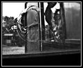
Peek-a-Booby garryyoungComment: There is alot going on here and most all of it good. The flow through the frame between the sill and the battens leading to the swirl of the glass break is really nice. Figuratively the weird fractal reflection in the edge of the broken glass, the face in teh opposite window and the reflection/ dark mass in that window keep the eye churning. top marks, my pick of the group. |
| Photographer found comment helpful. |
| 04/11/2011 08:59:23 PM |
With this ring...by jrmyrnsmComment: A beautiful moment captured, but to my eye you sacrificed the whites and the skin tones for the sake of the minister's dark suit. The suit looks great but isn't the story, the skin tones the shirt and the dress aren't really burnt out but they area all in a very narrow tonal range, one where the real story is taking place. |
| 04/11/2011 08:52:30 PM |
Life's Frustration: Why Isn't He Answeringby angkokwengComment: There are a few images that really tell a story in this challenge and this is one of the best. You really captured the deflated body posture of disappointment.
On the downside, the bohken in the background is lovely but it is busy enough to pull my eye away from the story, and has nothing to say. And the hand holding the phone is a major element of the image and I wish it were in focus.
That said, nice work, top ten. |
| Photographer found comment helpful. |
| 04/11/2011 08:48:25 PM |
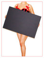
Censored!by FocusPointComment: Cute, clever and wow is this well lit! You really got those Vargas skin tones to play up the pin-up girl imagery. Top five. |
| Photographer found comment helpful. |
| 04/11/2011 08:46:45 PM |
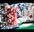
How Eating Disorders Beginby bcrantsComment: I look forward to finding out how this was done, I think I see a difference in freckle count between your models, and I hope its enough to keep people from thinking you did an illegal edit and voting you down. this shot works on many levels, It tells a story truly and quickly. It has a very nice tonal range, showing skill in lighting and editing. And it is a fine graphic. I hope to see it win a ribbon. |
| Photographer found comment helpful. |
| 04/11/2011 08:42:23 PM |
The Heartby Glacian22Comment: A truly great idea, but the pallet is so limited, and the focus so soft that Im afraid it will turn off a lot of voters. Still it is very sweet and the soft focus is in keeping with the subject and its in my personal top ten. |
| 04/11/2011 03:32:38 PM |
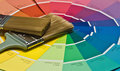
Paint Chip Kaleidoscopeby GarryComment: I like the idea and layout but your narrow DOF puzzles me, I have no idea why you chose to focus on the narrow band you did rather than having the wholle image in focus. It seems to me the bristles are the center of the image, not the handle which runs the eye off the page. |
| Photographer found comment helpful. |
Home -
Challenges -
Community -
League -
Photos -
Cameras -
Lenses -
Learn -
Help -
Terms of Use -
Privacy -
Top ^
DPChallenge, and website content and design, Copyright © 2001-2025 Challenging Technologies, LLC.
All digital photo copyrights belong to the photographers and may not be used without permission.
Current Server Time: 08/08/2025 06:21:23 AM EDT.