| Image |
Comment |
| 09/21/2005 12:54:12 PM |
|
 Photographer found comment helpful. Photographer found comment helpful. |
| 09/16/2005 03:22:29 PM |
Branch and shadowby HVGB_photosComment: I try to make a comment on the shot I think was most underscored in a challenge, and this is the one. Yes, the DOF might have been a bit wider, but the lighting and composition create a delicate stillness that is quite lovely. The interplay of fruit, leaf, branch ,trunk and shadow is outstanding. Keep this up and your scores ought to rise fast. |
| Photographer found comment helpful. |
| 09/16/2005 03:08:53 PM |
join the fun!by myceliumComment: Very pretty, both the shot and the model. I love the pairing of the blue with the skin tones, the lighting on her face is deftly handled, but a second lamp with a snood or jury riggged barn door to add some highlight detail in the flowers, while keeping it off the model's face, might have made the image better balanced. Message edited by author 2005-09-16 15:10:47. |
| Photographer found comment helpful. |
| 09/16/2005 02:40:42 PM |
Church001.jpgby GreenGiantComment: Had you moved a few feet down the block for a more dramatic angle or a few feet up to get truly square with the facade I think you would have had a stronger image.
The road traffic isn't strong enough to make an impression as it would if your camera was wider open for less time, but it does shift the lighting. The Fairmont traffic dwindles after midnight, but those street lighs stay on all night long. Perhaps a longer exposure with some sort of flashlight light painting could balance out the bounce light in the lower frame with a few picked out details in the towers.
I like the elements of the image but the blue light on the rose windows, the dim glow on the towers and the warm street light on the steps create very different feelings. I can imagine how different it would be if you picked out the crosses on the towers with a bluish high powered light, creating a counter balance to the repeting arcs of the rose windows. |
| Photographer found comment helpful. |
| 09/15/2005 07:57:46 PM |
PURRtraitby CarmelynnComment: while you got the eyes in focus puuurrrfectly, the wiskers are just too fuzzy. a bit deeper plane of focus would have helped. I like the color if his (her?) coat, but the contrast with the blue backround is quite jarring, while the textuer is so similar that it just seems odd. pertty cat and a very nice pose you got out of him(her). |
| Photographer found comment helpful. |
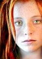
| 09/15/2005 07:45:56 PM |
Jacquelineby QartComment: good shot but I think you failed it in the lighting, the post processing looks good on the incandessant lit side, but the natural light side is too blue and blown out. other than that a potential ribbon shot. 7 |
| Photographer found comment helpful. |
| 09/14/2005 03:02:08 PM |
Caffine Buzzby TroutbearComment: I agree with most of the comments, though this pretty a shot should never score below a 4 IMHO. The tie in to the challenge has to be so obvious as to risk the cliche, where it will be ripped for being too obvious. |
| Photographer found comment helpful. |
| 09/14/2005 02:58:45 PM |
Functional Decorby TroutbearComment: i like the framing and the lighting, but the greatest drama of the shot is where the light fades off the carving and you placed that all the way down in the bottom, I wish I could watch that fading more easily. As to the grain, Im not sure if that is grain in the object photographed, or an artifact of sharpening, but most voters here are very sensative to overshapening, and will sadly assume anything that looks like too much USM was applied, must be that, rather than assuming it to be inherent in the subject.
The colors are great , but the focus is just a bit soft, but for the softness this is a very nice shot. |
| Photographer found comment helpful. |
| 09/13/2005 09:10:25 PM |
Traditional Bridesmaidby docpjvComment: the focus just misses on her face, a bit soft, and it looks like it belongs in a travel magazine, rather than being a shot a an individual. But oh, those colors and perfect backround, and such lighting.Lovely altogether. top ten |
| Photographer found comment helpful. |
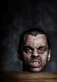
| 09/13/2005 09:07:44 PM |
Bite meby heidaComment: ugly nasty crude and mean. top ten, thei image of a severed head bugs me, and it only helps the vibe. |
| Photographer found comment helpful. |
Home -
Challenges -
Community -
League -
Photos -
Cameras -
Lenses -
Learn -
Help -
Terms of Use -
Privacy -
Top ^
DPChallenge, and website content and design, Copyright © 2001-2025 Challenging Technologies, LLC.
All digital photo copyrights belong to the photographers and may not be used without permission.
Current Server Time: 08/14/2025 08:59:03 AM EDT.