|
|
|
Showing 691 - 700 of ~979 |
| Image |
Comment |
| 06/28/2004 10:55:17 AM | who is afraid of yellow bricks?by PhileineComment: i feel slightly cheated on your behalf here - no WAY did you deserve 13 ones and twos... the average 6.75 from commentors just goes to prove that you really need a bit of a moment to appreciate this, which obviously the speed voters didn't get. i thought this was a lovely composition, a nice modern bit of artiness and deserved to do far better. |  Photographer found comment helpful. Photographer found comment helpful. |
| 06/26/2004 11:17:29 AM | |
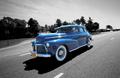
| 06/25/2004 09:26:29 AM | American Legendby crabappl3Comment: i love this to bits. it doesn't even look like a camera was used to take this it looks so perfect. it could be used on the cover of american classic magazine on some such. don't tick this as being helpful, because it's a bugger to come up with anything helpful other than, keep doing more of the same. composition, lighting, choice of desat, angle of shot, EVERYthing is perfect. gave three tens this week; this is one of them.
incidentally, somebody left a comment on my shot about corvettes. i wonder, was that you...? | | Photographer found comment helpful. |
| 06/25/2004 05:11:53 AM | Traveling through time..by fpilatoComment: This is wonderful subject matter for a challenge of this type. the car is gorgeous, and the blue shades are nice and bright and bold. Though chrome also looks very lovely, with the complimentary deep blue sky reflected in the top half of the bumper and the hub caps. only minor criticisms include that i think it might be prefereable if the background visible through the windows had been desatted, if you had cloned out your reflection clearly evident in the front corner, and most importantly, the car should really have been in motion. it looks just a bit odd (to my pre-conceived expectation) being situated on a nice picturesque straight road, but stationary. a very slight motion blur to the road surface would have helped, methinks. i might be wrong, it might have been in motion - it just to me, it doesn�t really convey that. Overall though it�s a very lovely poster-friendly image, get�s a 7 from me and I hope it does well. |
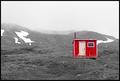
| 06/24/2004 09:11:33 AM | Emergency Shelterby tyrkinnComment: the brightness or contrast (one of those things) of the hut seems out of synch with the rest. perhaps if the land around the hut was made darker it would seem more at one (or do you have PS? try selecting the land and play with curves by doing left end down and right end up). it's a pity because i feel the composition, subject matter and the environment is all totally brilliant, and this is one of the most can-hang-on-a-wall shots submitted this week. Selective desat is totally suitable here. 8. | | Photographer found comment helpful. |
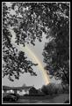
| 06/24/2004 09:02:51 AM | Beauty After the Beastby duncesComment: takes a bit of thought to fully appreciate what's going on here. i've got it now, but initially my thoughts were "eh?". i'm slightly worried the more speedy voters might pass over a bit too quickly. the capture of the rainbow is grand, though perhaps if you stood up (apologies if you're a dwarf) it would be less obscured by the dead pole? also, i would have left the devesation in monochrome - i personally think it might be more symbolic if the peace after the storm was the only thing in colour (and what glorious colour it is - it's bright and lovely) . interesting and novel concept though. 7. | | Photographer found comment helpful. |
| 06/24/2004 08:57:31 AM | Red or White -- It's all the same to me!by ChefbozComment: the white wine looks a bit green, really, but overall there are parts of this i really like. i think the light in the shadow and reflections are very lovely, and reasonably well captured. i think it's a bit of a pity that the glasses are not still transluscent, as this might have been more effective. similarly, did you try to position the glasses in a way that the projected shadows match better - for example, there is a entimeter gap between the stem and the shadow on the right, but no gap on the left. just seems a little bit unbalanced. 5. | | Photographer found comment helpful. |
| 06/24/2004 07:30:50 AM | A Brighter Day Comingby LENWOODBLUZComment: first off, nice job on the desat part of the picture - extracting colour from something with no real clearly defined edge must have been something of a bugger. i do like very much how you have the rainbow in between the trees, i think that is quite arty and nicely composed. what i'm not so impressed with is the house and cars in the foreground - it appears a bit more woody further up the street, and i think standing there might have been more in keeping with the shot. similarly, you could try cloning the trees in the background and covering the house with them. however, choice of subject is perfect, and to my eyes, it's a shot nicely executed. |
| 06/24/2004 05:24:13 AM | Under Wrapsby e301Comment: oh man, that sucks. the fact that it was under-wraps, i'm not referring to the picture itself. I went to the moto-expo on Friday the 18th, and there it was; shiny, silver, mean, GORgeous! took LOTS of pictures of it (and all the other cars - highlight of te day was sitting in the Bentley Continental GT - felt very Penelope Keith). one of the most perfectly design cars ever (i'll put a couple on the portfolio tonight after THE game), though it had different colour wheel nuts on each side, which i thought was odd. however, your shot is still interesting different enough, technically decent, so i'm surprised it scored less than 6.
| | Photographer found comment helpful. |
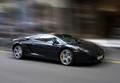
| 06/24/2004 04:04:43 AM | Lamborghini Gallardoby redmoonComment: hello all who looks at this,
thanks for all the jolly and surprisingly helpful comments this past week. i think people generally have a love / hate / not really bothered with it approach to the shot. i must concede, it was stationery, and i had a fair amount of help with PS. the background was motion blurred, and the wheels were spin blurred, and that's about it as far as editting is concerned (tweaked curves and very gently mildy desatted the background to help the car stand out a bit better - black isn't a very photogenic colour for metal, i think). . the more observant of you noted the wing mirrors and the sharp reflection on the side of the car - points i've taken on board (from imagineer and others, for which i'm grateful and i think i've learned from). it isn't actually a race car, it's just a (very expensive, sexy and italian) road car. sorry if people thought it wwas a panning shot - and i hope you don't think i'm a charlatan - i do feel a bit guiltily dirty though...
|
|
Showing 691 - 700 of ~979 |
Home -
Challenges -
Community -
League -
Photos -
Cameras -
Lenses -
Learn -
Help -
Terms of Use -
Privacy -
Top ^
DPChallenge, and website content and design, Copyright © 2001-2025 Challenging Technologies, LLC.
All digital photo copyrights belong to the photographers and may not be used without permission.
Current Server Time: 08/17/2025 03:12:31 PM EDT.
|