|
|
|
Showing 571 - 580 of ~979 |
| Image |
Comment |
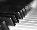
| 11/02/2004 09:08:43 AM | Keysby darixComment: not sure, really. the very precise depth of field looks a little fake, sudden and unnatural. it might not be editted, i can't say for certain, but it just feels a bit, erm, wrong 0 i think the harshness along the top edge of the in-focus key does it. I do like how it goes slightly bonkers in the top right though, and conceptually, this is a really good photo - quite arty, in fact. just needs to go a little softer on the softening... 5. |  Photographer found comment helpful. Photographer found comment helpful. |
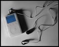
| 11/02/2004 09:00:12 AM | i listen, therefore ipodby EyesOnlyComment: stone me, a decent ipod picture. the lighting and soft grey tones work remarkably well, although the little orange lights look a little too orange (aren't they more red)? the background is also nicely complimentary, and does the little iconic gizmo a fair bit of justice. so many shots of the ipod look like a half hearted ill conceived balls up. this looks very cool, and would even look good hanging on the wall. my first ten of the challenge |
| 11/02/2004 08:55:00 AM | Strumming My Painby flip89Comment: not to want to be pernickity, but the tie does not really express "pain" to me. It's definietly prefereable to see an instrument in a photo being played, i agree with that aspect (although i'm two minds about the moving hand - a simple still pose would have been okay) but i don't know - shirt and ties don't really suit soulful anguished music. Lot's of black attire would i think be more suitable. 5. |
| 10/31/2004 05:21:03 AM | Heading back homeby DufusComment: I was just going though some of my old favourites, whereupon i stumbled on this lovely, brilliant picture. There is so much to like about this - the bee for one, but what really does it for me is 1) the different levels of focus (really sharp, pretty soft and really fuzzy in the top left) and the colours (the green and greeny-whites against the wonderful blue sky). composition and setting is perfect for me. there's a lot to look at too. it shocks me that it only got a 5.13 - i gave you a ten and i still stand by that score. excellent. would make a great record sleeve. | | Photographer found comment helpful. |
| 10/29/2004 04:29:49 PM | P9085060.jpgby GabrielComment: i much prefer this original - says so much more in a neo-gothic kind of why. spiffing. | | Photographer found comment helpful. |
| 10/28/2004 05:46:25 AM | SkyLights and TrackLightsby troyloxComment: The principal content of this picture fails, in my mind, to meet the challenge. However, the run of luminaires at the foot of the shot, in my mind, does. if only they featured a little more in the shot. it's a good shot, and wouldn't look out of place in a construction trade magazine. it just doesn't imply lines to me. 5. |
| 10/27/2004 05:26:56 AM | A Little of Bothby MWittComment: Great shot, lovely depth of field, composition and colours. Not entirely sure if there are any lines that are only implied... it's very nice, and the splash of red brings something special to what is a pretty common-themed photo. 7. |
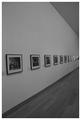
| 10/27/2004 05:22:44 AM | Picturesby MikeOComment: hmmm, it certainly fits the challenge. I like the look of this shot, and the graininess too. Though I wonder if this might be one of the few justifiable cases for selective desaturation? also, i think a landscaped orientaiton (with less ceiling and floor visible) might have helped drawing your eye along the picutres thereby emphasising the implied lines. It's a good arty concept though. 6. | | Photographer found comment helpful. |
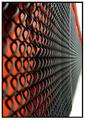
| 10/25/2004 12:28:02 PM | Fenceby bobdaveantComment: yes. i'd say this fits pretty well. i'd say the orientation is perhaps not best suited for this sort of picture for two reasons; one is that ones eyes are drawn towards the right, which ends abruptly, and second is the expanse of white in the corners kind of unbalances the overall shot. that minor compliant aside, i think this is brilliant - i love how bold the black and red looks at the core of the shot, and the subject matter though not obvious in the street, fits the implied line thing very well. good thinking and well executed. 8. | | Photographer found comment helpful. |
| 10/25/2004 12:24:38 PM | Line of Fireby bongoComment: genius, and an excellent capture of the action to boot. I am thoroughly impressed with this and i think it completely deserves a top 3 slot (haven't finished voting - but so far i'd say this is #1). the sharp detail of the matches, and the lighting upon them, is great. it suits the challenge brilliantly, and is quite frankly, fab. 10. | | Photographer found comment helpful. |
|
Showing 571 - 580 of ~979 |
Home -
Challenges -
Community -
League -
Photos -
Cameras -
Lenses -
Learn -
Help -
Terms of Use -
Privacy -
Top ^
DPChallenge, and website content and design, Copyright © 2001-2025 Challenging Technologies, LLC.
All digital photo copyrights belong to the photographers and may not be used without permission.
Current Server Time: 12/15/2025 12:04:32 AM EST.
|