| Image |
Comment |
| 06/12/2006 03:38:01 AM |
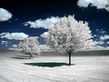
A barrel of funby BoltiComment: not having a toxic nuclear waste sign on the barrel feels like a slightly missed opportunity, but i still think this is a fun amusing image, and it actually conveys a sort of infectuous fun feeling too. technically, i think the shot looks a little over cluttered, but i do like how clearly defined the shadows are, and the tones and colours are very pleasing also. 7. |
 Photographer found comment helpful. Photographer found comment helpful. |
| 06/12/2006 03:34:20 AM |
|
| Photographer found comment helpful. |
| 06/08/2006 03:29:25 AM |
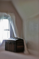
Last Whisperby xianartComment: i fear that you are SO going to get condemned for your selective blur and out-of-focus treatment. i personally adore this style - i've tried it myself with not remotely the level of success you did here. i hope i'm wrong and people who are voting warm to the atmospheric and stylisctic approach you've taken. the only thing not getting this a ten is something i can't quite place about the composition; perhaps it's the amount of wall on the right? might be talking out of my arse, but i wonder if a wide-angled landscape shot might make it fit a bit more comfy? or even show less of the room altogether (i put my hand over the right third, and it seems a bit more balanced). anyway, splendid job anyway. 9. |
| Photographer found comment helpful. |
| 06/08/2006 03:23:02 AM |
She LEFT by edmengComment: not totally enthused with the title (lacks a certain subtlety!) but the image itself is wonderfully composed and expertly presented. you've given a bona fide excuse for selective desat, which i feel is more often than not used totally wrongly. it works GLORiously here. every detail / element is perfectly positioned and treated - the light from the door, the door, the way the hanger appears to be floating. it gives the impression that you took a lot of care and attention to get this shot just so. easily one of my favourites this week. 10. |
| Photographer found comment helpful. |
| 06/07/2006 03:08:14 AM |
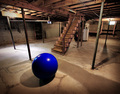
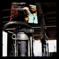
Basement Singularityby Bear_MusicComment: this has a lot of promise; one wonders how it might have looked if you had taken one or two lightbulbs out from the background. i think the brightness and shock value of the blue ball might have had greater impact. i like how you positioned the ball, and the idea of space is pleasing. overall the shot seems a tad too bright to me, but very likeable. 8. by the way; if this is your basement, i'm very jealous - seems like a wonderful place for shooting. |
| Photographer found comment helpful. |
| 06/05/2006 03:47:24 AM |
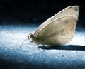
Moth On the Floorby stare_at_the_sunComment: the quality of the picture itself is super, and the way you've done the post processing is very likable. it just doesn't say "empty room" to me in any strong way - though i imagine any sort of macro shot would have the same difficulty. but's it's still quite lovely, and the blue tones are very very nice. 7. |
| Photographer found comment helpful. |
| 06/05/2006 03:42:16 AM |
Modern Torch Songsby gsalComment: this is just very weird - the record sleeve is completely out of context with its surroundings. even more weirder is that it seems to work exceedingly well - this itself would make a glorious album cover. with regards to meeting the challenge, i could be a bit pernickity and mention that temporary props aren't actually part of the room... but that's just me being excessively stupid. i think the post-processing is fantastic and the slightly bonkers thinking behind it is to be saluted. the only real slight complaint is that i would have liked to see the sleeve a little less stuck at the top of the shot. overall - 9. |
| Photographer found comment helpful. |
| 09/29/2005 02:34:15 PM |
|
| 07/04/2005 03:09:39 AM |
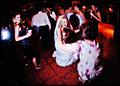
Serenityby sheapodComment: 107th? totally shocked; had this down for a top ten from the moment i saw it; totally gorgeous and my favourite of the week. keep at it! |
| Photographer found comment helpful. |
| 06/30/2005 03:06:31 AM |
Healthy Biteby muggle_girlComment: i love the concept of this, and the look of the fork with the apples juice at the tips looks lovely. the only negative thing i would add is that i think a closer crop at the top might work better, possibly as far down as taking out the top half of the piece of apple. the contrast of the black against the to of the apple feels too heavy, and detracts form the super detail you've captured in the rest of the image; seeing the brushed metal of the fork is exspecially pleasing. 7. |
| Photographer found comment helpful. |
Home -
Challenges -
Community -
League -
Photos -
Cameras -
Lenses -
Learn -
Help -
Terms of Use -
Privacy -
Top ^
DPChallenge, and website content and design, Copyright © 2001-2025 Challenging Technologies, LLC.
All digital photo copyrights belong to the photographers and may not be used without permission.
Current Server Time: 08/17/2025 03:45:15 PM EDT.